


DESCRIPTIVE STATISTICS 1
Discussion Thread: Descriptive Statistics, Ordinal Scale, and Dichotomous Variable
School of Business
BUSI 820 – Quantitative Research Methods (B03)
DESCRIPTIVE STATISTICS 2
Descriptive Statistics, Ordinal Scale, and Dichotomous Variable
The current discussion encompasses a range of outputs and statistical measures that aid in
comprehending the data, detecting errors, and determining if the collected data satisfies
fundamental assumptions for calculating statistics. Before conducting any inferential statistical
analysis, engaging in exploratory data analysis (EDA) is imperative. To enhance comprehension
of the data, various methods of analysis will be utilized to generate diverse types of plots,
contingent upon the measurement level of the variables. During this discussion, the researcher
will address five questions related to interpretation to facilitate the execution of a comprehensive
EDA.
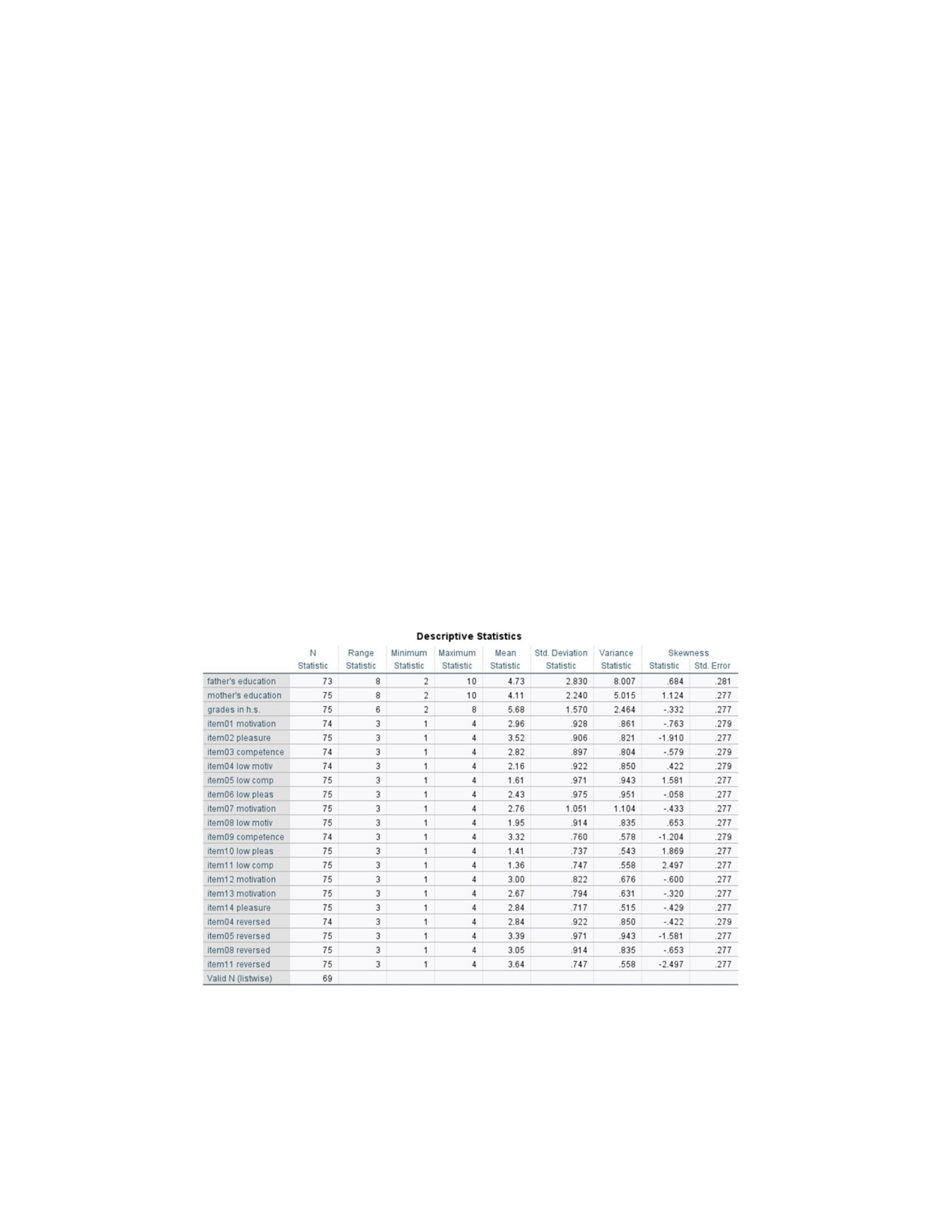
D3.4.1. Using Outputs 4.1a and 4.1b:
Output 4.1a (Morgan et al., 2020, p. 69)
Descriptive Statistics Labeled Ordinal
Note. The data were analyzed using IBM SPSS Statistics (Version 28) predictive analytics
software.

DESCRIPTIVE STATISTICS 3
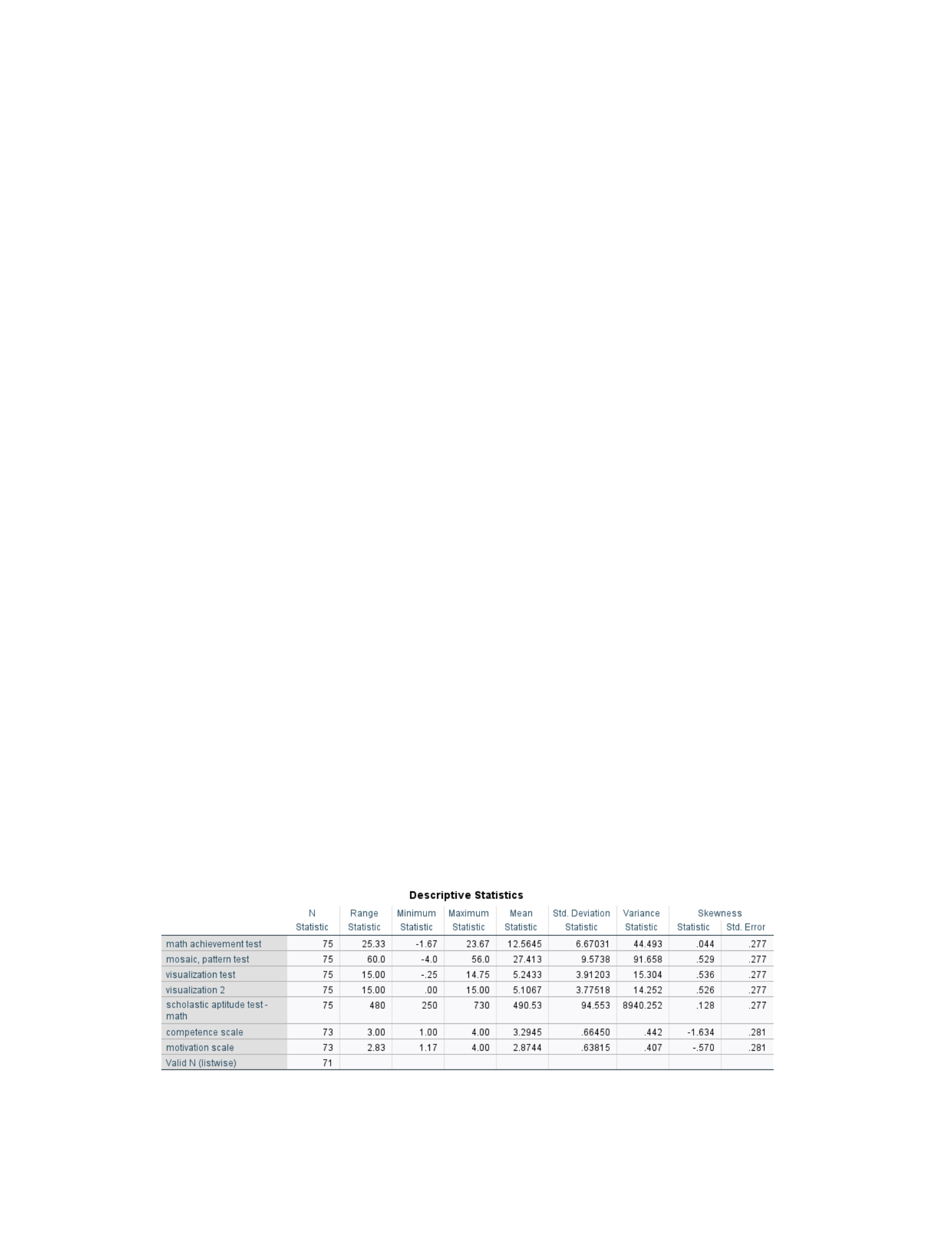
Output 4.1b (Morgan et al., 2020, p. 70)
Descriptive Statistics Labeled Scale
Note. The data were analyzed using IBM SPSS Statistics (Version 28) predictive analytics
software.
D3.4.1.a. What is the mean visualization test score?
Rao et al.5(2023) assert that visualization generates the links, trends, and variations inherent in
the data. Moreover, Rao et al. (2020) discuss the concept of aesthetic mappings, which establish
the connection between qualities (variables) within a dataset and their visual representation in a
visualization. In a multivariate scatter plot, assigning one attribute to the x-position, another to
the y-position, and a third to the color mapping is standard practice. The comprehension of
aesthetic mappings can potentially offer a framework for establishing connections between data
and visualization.
Based on the data provided in output 4.1b above, precisely the descriptive statistics scale, it
can be observed that the average score obtained in the visualization test is 5.24, where the low
value of the label is coded as -4, low, and the high is coded as 16. According to Morgan et al.
(2020, p. 69), the primary concept involves assessing normality. In the initial stage, we must
examine potential flaws to validate the assumptions inferred from our outputs. Upon verification,

DESCRIPTIVE STATISTICS 4
the calculated mean score would provide the researcher with valuable information regarding the
anticipated average performance on test scores across all participants.
D3.4.1.b. What is the skewness statistic for the math achievement test? What does this tell us?
According to Kochar and Xu (2014), skewness is the deviation of a distribution from
symmetry, which occurs when one tail of the density is more "stretched out" than the other tail.
Data with significant bias can be found in various fields, including economics, engineering,
health, insurance, and psychology. It may be simple to identify symmetric distributions. Still, it
is not so simple to evaluate the degree of skewness in non-symmetric distributions and decide
which is more extreme.
Based on the data presented in output 4.1b above, precisely the descriptive statistics scale, it
is evident that the math accomplishment exam has a skewness statistic of .044. A variable with a
favorable frequency distribution and a slight skewness can be characterized as not deviating
much from normality. Skewness pertains to the absence of symmetry in a frequency distribution
(Morgan et al., 2020), where a normally distributed or bell-shaped curve exhibits a skewness
value of zero. The skewness value of .044 suggests that the distribution curve is relatively
symmetrical.
It's important to note that distributions with a long right tail have a positive skew (i.e., a value
of 1), whereas distributions with a long-left tail have a negative skew (i.e., a value of -1). An
important role in statistical analysis is played by skewness, which helps determine whether or not
a variable follows a normal distribution. The skewness value measures how much the
distribution of a given variable deviates from a normal curve (Morgan et al., 2020).
DESCRIPTIVE STATISTICS 5
D3.4.1.c. What is the minimum score for the mosaic pattern test? How can that be?
According to Vetter (2017), similar to newspapers, effective descriptive reporting addresses
the fundamental inquiries of who, what, why, when, and where. A sixth point to consider is the
question of significance or relevance. In descriptive statistics and their presentation in academic
reporting, the comparison between the total study sample size and the sizes of individual study
groups, the estimation of a point within the study sample, the calculation of frequency,
percentage, ratio, and proportion, the determination of measures representing the central
tendency of data, the assessment of the variability or dispersion of data, the utilization of
confidence intervals (CIs) to gauge the precision of a point estimate, and the graphical
representation of various data types are all critical aspects in academic research.
According to the information provided in output 4.1b, particularly about the descriptive
statistics scale, the lowest possible score on the mosaic pattern test is -4.0, while the highest
score is 56. This information is readily apparent, implying that at least one participant obtained
the lowest possible score and that at least one participant got the maximum score on this test,
which might indicate a potential error in the data.
D3.4.2. Using Outputs from 4.1b:
Output 4.1b (Morgan et al., 2020, p. 70)
Descriptive Statistics Labeled Scale

DESCRIPTIVE STATISTICS 6
Note. The data were analyzed using IBM SPSS Statistics (Version 28) predictive analytics
software.
D3.4.2.a. For which variables we called scale, is the skewness statistic more than 1.00 or less
than –1.00?
Blanca et al. (2013) highlight that a commonly employed approach for evaluating the shape of
distribution involves the utilization of skewness (y1) and kurtosis, also known as the coefficient
of excess (y2), which are derived from the third and fourth central moments. When y1 = 0, it
signifies a symmetrical shape. Positive values of y1 imply right-skewness (right-tail), whereas
negative values suggest left-skewness (left-tail). Scholarly literature often regards the y2
coefficient as an indicator of peakedness and flatness, while subsequent research has also
proposed alternative interpretations. A y2 value of 0 indicates that the data exhibits the same
level of kurtosis as a normal distribution with a mean of 0 and a standard deviation of 1 (N(0,1)).
Positive y2 values suggest a higher degree of peakedness, while negative values suggest a lower
degree than the normal distribution.
According to the information provided in output 4.1b above, particularly about the descriptive
statistics scale, the skewness statistic for the only variable with a skewness statistic of more than
1.00 or less than –1.00 is the competence scale variable with a skewness statistic of -1.634
(Morgan et al., 2020).
D3.4.2.b.Why is the answer important?
The significance of the response lies in the fact that skewness values below -1.00 or over 1.00
indicate a substantial degree of skewness in the data, which has implications for the measures of
central tendency, such as the mean, median, and mode. The variable of the competence scale,
which exhibits a high degree of skewness, may possess a notable leftward tail, resulting in a
DESCRIPTIVE STATISTICS 7
substantial number of data points that are consistently smaller than the mean (Morgan et al.,
2020).
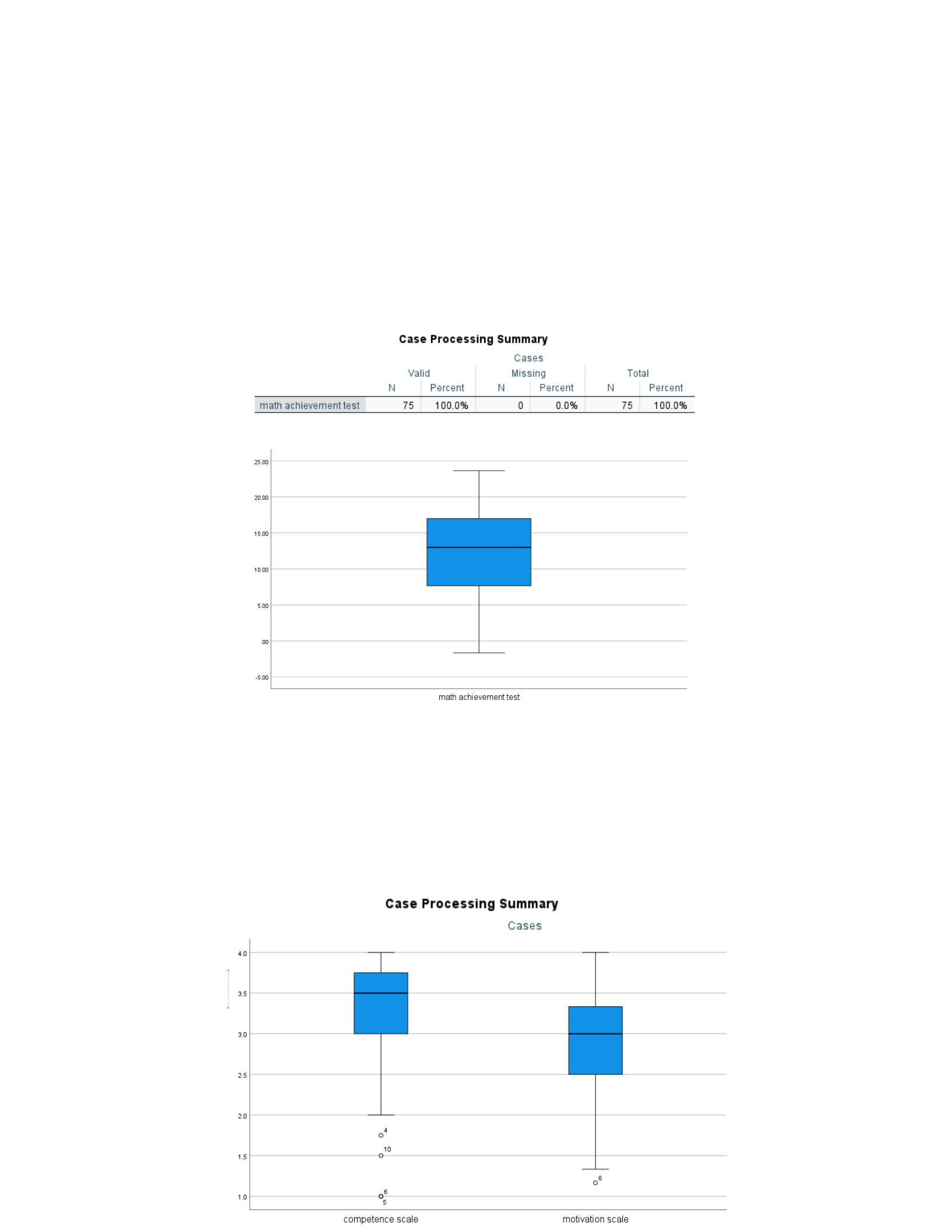
D3.4.2.c. Does this agree with the boxplot for Output 4.2? Explain.
Output 4.2a (Morgan et al., 2020, p. 73)
Boxplot of Math Achievement Test
Note. The data were analyzed using IBM SPSS Statistics (Version 28) predictive analytics
software.
Output 4.2b (Morgan et al., 2020, p. 74)
Boxplot of confidence and motivation scales

DESCRIPTIVE STATISTICS 8
Note. The data were analyzed using IBM SPSS Statistics (Version 28) predictive analytics
software.
According to Morgan et al. (2020), boxplots are a valuable tool for detecting variables that
exhibit extreme scores, resulting in a skewed distribution and deviating from normality.
Moreover, if there are only a limited number of outliers, the whiskers show similar lengths, and
the line within the box is positioned approximately at the center of the box, one can infer that a
normal distribution approximately characterizes the variable. Therefore, the math
accomplishment test exhibits a distribution that is close to normal, while the motivation scale
demonstrates a relatively normal distribution; however, the competence scale displays a
noticeably skewed distribution. The boxplot for the competence scale exhibits three outliers, as
seen by the presence of Os at the lower ends of the whiskers. Similarly, the boxplot for the
motivation scale displays one outlier, also characterized by a meager score.
D3.4.3. Using Output 4.2b above:

DESCRIPTIVE STATISTICS 9
D3.4.3.a. How many participants have missing data?
The information supplied in output 4.2b, a boxplot of the confidence and motivation scale,
indicates that four individuals are missing data.
D3.4.3.b. What percent of students have a valid (non-missing) motivation scale or competence
scale score?
The data presented in output 4.2b, which displays a boxplot of the confidence and motivation
scale, reveals that 71 out of the total 75 instances were included in the study. This is a proportion
of 94.7% of students with a valid score on either the motivation or competence scales, with no
missing data.
D3.4.3.c. Can you tell from Outputs 4.1 and 4.2b how many are missing both motivation scale
and competence scale scores? Explain.
Social science has three common data loss causes. Random data loss is the first distinct
category, where the dataset is impartially empty. Missing data does not affect the variable's value
or correlation with other variables. Any real-world social science data set is unlikely to have this
characteristic, and even if there is non-missing data, it would not be enough to identify it. Non-
responders to surveys may be busy, illiterate, self-confident, or uninterested.
Another data loss, known as missing data, is not randomly distributed and is affected by non-
responses. A survey dataset with few literacy cases may overestimate respondents' literacy levels
because low-literate respondents are less likely to read the questionnaire. Finally, missing data is
called "missing at random," distinguishing it from "missing completely at random" and "missing
not at random." Only after controlling for other variables are missing data assumed to be
unrelated to their value. According to the theoretical framework, empirical evidence can explain
DESCRIPTIVE STATISTICS 10
or predict missing data, suggesting that additional variables in the dataset may explain missing
data patterns.
Based on the data presented in output table 4.1b on page 3 of the referenced document, it is
observed that the competence scale and the motivation scale exhibit scores of 73 each. However,
it is noteworthy that the population size is reported as 75, indicating the presence of missing
scores for both variables in the output. Furthermore, by the data presented in output table 4.2b on
page 7 of this document, the competence scale exhibits a value of 71, which is consistent with
the motivation scale variable. This observation indicates that both the motivation and
competence variables contain missing data.
D3.4.4. Using Output 4.4:
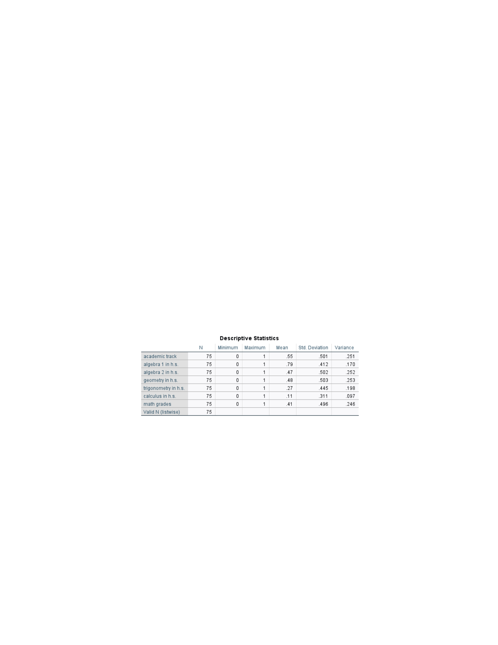
Output 4.4 (Morgan et al., 2020, p. 80)
Descriptives for Dichotomous Variables
Note. The data were analyzed using IBM SPSS Statistics (Version 28) predictive analytics
software.
D3.4.4.a. Can you interpret the means? Explain.
Based on the data presented in output table 4.4 above, descriptives for dichotomous variables,
although the mean is typically not applicable to nominal variables, can be employed in
dichotomous variables to gain insights into the proportion of research participants in each group
category. In the present scenario, the average value for the academic track is 0.55. According to

DESCRIPTIVE STATISTICS 11
the findings of Morgan et al. (2021), it can be inferred that 55% of the participants were
classified as belonging to the regular track category (coded as 1), while the remaining 45% were
classified as belonging to the fast-track category (coded as 0). Since the mean has been
established to exceed fifty percent (0.50), more students are now enrolled in the regular rather
than the fast track.
D3.4.4.b. How many participants are there altogether?
As shown in output table 4.4 above, the descriptive statistics for dichotomous variables
indicate that the population surveyed, denoted by Valid N (listwise), consists of 75.
D3.4.4.c. How many have complete data (nothing missing)?
As shown in output table 4.4 above, the descriptive statistics for dichotomous variables
indicate that in the population surveyed, all variables show 75 participants have completed the
data, which means the data is complete.
D3.4.4.d. What percent are on the fast track?
As indicated in output table 4.4 presented above, to identify the fast track, researchers need to
calculate the descriptive statistics for dichotomous variables by subtracting the mean (coded as 1
for regular track) by 1. By doing so, the individuals considered fast-track participants (coded as
0) are brought to the forefront. To enhance clarity, the average for the academic track is 0.55,
which can also be expressed as 55%. When subtracting 1 from the mean value (1 - .55 = x), the
result is .45 (or 45%). This suggests that 45% of the surveyed individuals are enrolled in the
regular track.
To determine the proportion of participants falling into the academic fast-track category, we
subtract the percentage of participants not falling into this category from 100%. Given that all 75
participants were surveyed, the remaining 45% represents the proportion of participants not in
DESCRIPTIVE STATISTICS 12
the academic fast-track category. Therefore, the academic fast-track percentage can be calculated
as 100% minus 45%, resulting in 55% of the surveyed participants falling into this category.
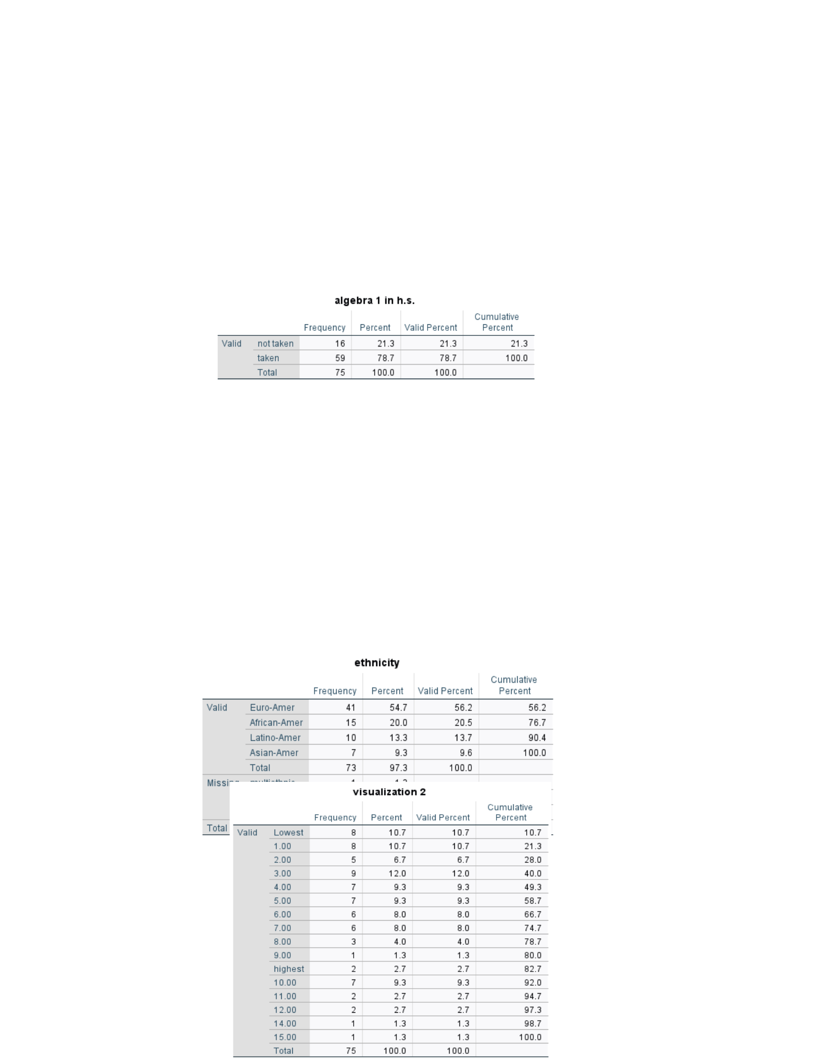
D3.4.4.e. What percent took Algebra 1 in h.s.?
Table 1
Algebra 1in High School Frequency Table
Note. The data were analyzed using IBM
SPSS Statistics (Version 28) predictive analytics software.
As noted in Table 1 above, participants who took Algebra 1 in high school were 79%. The
values for this variable are 0 for Not Taken and 1 for Taken.
D3.4.5. Using Output 4.5:
Output 4.5: Frequency Tables for Four Variables (Morgan et al., 2020, p. 82)
Frequency Ethnicity
Visualization 2 Scores

DESCRIPTIVE STATISTICS 13
Note. The data were analyzed using IBM SPSS Statistics (Version 28) predictive analytics
software.
D3.4.5.a. 9.6% of what group are Asian-Americans?
According to Morgan et al.'s research from 2020, a frequency table can be utilized for
nominal, scale, ordinal, and dichotomous variables. When observing the frequency of the data, it
is possible to get a better idea of how many participants lack data and how many show up at each
level. According to the output, based on the data presented in output table 4.5 above, frequency
ethnicity, 9.6% of the participants with non-missing data are Asian Americans. This information
is derived from the data. This indicates that Asian Americans make up 9.3% of the total of 73
participants (students) in the study.
D3.4.5.b. What percent of students have visualization 2 scores of 6?
Based on the data provided in Table 4.5, specifically in Visualization 2, it can be observed
that a mere 5.3% of students achieved a perfect score of 6 on the Visualizing 2 test. This
calculation is derived from multiplying 60.70 by 0.08, resulting in a value of 5.336%,
highlighting no gaps in the data for this particular variable.

DESCRIPTIVE STATISTICS 14
D3.4.5.c. What percent of students have visualization 2 scores of 6 or less?
According to the output, based on the data presented in output table 4.5 above, visualization
2, 70.7% of the total is displayed in the cumulative percentage column, i.e., 74.7 + 66.7 =
144.2/5 = 70.7%.
Conclusion
In summary, the preceding discussion included several outputs and statistical measures that
facilitate data analysis, identification of errors, and assessing whether the collected data satisfies
fundamental assumptions for statistical calculations. These methods aid in evaluating if the
collected data meets the essential assumptions required for statistical calculations. Moreover,
these characteristics are crucial in determining how the collected data satisfies statistical
analysis's fundamental assumptions. Before executing inferential statistical analysis, conducting
exploratory data analysis (EDA) is essential, where the processing and representation of data will
vary depending on the measurement levels of the variables. The researcher's analysis and
interpretation of the collected and analyzed data will enhance the reader's understanding of the
content, which supports a comprehensive exploratory data analysis.
References

DESCRIPTIVE STATISTICS 15
Blanca, A., López-Montiel, D., Bono, R., & Bendayan, R. (2013). Skewness and kurtosis in real
data Samples.5Methodology: European Journal of Research Methods for the Behavioral
& Social Sciences.,59(2), 78–84. https://doi.org/10.1027/1614-2241/a000057.
Gorard, S. (2020). Handling Missing Data in Numeric Analyses.5International Journal of Social
Research Methodology,523(6), 651–660.
https://doi.org/10.1080/13645579.2020.1729974.
Kochar, S., & Xu, M. (2014). On the skewness of order statistics with applications.5Annals of
Operations Research,5212(1), 127-
135.5https://link.gale.com/apps/doc/A379640813/GBIB?
u=vic_liberty&sid=summon&xid=d9492211.
Liao, S., & Chen, Y. (2014). A rough set-based association rule approach implemented on
exploring beverages product spectrum.0Applied Intelligence,040(3), 464-478.
https://doi.org/10.1007/s10489-013-0465-.
Morgan, G., Barrett, K., Leech, N., & Gloeckner, G. (2020). IBM SPSS for
Introductory Statistics Use and Interpretation (6th ed.). New York, NY, USA: Routledge.
Rao, V., Legacy, C.,5Ziegler, A., & DelMas, R. (2023). Designing a sequence of activities to
build reasoning about data and visualization,5Teaching Statistics, 45(51), 80-
92.5https://doi.org/10.1111/test.12341.
Vetter, T.5(2017).5Descriptive statistics: Reporting the answers to the 5 basic questions of who,
what, why, when, where, and a sixth, so what?5Anesthesia & Analgesia,01250(5),51797-
1802.5doi: 10.1213/ANE.0000000000002471.

