


Visual Analysis of Nature in Modern Art

Introduction
Art is present in nature, just as nature is present
in art. The very term “Nature” is very broad and
all-encompassing, like life itself. It is connected
to humanity at a deep, intimate level. We
emerged from it, and we would likely return to
it, eventually. From ancient artists to modern
creators, many drew inspirations from many
aspects of nature, ranging from the harmonious
coexistence of various flowers, trees, and plants
to the ferocious and macabre cycles of life and
death that often go unseen to the human eye.
Every artist sees something in nature that
appeals and calls to them. In the age of modern
arts, when both the creators and the audience is
less concerned with the physical form and more
with the underlying messages and feelings that
art invokes, the multi-faceted topic of nature

emerges once more in all of its beautiful and
frightening glory.
This paper is dedicated to the visual art analysis
of the two prominent artists of the modern age –
Lars von Trier and Fiona Hall. They are quite
unlike one another – one is a cinema director and
screenwriter while the other is an artistic
photographer and sculptor.
What unites them are the unusual and elaborate
portrayals of nature in their works. Unlike the
photorealistic pictures of the classic artists of
old, that had no deeper meaning behind it other
than trying to replicate the splendor of the
forests and wildlife to the best of their ability, the
depictions of nature in modern art go beyond
that. They tell a story, and they are meant to
invoke feelings and thoughts.

Lars von Trier depicts nature as a silent
character, addresses the connection between
nature and humans in three of his films named
Dogville, Antichrist, and Melancholia. Fiona
Hall, on the other hand, looks at nature through
the prism of history, colonization, and
consumerism. This is illustrated by three of her
famous works named Leaf Litter, Cash Crop,
and Dead in the Water.
Definitions of Nature in Art
According to Raymond Williams, “nature is a
contested term that means different things to
different people in different places.” While there
are many possible interpretations of the word,
they typically fall into one of three categories:
• Nature as the essence of something.
• Nature as a material place, like a forest or
a garden.

• Nature as a universal order or force, which
could include humans, oppose them, or
both.
Darvin described nature not as a passive entity,
but as a living and breathing organism, a force
of alteration, innovation, and evolution. He
classifies it as a medium within which humans
exist, but which does privilege the human.
Viewing nature in the context of the
Anthropocene era is a somewhat modern notion,
which sprouted into existence during the second
half of the 20th century. After the atomic bombs
were dropped on Hiroshima and Nagasaki,
humanity was officially acknowledged by the
scientific community as the driving force behind
geological and biological change. The artists
reflected on that by portraying nature through a
prism of industrialization, globalization, and
politics.

Lars von Trier– general themes and attitudes
towards Nature
Lars von Trier’s view of nature can be seen
throughout his unfinished trilogy, namely
Dogville, Antichrist, and Melancholia. He
portrays Nature as a terrifying entity, yet mostly
concerned with itself – it is neither benevolent
nor malevolent. In that, it relates to the
Darwinian view of nature. It is not a faceless
force, though it is portrayed that way in the first
film, Dogville.
Nature has an identity and gender in his works.
It embodies everything that a man is not and
stands in opposition to his logical, oppressive,
and destructive nature. The main characters of
all three films are women, and their relationship
with Nature is what ultimately defines whether
they succumb to the man-driven society or

liberate themselves through the acceptance of
their nature.
Lars von Trier, Dogville.
In Dogville, the central character is a woman
who moved to a small mining town to escape the
big city. The town ultimately becomes her
prison, as the predominantly male populace
forces her into submission. The looks of the
landscape in this film are mostly metaphoric and
sketchy, as the female heroine rejects the
possibilities that Nature offers, instead choosing
to seek comfort in people. Through the rejection
of Nature, she rejects herself and becomes one
with the opposite, destructive side.
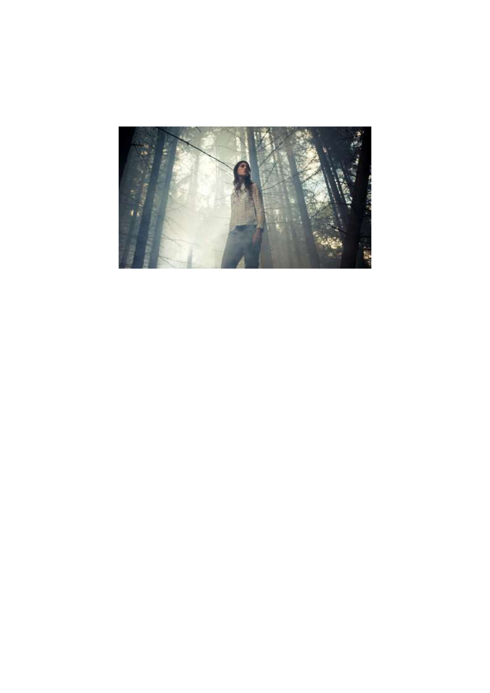
Lars von Trier, Antichrist.
In Antichrist, Nature is revealed as a ghastly
entity. Nature is neither benevolent nor evil, and
it reflects the attitude of the female character
towards it. She is afraid of the woods, and they
appear macabre to her – painted in cold blue
hues, covered with fog. Only when she feels the
call of nature and maternity, does the color
change from blue to a warmer green.
The landscape and the forest begin
communicating with the female as the scene
grows dark. The woman’s husband deals with
Nature the same way he deals with his wife –
without understanding it. In the end, while the
woman accepts nature and relinquishes her fear,
she returns to the human society, and dead
bodies of mourners rise from the fog as if to wish
her farewell. The scenes in this movie reveal the
femininity of Nature both figuratively and
conceptually, in opposition to the logical and
inflexible mind of the Man.
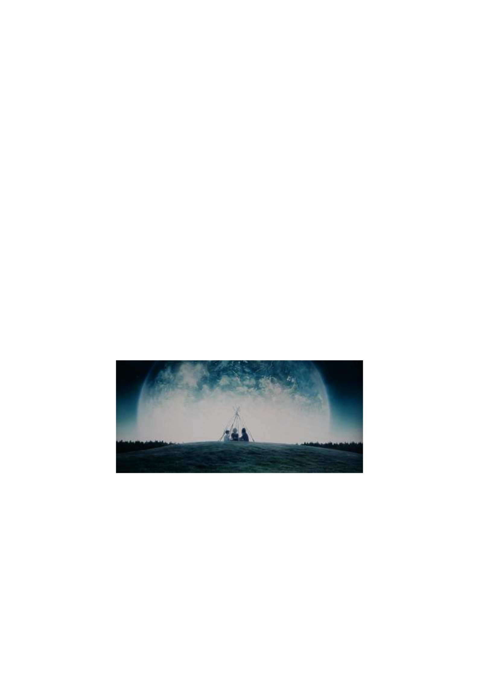
Lars von Trier, Melancholia.
In Melancholia, one of the female characters
also hears the call of Nature, but unlike in the
other two films, she does not push Her away,

instead of agreeing with the message and
becoming in tune with it. This paves her way to
personal liberation from male domination.
Nature is portrayed differently in Melancholia,
in comparison to Antichrist – it is groomed and
shows signs of human order and tampering,
which saps the life away from it.
Despite being seemingly under control, Nature
remains a separate entity, and forms a bond with
Justine, in contrast to the orderly and
conventional Claire. As the prospect of
imminent death from the clash between planets
looms over them, both sisters join each other in
accepting Nature, and blend into the landscape,
finding harmony with the surroundings.
As we could see, the female characters find true
peace only when they hear and accept the
Nature’s call, the call of their femininity, rather
than conforming to the standards of the orderly

and foreign male society. Yet it is not the purpose
of Nature to make them accept it – she simply
offers a hand, and it is up to the characters to take
it.
Nature in Fiona Hall’s Art
Fiona Hall portrays nature through a prism of
modern human expansion and colonization. Her
works represent a blend of modern materials
such as plastic or soap and portrayals of animals
and plants. Frequently, the objects of her art are
showcased in museum-like stands. However,
these stands are also part of the composition,
representing the human’s need to study and
classify nature, after having reaped it. These
tendencies could be found in three of her
compositions, called Leaf Litter, Cash Crop, and
Dead in the Water.

Fiona Hall, Leaf Litter.
Leaf Litter is a series of paintings made in
gouache. Each painting consists of a highly
photographic drawing of various botanical
cultures over the currencies of different nations.
These illustrations make the viewer think about
the correlation between money and nature, as
many of our economies are dependent on
exploiting nature to survive. In Leaf Litter,
nature is looked upon as a resource in many
ways. It is dead, dried up, and used not only to
earn money but also to produce it, as the paper
for the bills also comes from natural sources.

Fiona Hall, Cash Crop.
Cash Crop continues the idea of utilitarianism of
humanity towards nature. It represents a
botanical stand, where various crops are
displayed and classified according to their
names and purpose. When looking at the stand
full of dead crops made out of soap, one tends to
wonder whether human cultivation and desire
for knowledge help us understand nature, or kills
it. The composition invokes uneasy feelings
since the viewers are more used to depictions of
living nature. In Cash Crop, nature is dead,
dissected, and classified.
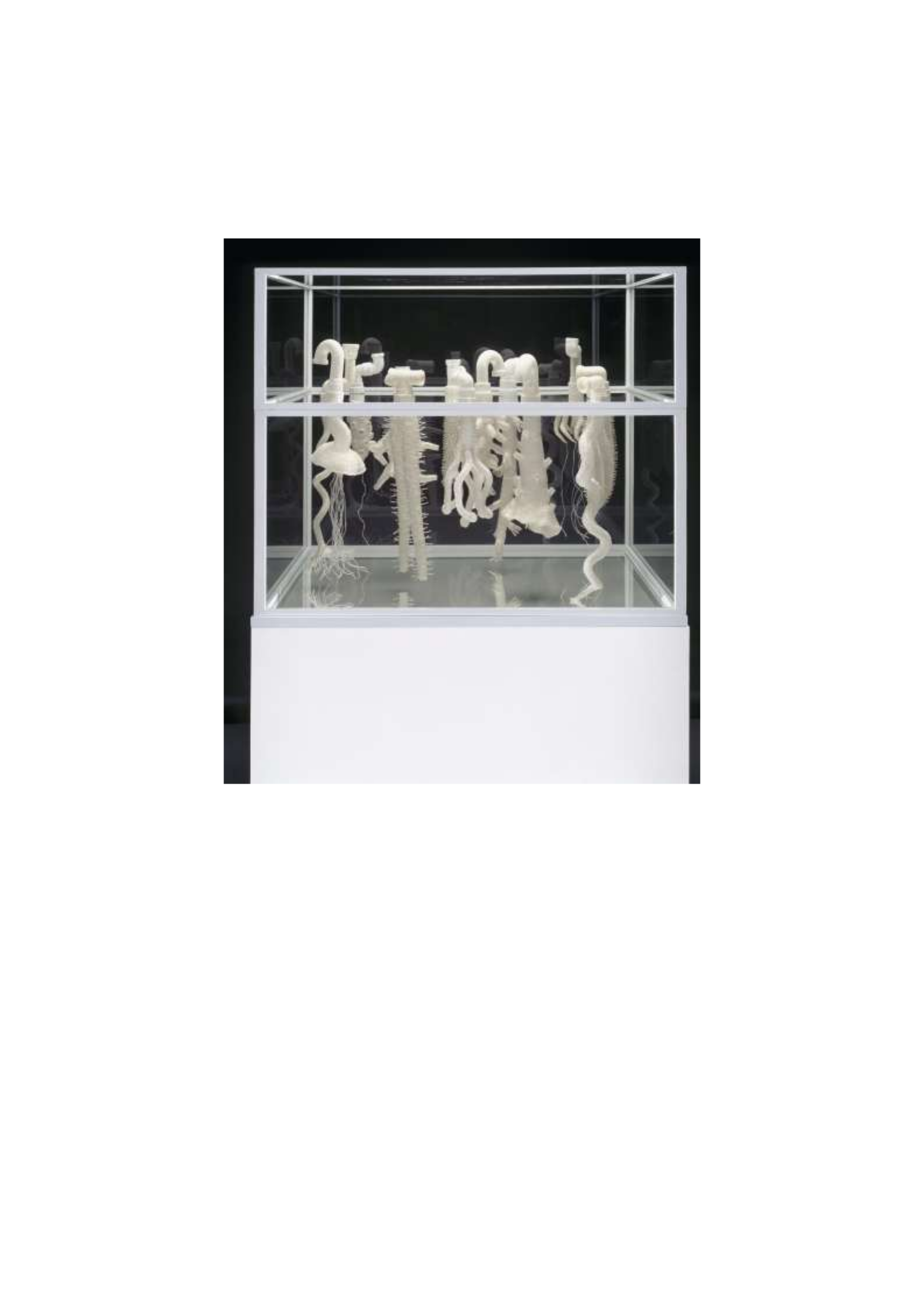
Fiona Hall, Dead in the Water.
Dead in the Water shares this line of thought,
though it takes a different turn in regards to the
portrayal of nature. While nature is dead in
previous works, in here, it is alive. The material
used for the creation of the display is PVC,

which is artificial. Yet, through skillful
manipulation, it is made to look alive, almost
ethereal, as the pipes turn into roots of numerous
plants. The stand plays a role similar to that in
Cash Crop. However, the composition itself
represents a struggle between humanity and
nature, good versus evil, and old versus new.
The fact the plants are growing out of PVC pipes
shows that nature always finds a way.
In all of her works, Fiona Hall sends a strong
message to the viewers. The the message is not
obvious, as it requires those who look upon her
art to think and analyze the pieces and the
thoughts behind them. However, the feelings of
that something is wrong invoked throughout the
three compositions reviewed in this paper,
certainly indicate that the artist does not approve
of how humanity treats nature. Thus, her art

contains a strong political and environmental
message.

Conclusions
Fiona Hall and Lars von Trier have different
views on nature and how it is portrayed. In
Trier’s films, Nature is a living entity,
mysterious and vibrant. In Hall’s sculptures, it is
depicted as a dead and dried-up shell of its past
self. However, there are similarities between
them as well.
For both of them, Nature is feminine and in
opposition to the logical and oppressive male
order. Their art invokes contemplation and
thought, as the images, they present to the
audience are complex in many different ways.
The environmental message is stronger in Hall’s
works, while Lars von Trier’s films are more
dedicated to the struggles of the feminine in a
masculine society.

Bibliography
Antichrist. Digital Image. Filmlinc. Web.
Arias-Maldonado, Manuel. Environment and
Society: Socionatural Relations in
the Anthropocene. New York: Springer, 2015.
“Cash Crop.” Art Gallery NSW. Web.
“Works by Fiona Hall.” Art Gallery NSW. Web.
“Nature, a Character in Lars von Trier’s
Works.” Cinema Scandinavia. Web.
Dogville. Digital Image. Alchetron. Web.
Ginn, Franklin, and David Demeritt. Nature: A
Contested Concept. London: Sage, 2009.
Grosz, Elizabeth. Becoming Undone:
Darwinian Reflections on Life, Politics and Art.
London: Duke University Press, 2011.
Hall, Fiona. 1999. Cash Crop. Sculpture.
Sydney: Roslin Oxley Gallery.

Hall, Fiona. 1999. Dead in the Water. Sculpture.
Melbourne: National Gallery of Victoria.
Hall, Fiona. 2000. Leaf Litter. Sculpture.
Canberra: National Gallery of Australia.
“Fiona Hall: Sydney Ambush.” Mahon Studio.
Web.
Melancholia. Digital Image. The Wit
Continuum. Web.
“Leaf Litter.” National Gallery of Australia.
Web.
Nicole Kidman. “Other Films by Lars von
Trier.” Nicole Kidman. Web.
“Case Study One – Nature.” Year 11 Visual
Arts. Web.
Zolkos, Magdalena. “Violent Affects: Nature
and the Feminine in Lars Von Trier’s
Antichrist.” Parrhesia 13 (2011): 177-89.

The Influence of Conceptual Image on
Modern Art and Design
Introduction
With the onset of print and digital sources of
information, all knowledge has become
available to people, which opened a vast field of
topics to draw inspiration from for artists and
designers from around the world. The traditions
of advertising have also changed with time. The
need for catchy images as a technique to
maximize sales has always persisted. At the
same time, the images created with the utmost
imagination developed into a form of art (Meggs
and Purvis 77). Conceptual image facilitated this
transition becoming one of the most influential
movements that left an imprint on both modern
art and design.

History, Development, and Meaning of
Conceptual Image
The history of the conceptual image as an
approach to graphic design unraveled with the
decline of the previously widely used technique
– narrative illustration. The image that tells a
story was one of the popular and effective ways
to convey an idea. It often depends on the
context that the person has to have to understand
it. For example, the works of Henry Darger, who
often depicted scenes with an abundance of
people in the middle of an action, relied heavily
on the understanding of a historical, social, or
another context (Davis 2). The problem with the
narrative illustration was that it was often
centered on objects of the real world (Male 180).
With the advancements in photography, print,
and paper quality in the 1950s, this problem
became even more evident, which marked a

certain decline of the narrative approach to
design as a form of visual art and advertising.
Photography made depictions of the world as
realistic as possible, which developed a slight
resentment towards such realism in certain
circles of designers (Lester xii). That partly gave
rise to the fascination with conceptual images
that not only crossed the border of reality but
also united the communicative power of words
and pictures.
In a sense, conceptual images draw inspiration
not directly from the real world but its
perception, forms, and color. That is what
designers and artists discovered in such an
approach – a new way to catch people’s eyes and
provoke them to feel, contemplate, and
juxtapose. Putting concepts inside a picture that
is seemingly non-telling and makes no sense at
first glance becomes a new way of expression

that kept the viewer attracted and entertained.
The image telling a story that, once understood,
partly strips the picture from its purpose and
leaves only the aesthetical pleasure to gain from
it. On the other hand, the conceptual approach
offers a lot more space for imagination and
creativity.
If a practical application is concerned, an image
is a way of communication, and a designer often
plays the role of the mediator between the public
and the seller of a product the image is set to
advertise (Lupton and Phillips 9). In a situation
when a potential buyer is not familiar with the
product, there is a need for something that can
initiate a process of communication, something
that can catch an eye to build interest in the
contact. The conceptual image became one of
the best design methods to establish such a
connection. Initiation of a communication

process in a world with a dense flow of
information requires originality, which the
conceptual approach abundantly provides if the
designer is talented enough. Color, shape, tone,
type, text – all of these instruments form the
toolbox of a modern graphic designer.
The Influence of Conceptual Image on
Modern Art
There is a seeming contradiction between art and
design that lies in the intention. Art is generally
created by the will of either heart or mind that is
full of passion and deep thought. Design is
roughly a way to present a product, which
implies the facilitation of a process of trade.
What unites them is communication. Both an
artist and designer want to reach the target
audience with their thoughts by means of visual
images. The conceptual image is a new, deeper
way of communication that brings a consumer to

a new level of perception making them think and
contemplate. A good designer educates the
public, brings it closer to the world of pure art,
and establishes the connection between the
societies of consumers and artists.
In the modern world, there is a constant process
of interpretation and reinterpretation of
literature, history, science, and, of course, art.
There seems to be no answer to what came first:
the work of an artist or the work of a designer.
In the end, many of the famous figures in
graphic design studied and practiced art in
schools, colleges, and universities. The
emergence of good design works contributed to
the erasing of the lines that divided art and
design. Provided the visual piece of the
advertisement campaign is successful and well
known it can be considered a contribution to
visual art. For example, the symbol “I love NY”

designed by Milton Glaser has become an
official logo of a city and launched a wave of
similar projects that build identities of numerous
cities. It became so influential around the world
that it was given a place in the Museum of
Modern Art in New York (Sooke para. 3). Thus,
the transition from design to art and back is quite
unstable and depends on the success and
popularity of the work. In the modern world,
perhaps, everything that has a concept lying at
the base of it can be considered modern art.

The Influence of Conceptual Image on
Modern Design
The onset of the conceptual image as a new trend
in graphic design if not revolutionized then
certainly changed the perception of commercial
design significantly. One of the trends graphic
designers marked was the use of text as an active
element of an image (Meggs and Purvis 466). In
the works of conceptual designers like Arnold
Varga, words, phrases or letters orchestrated the
whole composition, drawing attention and
setting the mood. The text ceased to be merely a
tool of language but acquired conceptual
meaning through rethinking the form of letters,
unusual placement, color or texture. Conceptual
image, as it was stated above, in its own way
built a smarter and more sensitive consumer
nurturing their taste for creative advertising and
developing a good sense of style.

In the same way, it has also influenced the
graphic designers themselves raising the
standards of quality and inspiring healthy
competition in creativeness. The implicit
meaning of the whole image started to play a
larger role in graphic design as an advertising
technique. Since the middle ages, many
commercial posters used objects and words
directly related to the subject of advertisement
(Meggs and Purvis 151). The conceptual image
brought more experiment and creativity. The
emergence of a vast variety of music bands and
private TV channels in the 60s, 70s, and 80s
showed the true power of imagination that was
set free with the help of the conceptual image.
Famous Contributors to the Movement
One of the most notable characters who pushed
forward the popularity of conceptual images in
graphic design was Arnold Varga. In the late

1950s achieved the award “Art Director of the
Year.” The latter once more proves the strong
ties between good graphic design and art. He
believed that honesty and informativeness are
the top priority as long as the visual
attractiveness stays intact (“Arnold Varga”). He
did not think of an advertisement as something
that would necessarily make the customer buy
the product but as a piece of art that possessed
enough information about the item and was
creative and attractive.
Another famous contributor to the movement
was Seymour Chwast, one of the inventors of
Push Pin Graphic. His broad scope of works that
included child book illustration, folk art, and
comic books made his creations communicate
ideas in a non-sophisticated manner. Even the
gravest and most serious subjects he managed to
depict simply and effectively. His unique style

incorporated Victorian-style letters, play with
figures, and the complete flatness of the image.
Due to his efforts, many people took a different
look at common items that surrounded them.
Milton Glaser is also one of the greatest
conceptual designers of his time. The world-
famous logo of the New York City, School of
Visual Arts, Brooklyn Brewery, Bob Dylan
album cover, and other famous works were
iconized and even now recognized as examples
of exceptional design. Many of his works are
stored in art museums around the US and the
world. Glaser showed the world the implicit
power of graphic design stating that the meaning
can be put in many different forms and nothing
stops one from experimenting.

Conclusion
All things considered, the contribution of the
conceptual image movement to modern graphic
design and art is immeasurable. Varga, Chwast,
Glaser, and others showed that good
advertisement and art are strongly connected,
and the result of this connection creates a visual
culture that shapes minds and develops a taste
for beauty. Conceptual image invited people to
think rather than to observe, look deeper to grasp
the meaning of things.

Works Cited
“Arnold Varga.” History of Graphic
Design, n.d. Web.
Davis, Ben.The Insider’s Outsider. 2008. Web.
Lester, Paul Martin. Visual Communication:
Images with Messages. Cengage Learning,
2013.
Lupton, Ellen, and Jennifer Cole
Phillips. Graphic Design: The New Basics:
Revised and Expanded. Chronicle Books, 2015.
Male, Alan. Illustration: A Theoretical and
Contextual Perspective. Bloomsbury
Publishing, 2017.
Meggs, Philip B., and Alston W. Purvis. Meggs’
History of Graphic Design. John Wiley & Sons,
2016.

Sooke, Alastair. “Milton Glaser: His Heart was
in the Right Place.” Telegraph, 2011. Web.

Pregnant Female Body in Renaissance and
Modern Art
The Renaissance Period was a time of
rediscovery of classical art and ideals of Ancient
Greece and Rome. The focus turned to the
individual, as opposed to the overall anonymity
typical of the Middle Ages. The importance of
nature and physical world combined with the
rekindled interest in the individual paved the
way for the birth of humanism. Pregnant women
were seen as a symbol of natural processes of
creation and destruction, of endless life cycles,
worthy of admiration. When comparing the
Renaissance attitude with the modern viewpoint,
it is clear that the differences are significant.

Renaissance Attitude to the Pregnant Female
Body
The Mona Lisa, painted by Leonardo Da Vinci,
has become a female archetype over the years.
Garrard and Broude elaborate on this
phenomenon by providing several
interpretations offered by art critics, art
historians, as well as other experts (67). The
author refers to the interpretation by Kenneth
Clarke, wherein he links the female figure of
Mona Lisa to the landscape in the background
(Garrard and Broude 67). Combined with the
paysage behind her, Gioconda becomes a
symbolic reference to the natural processes of
life. According to this interpretation, the female
image is intertwined with the powers of nature,
pertaining to the creative and destructive
processes. Garrard and Broude also refer to the
opinion aired by Kenneth D. Keele, who saw

several signs of an advanced stage of pregnancy
in Leonardo’s Gioconda (68). Thus, he
considered Mona Lisa to be a symbol of the
origin of life, and the female image as a
symbolic source of natural powers of creation
and destruction.
The Arnolfini Portrait by Jan van Eyck, the
Flemish artist, is an allegorical piece, depicting
a wealthy couple in a home setting. Although the
pregnancy of the female figure in this painting is
widely disputed, there are various symbolic
references to the ideas of childbirth and fertility
in the background. The image of St. Margaret,
the saint of childbirth, over the marriage bed,
symbolizes the idea of fertility and a healthy
family (“The Arnolfini Portrait by Jan van
Eyck” par. 7).
Even though the woman’s protruding abdomen
is often attributed to the fashion at the time, the

symbolic dimension of the van Eyck’s piece
hints at the idea of pregnancy and childbirth.
According to Soraya, even if the woman was not
actually pregnant, the idea was crucial for the
Renaissance artists to convey (par. 7). Therefore,
it means that the aspect of fertility was of utmost
importance in the Renaissance period, and the
image of a pregnant female body was essential,
as it was employed to illustrate the nature of
humanity.
Raphael’s La Donna Gravida depicts a pregnant
woman, touching the protruding abdomen with
her hand as if drawing our attention to her
condition. The red and black colors of her
clothing indicate that she is of noble descent.
Raphael’s image of a female pregnant body
seems to aim at combining the idea of fertility
and nobility. The look on the woman’s face is
calm, peaceful, and rather serene. The image

depicted by Raphael seems harmonious and
natural, full of serenity and tranquility.
These interpretations of the Mona Lisa,
the Arnolfini Portrait, and La Donna
Gravida provide invaluable insights into our
understanding of the Renaissance attitude
towards an image of female pregnant body. A
pregnant woman for the Renaissance artists was
a symbol of natural processes, an essential part
of human condition, and a link to the powers of
creation and destruction. A female pregnant
body is often depicted with peaceful,
distinguished features, indicating the admiration
artists felt for the female fertility.

Comparison with the Modern Perception
Compared to the Renaissance depiction of the
female pregnant body, modern images are rather
different. Due to the fashion trends and the
expectations of society, women are put under a
great deal of pressure regarding their body.
While the Renaissance paintings show that a
pregnant woman is admired and cherished,
modern media and fashion feed the society the
image of an ideal woman, which is far from the
notion of fertility. Nowadays, pregnancy is a
concern for women, as due to this change, their
body might never look the same, and, more
importantly, might not adhere to the modern
beauty standards determined by media and high
fashion.
Compared to the Renaissance attitude towards
pregnancy, where a pregnant woman is seen as
an astonishing phenomenon, symbolizing the

origin of life, and worthy of admiration, modern
image of a pregnant woman seems rather
mundane, or even unappealing. The symbol of
life has disappeared from this image, making
way for the idea of eternal youth and beauty
valued above everything else. Thus, a
conclusion may be drawn: perhaps the principal
difference between the Renaissance attitude
towards pregnancy and its modern analogy lies
in the temporal aspect. Renaissance artists
depicted pregnant woman with admiration, as
this condition symbolized the idea of ever
changing nature of things, of endless cycles of
natural processes, and the immense powers of
nature. Nowadays, however, pregnancy is seen
as an inconvenience. Youth and eternal beauty,
unhindered by ageing and other natural life
processes are top priorities. The notion of
pregnancy cannot be held in high regard in such

a context, as it is symbolic of change, which is
not appreciated in the modern society.

Conclusion
Throughout the ages, the image of a female
pregnant body has changed a great deal. Female
fertility, seen in Renaissance as the origin of life,
the symbol of incredible powers of nature,
transformed into an inconvenience, hindering
the lives of women in modern society. The
cycles of natural phenomena, an endless process
of change, including ageing, were the sources of
inspiration. However, modern attitude towards
pregnancy differs from the Renaissance
perception. The admiration of the process of
change gave way to the ongoing efforts to halt
the ageing process and remain young and
unchanging throughout our increasingly long
lives.

Works Cited
Da Vinci, Leonardo. The Mona Lisa. 1503-
1506, oil on wood panel, Louvre Museum, Paris.
Garrard, Mary D., and Norma Broude. The
Expanding Discours: Feminism and Art History.
New York: HarperCollins Publishing, 1992.
Print.
Raphael. La Donna Gravida. 1505-1506, oil on
panel, Palazzo Pitti, Florence.
Soraya, Jane Kashfi. Six Steps to Decoding The
Arnolfini Portrait. 2016. Web.
The Arnolfini Portrait by Jan van
Eyck. Interpretation of Flemish Oil Painting:
The Arnolfini Marriage Web.

Modern Art: Condensation Cube by Hans
Haacke
There is no use denying the fact that art has
always been an integral part of human society. It
has always helped people to reflect their feelings
and emotions or show issues that are topical at
the given stage of the development of society.
That is why, every age has certain artworks that
could characterize it. The modern age could be
characterized by the development of science and
technologies which introduce a great number of
possibilities to researchers and artists who want
to embody the peculiarities of the epoch and
show people their feelings connected with a
certain process, discovery or nature
phenomenon. It resulted in the appearance of a
certain sphere of art closely connected with
science and the newest technologies.

In Condensation Cube, a work of 1963-65, by
Hans Haacke, the field of biology and ecology is
touched. The artist presents “a hermetically
sealed, clear acrylic plexiglass box, thirty
centimeters on the side that holds about one
centimeter or so of water” (Jarzombek 1). The
condensation appears against the inner surface
of the given box and changes its look. Thus,
obviously being the bright example of the
modern art, Condensation Cube helps to author
to introduce several questions which are
interesting to him and raise the question of the
relations between art and science and the way in
which one can help another to develop and be
more understandable for people who wants to
reconsider their vision of the nature and science.
Speaking about the given artwork, it is necessary
to mention its author, Hans Haacke and his ideas
about the development of art and its connection

with other sciences. Being a famous German
artist, he devotes a great number of his works to
the theme of relations between art and science.
The given sphere is very interesting for the artist
as it helps him to demonstrate the nature of some
inner processes and reconsider the vision of our
world (Vincent para. 7). Creating his artworks,
Haacke underlines their connection with various
sciences, such as biology, ecology etc
(Shapolsky et al para. 5). With this in mind, it is
possible to say that science is used as the
background for the development of the authors
idea.
Thus, there are several ideas peculiar to Haacke
and connected with the Condensation Cube.
First of all, it is the question of life and identity.
Being quite simple at the first gaze, the given
cube however, has a very powerful symbolic
meaning. Analyzing it in terms of biology, it is

possible to come to the conclusion that the artist
tries to show his impressions connected with
some nature phenomena. Thus, in Condensation
Cube Haacke “explored cycles of evaporation
and condensation in response to temperature and
barometric changes” (Wilson 132). Being one of
the most important processes of our planet, it
shows the way in which the life exists and
renews every time.
Thus, the usage of the concept of life is peculiar
to a great number of Haackes works. The fact is
that the great scientific progress introduces
many various visions of life and the way in
which it evolutes. Thus, Cube helps to present
another perspective on it. The processes of
evaporation and condensation are very
important for the existence of various life forms
and, that is why, the cycle comprised of these
two processes could be taken as the symbol of

the whole life which exist on our planet and its
cyclicism (Wilson 132). The given artwork also
presents the vision of the life through the prism
of scientific thought and development of various
theories.
Analyzing the Condensation Cube, it is also
possible to outline the fact that it could be taken
as an ideal example of the collaboration of art
and science. The author takes into account
various scientific theories that describe the
process of the creation of condensation. Thus, to
create the needed conditions, the scientific
approach should be used. That is why,
the Cube is placed in the water. Thus, some laws
of nature connected with condensation are also
taken into account while creating the conditions
need for evaporation and condensation.
However, at the same time being an artwork, the
given object helps the artist to show his feelings

and emotions connected with our world and
peculiarities of its existence. That is why it could
be taken as the bright example of the
cooperation of art and science.
One should also take into account the materials
used for the creation of the given artwork.
The Cube is made of plexiglass and is placed in
the water. The choice of the materials is no
accidental as they help to show the relations
between nature and science. Water is one of the
basic elements of our universe which promoted
the appearance of life. However, plexiglass is
the artificial material created due to the scientific
progress and development of human thought.
That is why, these materials create the
opposition which again demonstrates the
modern stage of relations between nature,
science and art and helps people to realize the

fact that they are interdependent and influence
each other.
Creating the given artwork, the artist also takes
into account the peculiarities of its exhibition.
The fact is that the Condensation Cube would
work only under special conditions needed for
the beginning of certain processes. Besides, “in
almost all art museums, the temperature is set at
a cool 65 degrees Fahrenheit, which means that
at a relative humidity of about 45 percent”
(Jarzombek 1). Plexiglass is a bad thermal
isolator, which means that the temperature is the
same as it the atmosphere and the conditions for
the evaporation and condensation are created.
With this in mind, it is possible to say that the
peculiarities of the exhibition have the great
impact on the whole artwork and influences the
viewers who look at it.

With this in mind, it is possible to say that the
choice of the given materials is quite relevant. It
has already been mentioned that it helps to
outline some peculiarities of the relations
between nature, science and art. However, it the
choice has also been made in accordance with
some important scientific processes that helped
the Condensation Cube to work and produce the
needed effect on people who want to see it. The
relevance of the given choice is also proved by
the fact that the cube looks modern which is one
of the main peculiarities of all art of our epoch.
The artist manages to create the best possible
choice.
It should also be said that the given artwork is of
great interest for people who want to enjoy the
Haackes works and personally for me. The fact
is that it demonstrates some very important
processes in the way which is very

understandable and clear. Looking at
the Condensation Cube one realizes the power
of nature, science and art and the way in which
they could be combined. It is one of the most
important aspects of the whole work. Even if a
person does not have the idea how these issues
could cooperate and interpenetrate, the given
artwork could help him/her to see some process
and reconsider the existing approach. Finally, it
could also be taken as the clearest and the most
understandable work of the given author as there
is no need in a certain background if a person
wants to understand it and get the idea of the
authors vision of the world.
With this in mind, it is possible to make a certain
conclusion. It should be said that the modern
world could be characterized by the blistering
development of various branches of science and
technologies. Being the soul and spirit of any

epoch, artists are not able to ignore these
processes and they create new artworks that
reflect relations between science and art,
showing people the possibility of their
collaboration and interchange.
Haackes Condensation Cube is one of these
works. It shows the way in which some very
important natural process happen and how laws
of nature and science could be united in a single
artwork That is why, it is possible to say that
Haacke manages to create the masterpiece
which touches such questions as life and
identity, art and science. Cube helps people to
believe in the integration of these two issues,
their common character and great perspectives
awaiting them.


Postmodern Art: Jay-Z’s “Picasso Baby”
Performance
The performance between Jay-Z and Marina
Abramović, Picasso Baby, can be seen as an
illustration of an important aspect of postmodern
art that is closely linked to the purpose and the
meaning of the art as seen by modern artists,
including the ones mentioned above, as well as
the larger public. At the beginning of the video,
Jay-Z stresses that he always tries to bridge any
gap that might exist between the artist and the
viewer during his concerts and performances,
which is an idea shared by many postmodern
artists who seek mutual ground and meanings
with the audience. Postmodern or contemporary
art is not confined to the focus on the form or
meaning solely but has a broader outlook as
artists want to convey the meanings they find
important for modern society by using the

symbols and language that will be understood by
the target audience, speaking to people’s hearts.
Moreover, with the help of his works, Jay-Z, as
well as many if not all postmodern artists, wants
to create a platform where the voices of the
audience will be heard and exchanged so that
this interaction made people closer and more
cooperative, open, and ready to compromise. In
the video, it is clearly visible that the artist
working on or presenting his work of art
addresses the viewer who co-creates the artwork
by adding their meanings and life stories to the
piece. These stories become the patterns on the
canvas created by the artist and the audience
who listen to each other and try to fix the world
that seems to have lost something very
important, such as love, wisdom, forgiveness,
empathy, and hope.

Museum of Modern Art: Reflection
One of the favorite artworks observed at the
Museum of Modern Art (MoMA) is Vincent van
Gogh’s, The Starry Night painting. The painting
portrays nature in a unique manner. It is an oil
on canvas painting that projects a star-filled
night sky with a moon. Van Gogh’s artistic
inclinations depict the objects in the painting are
swirling or in turbulent waves. Moreover, the
artist chose to use concentric circles and lines
painted with yellow and white colors as well as
green colors scattered throughout to illuminate
the night sky (MoMA). Also, the painting’s key
feature is the presence of the impasto texture,
which is created using a loaded brush. The
village and the Bell Tower appear to be in
harmony with the night sky as they are painted
using the same tone as the sky. The Cypress tree
is also a significant element in the painting as

van Gogh projects it as a rising flame from the
ground to the night sky. Such elements in the
painting create an emotional and mental
awakening in the audience.
While MoMA features many artists from the
past and modern times, a few of them stand out.
Berenice Abbott is one of my favorite artists, as
she is renowned for her extensive work on built
landscape photography. In particular, she
popularized architecture and urban design
photography with her popular New York City
photographs of the 1930s. Besides Berenice
Abbott, Vito Acconci also stands out as a great
artist. Acconci was popular with landscape
architectural photography (MoMA). However,
unlike many other featured artists on MoMA,
Acconci was an all-around creator as he had
other interests in poetry, and video and dance
performance. Given their similarity in

architectural photography, Acconci and Abbott
are my favorite featured artists on MoMA.
Fredric Bruly Bouabre is another favorite artist
found on the website. Bouabre focused on
transmitting knowledge about what is known in
the universe in his paintings. He majorly
codified this knowledge from different sources,
usually spiritual belief systems, folklore,
popular culture and philosophy (MoMA). His
works were simple, consisting of colored
pencils, ballpoint pens and pencils as well
rectangular cardboard. Majorly, he focused on
drawing everyday items and scenes he labeled as
the Alphabet Bete. He created his unique way of
painting, providing a new perspective on the
idea of art. His works projected that paintings do
not have to be done on canvas using
paintbrushes. Rather than that, he chose to use
simple instruments to become an artist.

Visiting MoMA also expanded my horizons and
perspective on how art is viewed. In most cases,
art can be taken at face value where a person is
only interested in the authenticity of the art and
its aesthetic elements. However, MoMA was an
eye-opener to other horizons as I was able to
place myself in the shoes of the artists and
imagine what they intended to portray to the
audience. For instance, MoMA features Claude
Monet’s works and demonstrates how she was
intent on not only giving the audience aesthetic
paintwork but also effectively capturing the
impressions in a given scene. As a result, one is
able to see and observe the paintwork
superficially and explore it through the eyes of
the artists and what they felt at the time of its
making. Therefore, by studying artwork more
keenly, a unique story behind its development is
revealed.

While visiting the website, the most unexpected
thing was that there were audio and video
attached to different paintworks. For instance,
on the website, one could always go on a tour
and search for any artists they would prefer to
look up their words. As long as that artist is
featured by MoMA, their works will be attached
and a brief description of the artists and their
style is described to enable those who visit the
website to have a clear picture of what kind of
work the artists did. While that is expected, the
website has gone the extra mile of attaching
audio videos from the internet about the artists
and their work. Such videos and audios are not
limited to the artist themselves, but to other
people giving their opinion on them. Such an
unexpected feature was pleasantly surprising as
one could learn as much from a website visit as
one could learn from a physical museum tour.

The exploration of the MoMA website allows
one to experience a great deal of insight
concerning art. The website provides
information on various forms of art, such as
architectural art and photography. It illuminates
on both modern and historical artists’ works
enabling one to have all the research data they
need on the website. Learning that a comic book
such as Ellen Lindner’s Teen Art Adventures is
also part of art was an eye-opener. In essence,
the MoMa allows one to see art not just from one
angle – that of canvas paintings and sculptures
alone – but perceive it with an open mind.

“Salt Shaker” by Stuart Davis and Modern
Art
When one thinks of art, various concepts may
come to mind ranging from the Black Square by
Malevich to Ginevra by Leonardo De Vinci, and
few would dare to portray and present banal
objects as pieces of art. Stuart Davis, a bold
representative of modern art, has proved that
objects ordinary as a saltshaker, Odol, or a
mellow pad may be viewed as items pertaining
to modern art and furthermore be exhibited in
museums.
Although Davis was associated with abstract
concepts, he insisted on being considered a
realist (Stokes 13). When Davis talked of his
paintings he said that he was an American to the
bone, he studied in America, and he painted
what he saw in America’s daily life (Doss 116).
His words truly relate to the quality of his

paintings which are widely different from those
found in Europe. An art lover might wonder
what moved Stuart Davis to portray daily life as
it is. Travis said that he was moved by
skyscrapers, storefronts, trains, cars, planes and
taxi cabs, and even electric signs (Jopp par.3).
When Davis felt there was more to learn, he
traveled to Paris where he familiarized himself
with European Art and incorporated some of its
elements into his painting (“Stuart Davis” par 4).
The Salt Shaker displayed in the Museum of
Modern Arts in New York presents interest for
art lovers. It is an oil-on-canvas painting,
credited as the Gift of Mrs. Edith Gregor
Halpert. Painting dimensions are impressive for
a Salts Shaker, 49 by 32 inches allowing even
for tiny details to be seen. The Salt Shaker is
seen differently by people and if one is not told
that he is actually looking at a Salt Shaker, he

might regard it differently. For some, the frothy,
white background and black dots on it, the
colored vessel may give the viewer an
impression of a cup of coffee from your local
coffee shop.
Upon closer examination, an observant viewer
may notice that the dots, in fact, represent tiny
holes for sifting salt. Another thing that
complicates the viewer’s perception lies in the
colors of the Salt Shaker. Most Salt Shakers are
made from glass, metal, or wood, although
Davis himself noted that the one he had painted
bears an exact resemblance to the Salt Shaker
from a café in Paris (Strokes 213). The
bifurcated yellow-and-white sphere above the
Salt Shaker is most probably ahead of a lid. It
also has two holes, black on yellow and white on
black semisphere, which serve for the passage of
salt.

The Salt Shaker itself is contained in a second,
bigger vessel. This form might be a container for
pepper. Standing closer to the picture, the viewer
will definitely notice the strokes of paint, which
might be lost in reproduction. The big letter ‘S’
across the Salt Shaker perhaps represents the
world ‘salt’. The painting has three horizontal
red strokes of paint of various lengths and a red
dot above them. It is hard to decipher and guess
what was on the artist’s mind when he added
them to the painting. There are two black arrows
at the bottom of the shaker, one pointing up and
the other pointing to the white corner. They may
imply the directions the meaning of which only
the painter himself might have explained. In the
painting’s left bottom corner, the artist left his
signature, Stuart Davis.
The Salt Shaker is a prominent example of how
most ordinary and banal items may be turned

into major art pieces. Not only is the artist
popular in the US, his homeland, but also in
Paris where his exhibitions are regularly
organized, with the latest one featuring Davis’
works in 2014 (“Two Americans in Paris: Stuart
Davis and Grant Wood” par. 2). Davis is also
popular among contemporary Americans and
many of them run blogs featuring the artist’s
works and contributions (Saith par.1).

Ron Meuck’s Postmodern Artworks
Introduction
Postmodern art is characterized by a strong
admission of the realities of life, including the
ugly parts, at the same time that it acknowledges
a degree of make-believe as each symbol or
image is recognized to hold different meanings
for different people based upon their individual
worldview. Artists working in this environment
have often turned to highlighting the ugly as a
means of revealing the sublime. One artist that
does this is Ron Mueck, who focuses on the
hyper-real to force reconsideration of everyday
images.
Main body
Mueck entered the world of high art through
television and film production. He was born in
Melbourne, Australia in 1958 to toy-making

parents and grew up working with them on their
projects (LifeCastings, 2001). By the time he
reached adulthood, Mueck was working as a
modeler, designer and puppeteer on a children’s
television show (Resource Library, 2007).
Through this work, he was able to land a
position working as a puppeteer on the 1986 film
“Labyrinth.”
It was thanks to his success on this project that
Mueck was able to start his second career as a
freelance modeler. Most of his work in this field
was involved in creating models to be used in
advertisements (LifeCastings, 2001). This
finally gave him the opportunity to focus on
details like he dreamed of doing, but remained
unsatisfied because of the way his work was
being transmitted to the world.
He broke through into the world of fine art with
his innovative use of fiberglass as a means of

capturing more lifelike detail and managed to
catch the eye of Charles Saatchi with “Dead
Dad.” This piece was a lifelike sculpture at
2/3rds scale that represented Mueck’s naked
father lying dead on the floor. Saatchi, who is
well-known for his extensive support of the arts,
ordered several commissions and Mueck was
officially made a part of the fine art crowd as a
hyper-realist sculptor.
Mueck’s work is characterized by his deliberate
manipulation of scale as a means of inciting an
emotional reaction to everyday images, such as
what is seen in “Big Man” (Tangey, 2003). The
name says it all as the sculpture is the image of
a big man seated on the floor. Even seated,
though, the statue is approximately eight feet
tall. The man is naked and sits on the floor with
his knees drawn up in front of him. Although
many of Mueck’s statues seem particularly

focused on the ‘unpleasant’ aspects of human
bodies, such as body hair, pimples or moles, this
particular statue has a noticeable lack of body
hair.
Mueck explains this as being a serendipitous
aspect of the piece as it reflects the model who
arrived to sit for the piece. According to Mueck,
“The model was a ‘smoothie’ as they call them
in the live modeling trade. It was very creepy. I
had actually intended to put some hair on the
figure, but in the end, the creepiness suited the
size. I did think, however, that hairs on those big
arms would have been quite nice actually – big,
hairy gorilla arms” (Tangey, 2003).
The man leans heavily on his elbows which rest
in turn on his knees. He props his chin up on his
hand and stares angrily out toward anyone
arriving to gawk at him which can be unsettling
given the statue’s larger than normal size. Within

the piece, it is obvious that Mueck has perfected
the art of fiberglass and resin in the very lifelike
tone and color he achieves on the surface of his
creations to simulate real skin while his
completed projects highlight his masterful
choice of models in order to achieve the look
he’s seeking.
In addition to being a ‘smoothie’, the model
proved unable to maintain the original position
Mueck had in mind primarily because of the
extra weight he carries around his waist. In
changing the pose to accommodate the man’s
limitations, Mueck also incorporated these faults
within the sculpture, brilliantly duplicating the
soft fatty tissue losing elasticity due to age in
characteristic places such as under the arms,
near the man’s buttocks and around his ankles.
The strong realism gives the impression that the
“Big Man” is a faithful representation, but

Mueck reveals that he took some creative license
such as intentionally enlarging the feet to give
the man a more bullish attitude.
Overemphasis is also represented in Mueck’s
sculpture “Pregnant Woman.” In a similar way,
the idea of the pregnant woman as all powerful
is established in his sculpture “Pregnant
Woman.” “At first, it’s the sheer technical
brilliance of the figures that astounds. From the
stubble on the chin of the small Man in a Boat to
the mole on the neck of the 8 foot-tall Pregnant
Woman, the attention to detail is awe-inspiring”
(Carter, 2003).
The woman stands eight feet tall and stands with
her hands raised over her head making her seem
even taller. Her pose makes it clear that she is
not trying to hide her body or any part of her
condition as she stands completely nude and
completely unaware of being observed. From

the expression on her face, it seems as if the
room is too hot for her as she stands with her feet
apart, holds the loose hair up off her face and her
cheeks are flushed.
She looks like a busy mother taking a moment
to catch her breath. Her eyes fall down toward
the tight skin stretched around her very pregnant
belly as if she is calmly dreaming of what the
future might bring, but this stance also enables
her to look down on her visitors and places her
in a position of power. Because of her size and
her tired, expectant attitude, “Pregnant Woman”
becomes EveryMother, tired of keeping up with
her children, warm from the exertion and always
patiently loving.

Conclusion
In his artwork, Mueck demonstrates a
fascination with representing as much of the real
as possible while also utilizing the formal
properties of art to convey the sense of a lived
experience. Although he remains faithful to the
imperfections of his human forms, Mueck
purposely disfigures his models in order to
emphasize a particular emotional idea. Because
of the realistic qualities portrayed in his
sculptures, it is almost impossible for audiences
not to discover some form of relationship with
them, particularly as their unusual changes and
sizes force us to consider them in an entirely new
way.

Modern Art Works: Painting, Sculpture and
Vintage Illustration
Introduction
Each period in the history of art is characterized
by its specific features. The modern art
encompasses the period from the late XIX
century to the second half of the XX century.
The artists of that period worked in various
genres expressing their world perception and the
peculiarities of time. The painting, sculpture,
architecture, graphic arts, and many other types
and genres were represented in the modern art of
1905-1935. The modernists and impressionists
of that time were eager to express their
perception of reality in their works. They created
their own styles, which became the subject of
study of the art researchers.

The aim of this essay is to describe the
painting Joy of Life by Henri Matisse, the
sculpture The Kiss by Constantin Brancussi, and
to present the vintage print illustration of 1930s.
The Discussion
The first modern art work, which I am going to
discuss, is the painting Joy of Life by Henri
Matisse. It was created in 1906. The medium of
the artwork is oil on canvas (“Matisse’s Bonheur
de Vivre” n.pag.). The work perfectly reflects
the modern tendencies of that period. Lassaigne
and Stuart claim that “he never ceased probing
the mystery of the creative process and applied
an intelligence far above the average to
discovering the origins of his art” (15).
The painting Joy of Life depicts the bright sunny
day, the trees shining in the sun, and people
enjoying their life. This work by Henri Matisse

reflects the pleasures of life. We can see the
figures of people in the painting. All of them
enjoy the moments of life. Some dance, others
play the musical instruments or communicate.
We can also see the pair kissing on the grass.
The painting Joy of Life is the perfect example
of the surrealism in the visual arts. If you look at
the work, you will, undoubtedly, see that the
objects of nature and the images of people are
depicted in the unusual form. The artist tried to
deviate from the traditional art conceptions and
to express his own perception of reality
(“Matisse’s Bonheur de Vivre” n.pag.). The
work lacks the objective depiction of the
surrounding world. Rather, the feelings and
moods play the crucial role in the expression of
the reality.
The second work of art, which I want to discuss,
is the sculpture The Kiss by Constantin

Brancussi. The scholars state that the processes
of creation the sculpture and the painting are
substantially different as the former represents
the transition of the vision into the volume,
whereas the later is about reflection of the vision
in a number of the abstractive forms (Valentiner
5).
The sculpture The Kiss represents the single
block with the depicted traces of the human
bodies. It is the bright example of the
impressionism in sculpture. The medium of the
work is the limestone. We can see that the
sculpture represents the embracing and kissing
pair. Brancussi created the figures with the
minimum features. We can only notice the
hands, the hair, the eyes, and the lips.
Undoubtedly, the sculptor tried to uncover the
theme of love in his work. It is argued that “The
Kiss presents a symbolic rendering of a male and

a female body merging into one”(“Modern and
Contemporary Art” n.pag.).
The third art work, which I am going to present,
is the print illustration of 1930s. The art work
was included in the book of French stories for
children. The illustration represents the vintage
in art. The size of the work is 7″ x 8 1/2″. The
medium of the work is the pencil on paper.
Isabelle Lehuu stated that the art of print
illustration resulted from both volume and style
(Lehuu 3). There were different views regarding
the essence of print illustrations and their
purposes. Despite the criticism, the print
illustrating achieved its recognition as the
separate kind of art. “The art of book-
illustrating, which has its finest success in the
intelligent wedding of picture and text,
unfolding originality within limits set, is

practised, in these times, by a number of able
and discriminating artists” (Weitenkampf 216).
The 1930’s Vintage illustration depicts the pair
in the sunny summer day. The romantic couple
takes the central position in the illustration. The
gentleman gives a bouquet of flowers to the
young girl, who holds the lambs. The
background of the illustration shows the large
yew tree, the summer sky, and the river. We can
also notice the girl’s hat lying on the grass. The
artist created the illustration in the soft colors.

Conclusion
In order to sum up all above mentioned, it should
be said that the art of the period between 1905
and 1935 is characterized by the various genres
and styles. The modernism, impressionism,
expressionism, surrealism, and other art
movements represent this period in the art
history. The painting by Henri Matisse, the
sculpture by Constantin Brancussi as well as the
book print illustration of the 1930s have been
discussed in the essay.

Works Cited
Lassaigne, Jacques, and G. Stuart. Matisse:
Biographical and Critical Study, Geneve: Skira,
1959. Print.
Lehuu, Isabelle. Carnival on the Page: Popular
Print Media in Antebellum America, Chapel
Hill, NC: University of North Carolina Press,
2000. Print.
“Matisse’s Bonheur de
Vivre”. Smarthistory.khanacademy.org. n.d.
Web.
“Modern and Contemporary
Art”. Philamuseum.org. n.d. Web.
Valentiner, William R. Origins of Modern
Sculpture, New York: Wittenborn, 1946. Print.
Weitenkampf, Frank. American Graphic Art,
New York: The Macmillan Company, 1924.
Print.

