


EXCEL
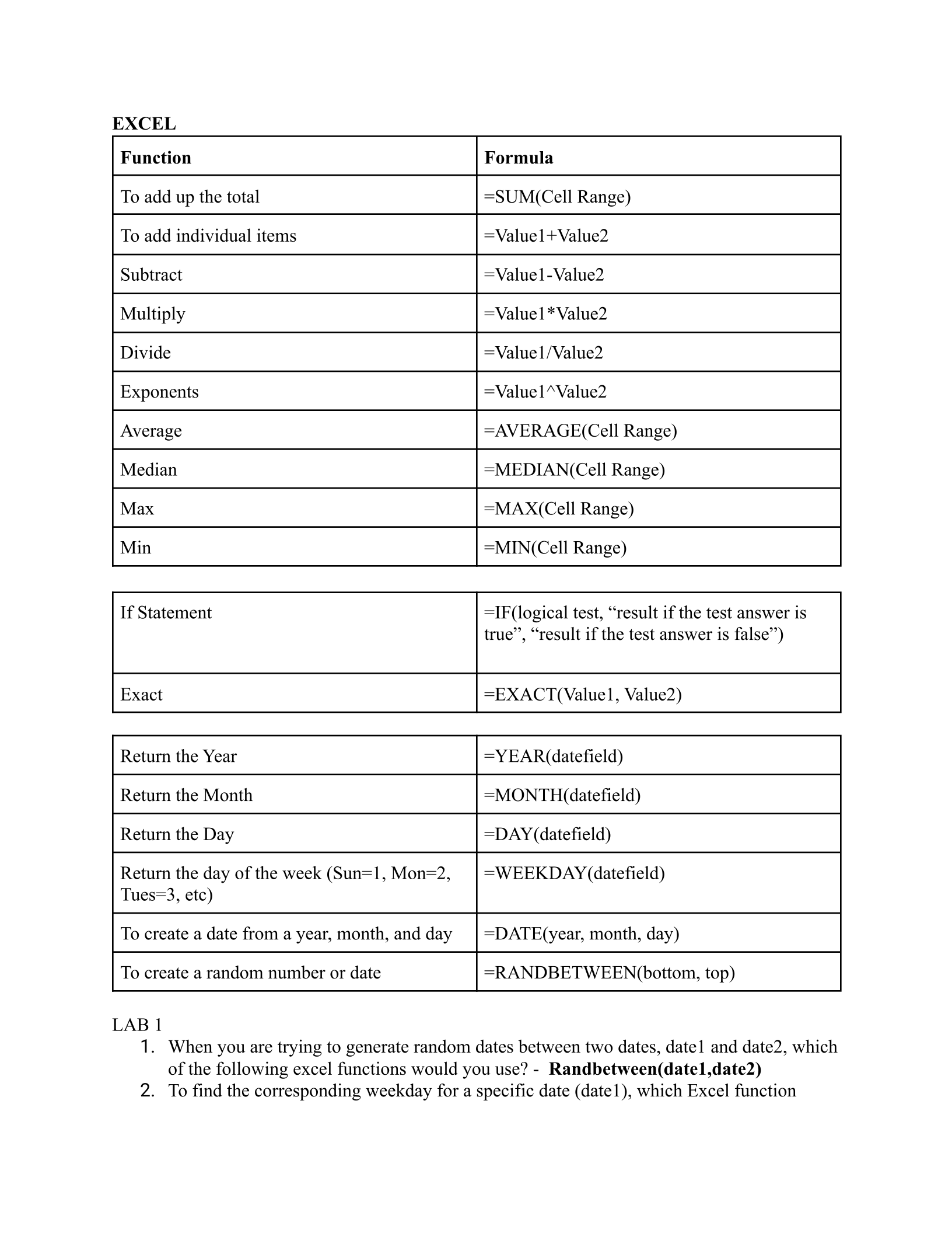
Function
Formula
To add up the total
=SUM(Cell Range)
To add individual items
=Value1+Value2
Subtract
=Value1-Value2
Multiply
=Value1*Value2
Divide
=Value1/Value2
Exponents
=Value1^Value2
Average
=AVERAGE(Cell Range)
Median
=MEDIAN(Cell Range)
Max
=MAX(Cell Range)
Min
=MIN(Cell Range)
If Statement
=IF(logical test, “result if the test answer is
true”, “result if the test answer is false”)
Exact
=EXACT(Value1, Value2)
Return the Year
=YEAR(datefield)
Return the Month
=MONTH(datefield)
Return the Day
=DAY(datefield)
Return the day of the week (Sun=1, Mon=2,
Tues=3, etc)
=WEEKDAY(datefield)
To create a date from a year, month, and day
=DATE(year, month, day)
To create a random number or date
=RANDBETWEEN(bottom, top)
LAB 1
1. When you are trying to generate random dates between two dates, date1 and date2, which
of the following excel functions would you use? - Randbetween(date1,date2)
2. To find the corresponding weekday for a specific date (date1), which Excel function
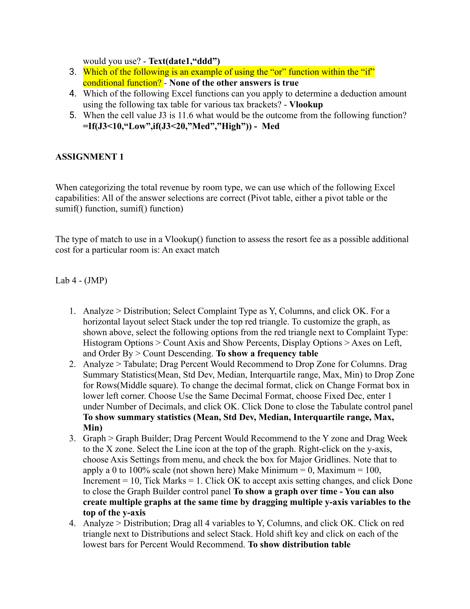
would you use? - Text(date1,“ddd”)
3. Which of the following is an example of using the “or” function within the “if”
conditional function? - None of the other answers is true
4. Which of the following Excel functions can you apply to determine a deduction amount
using the following tax table for various tax brackets? - Vlookup
5. When the cell value J3 is 11.6 what would be the outcome from the following function?
=If(J3<10,“Low”,if(J3<20,”Med”,”High”)) - Med
ASSIGNMENT 1
When categorizing the total revenue by room type, we can use which of the following Excel
capabilities: All of the answer selections are correct (Pivot table, either a pivot table or the
sumif() function, sumif() function)
The type of match to use in a Vlookup() function to assess the resort fee as a possible additional
cost for a particular room is: An exact match
Lab 4 - (JMP)
1. Analyze > Distribution; Select Complaint Type as Y, Columns, and click OK. For a
horizontal layout select Stack under the top red triangle. To customize the graph, as
shown above, select the following options from the red triangle next to Complaint Type:
Histogram Options > Count Axis and Show Percents, Display Options > Axes on Left,
and Order By > Count Descending. To show a frequency table
2. Analyze > Tabulate; Drag Percent Would Recommend to Drop Zone for Columns. Drag
Summary Statistics(Mean, Std Dev, Median, Interquartile range, Max, Min) to Drop Zone
for Rows(Middle square). To change the decimal format, click on Change Format box in
lower left corner. Choose Use the Same Decimal Format, choose Fixed Dec, enter 1
under Number of Decimals, and click OK. Click Done to close the Tabulate control panel
To show summary statistics (Mean, Std Dev, Median, Interquartile range, Max,
Min)
3. Graph > Graph Builder; Drag Percent Would Recommend to the Y zone and Drag Week
to the X zone. Select the Line icon at the top of the graph. Right-click on the y-axis,
choose Axis Settings from menu, and check the box for Major Gridlines. Note that to
apply a 0 to 100% scale (not shown here) Make Minimum = 0, Maximum = 100,
Increment = 10, Tick Marks = 1. Click OK to accept axis setting changes, and click Done
to close the Graph Builder control panel To show a graph over time - You can also
create multiple graphs at the same time by dragging multiple y-axis variables to the
top of the y-axis
4. Analyze > Distribution; Drag all 4 variables to Y, Columns, and click OK. Click on red
triangle next to Distributions and select Stack. Hold shift key and click on each of the
lowest bars for Percent Would Recommend. To show distribution table
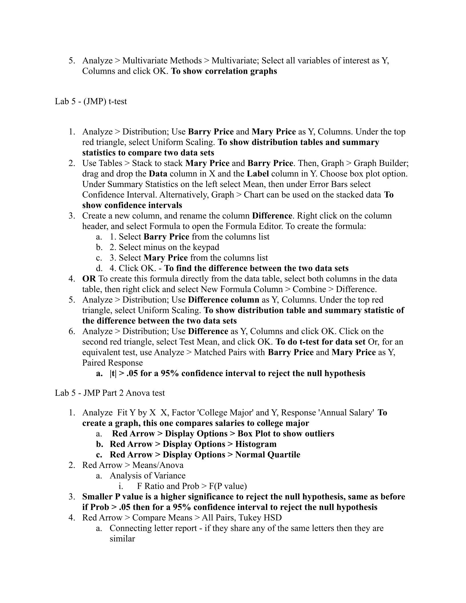
5. Analyze > Multivariate Methods > Multivariate; Select all variables of interest as Y,
Columns and click OK. To show correlation graphs
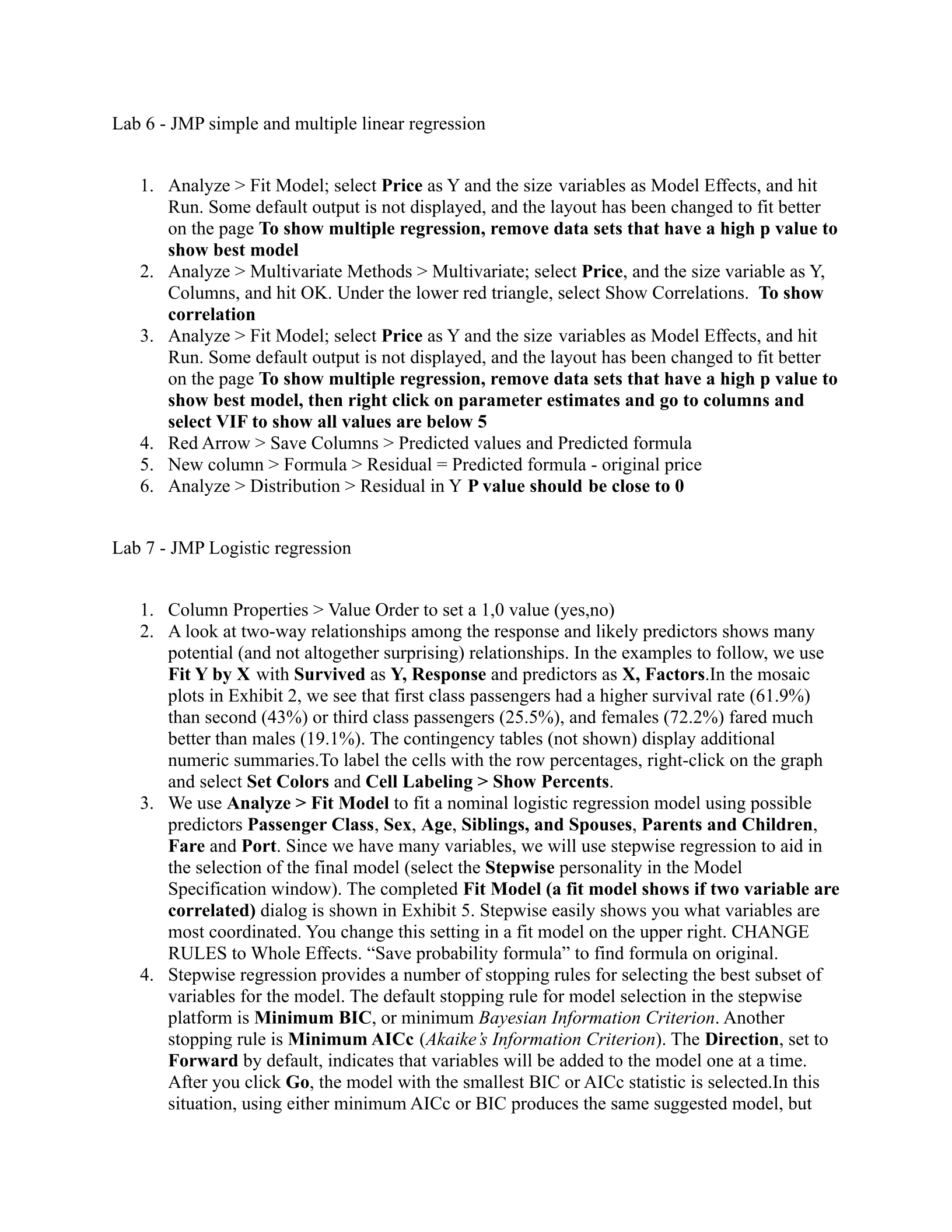
Lab 5 - (JMP) t-test
1. Analyze > Distribution; Use Barry Price and Mary Price as Y, Columns. Under the top
red triangle, select Uniform Scaling. To show distribution tables and summary
statistics to compare two data sets
2. Use Tables > Stack to stack Mary Price and Barry Price. Then, Graph > Graph Builder;
drag and drop the Data column in X and the Label column in Y. Choose box plot option.
Under Summary Statistics on the left select Mean, then under Error Bars select
Confidence Interval. Alternatively, Graph > Chart can be used on the stacked data To
show confidence intervals
3. Create a new column, and rename the column Difference. Right click on the column
header, and select Formula to open the Formula Editor. To create the formula:
a. 1. Select Barry Price from the columns list
b. 2. Select minus on the keypad
c. 3. Select Mary Price from the columns list
d. 4. Click OK. - To find the difference between the two data sets
4. OR To create this formula directly from the data table, select both columns in the data
table, then right click and select New Formula Column > Combine > Difference.
5. Analyze > Distribution; Use Difference column as Y, Columns. Under the top red
triangle, select Uniform Scaling. To show distribution table and summary statistic of
the difference between the two data sets
6. Analyze > Distribution; Use Difference as Y, Columns and click OK. Click on the
second red triangle, select Test Mean, and click OK. To do t-test for data set Or, for an
equivalent test, use Analyze > Matched Pairs with Barry Price and Mary Price as Y,
Paired Response
a. |t| > .05 for a 95% confidence interval to reject the null hypothesis
Lab 5 - JMP Part 2 Anova test
1. Analyze Fit Y by X X, Factor 'College Major' and Y, Response 'Annual Salary' To
create a graph, this one compares salaries to college major
a. Red Arrow > Display Options > Box Plot to show outliers
b. Red Arrow > Display Options > Histogram
c. Red Arrow > Display Options > Normal Quartile
2. Red Arrow > Means/Anova
a. Analysis of Variance
i. F Ratio and Prob > F(P value)
3. Smaller P value is a higher significance to reject the null hypothesis, same as before
if Prob > .05 then for a 95% confidence interval to reject the null hypothesis
4. Red Arrow > Compare Means > All Pairs, Tukey HSD
a. Connecting letter report - if they share any of the same letters then they are
similar
Lab 6 - JMP simple and multiple linear regression
1. Analyze > Fit Model; select Price as Y and the size variables as Model Effects, and hit
Run. Some default output is not displayed, and the layout has been changed to fit better
on the page To show multiple regression, remove data sets that have a high p value to
show best model
2. Analyze > Multivariate Methods > Multivariate; select Price, and the size variable as Y,
Columns, and hit OK. Under the lower red triangle, select Show Correlations. To show
correlation
3. Analyze > Fit Model; select Price as Y and the size variables as Model Effects, and hit
Run. Some default output is not displayed, and the layout has been changed to fit better
on the page To show multiple regression, remove data sets that have a high p value to
show best model, then right click on parameter estimates and go to columns and
select VIF to show all values are below 5
4. Red Arrow > Save Columns > Predicted values and Predicted formula
5. New column > Formula > Residual = Predicted formula - original price
6. Analyze > Distribution > Residual in Y P value should be close to 0
Lab 7 - JMP Logistic regression
1. Column Properties > Value Order to set a 1,0 value (yes,no)
2. A look at two-way relationships among the response and likely predictors shows many
potential (and not altogether surprising) relationships. In the examples to follow, we use
Fit Y by X with Survived as Y, Response and predictors as X, Factors.In the mosaic
plots in Exhibit 2, we see that first class passengers had a higher survival rate (61.9%)
than second (43%) or third class passengers (25.5%), and females (72.2%) fared much
better than males (19.1%). The contingency tables (not shown) display additional
numeric summaries.To label the cells with the row percentages, right-click on the graph
and select Set Colors and Cell Labeling > Show Percents.
3. We use Analyze > Fit Model to fit a nominal logistic regression model using possible
predictors Passenger Class,Sex,Age,Siblings, and Spouses,Parents and Children,
Fare and Port. Since we have many variables, we will use stepwise regression to aid in
the selection of the final model (select the Stepwise personality in the Model
Specification window). The completed Fit Model (a fit model shows if two variable are
correlated) dialog is shown in Exhibit 5. Stepwise easily shows you what variables are
most coordinated. You change this setting in a fit model on the upper right. CHANGE
RULES to Whole Effects. “Save probability formula” to find formula on original.
4. Stepwise regression provides a number of stopping rules for selecting the best subset of
variables for the model. The default stopping rule for model selection in the stepwise
platform is Minimum BIC, or minimum Bayesian Information Criterion. Another
stopping rule is Minimum AICc (Akaike’s Information Criterion). The Direction, set to
Forward by default, indicates that variables will be added to the model one at a time.
After you click Go, the model with the smallest BIC or AICc statistic is selected.In this
situation, using either minimum AICc or BIC produces the same suggested model, but
this is not 1 always the case .The Rules option in the Stepwise Regression Control panel
relates to how stepwise regression handles categorical variables and interaction effects.
We have entered two three-level categorical variables, Passenger Class and Port. For
each of these variables, two parameters can be estimated. To run the logistic model with
the selected parameters, we click Make Model to return to the Model Specification
window, and then click Run. The resulting summary of the model fit is shown in Exhibit
Powered by TCPDF (www.tcpdf.org)

