


Guideline Examples Assignment
CSIS 375: Introduction to Computer-Human Interaction
Guideline Examples
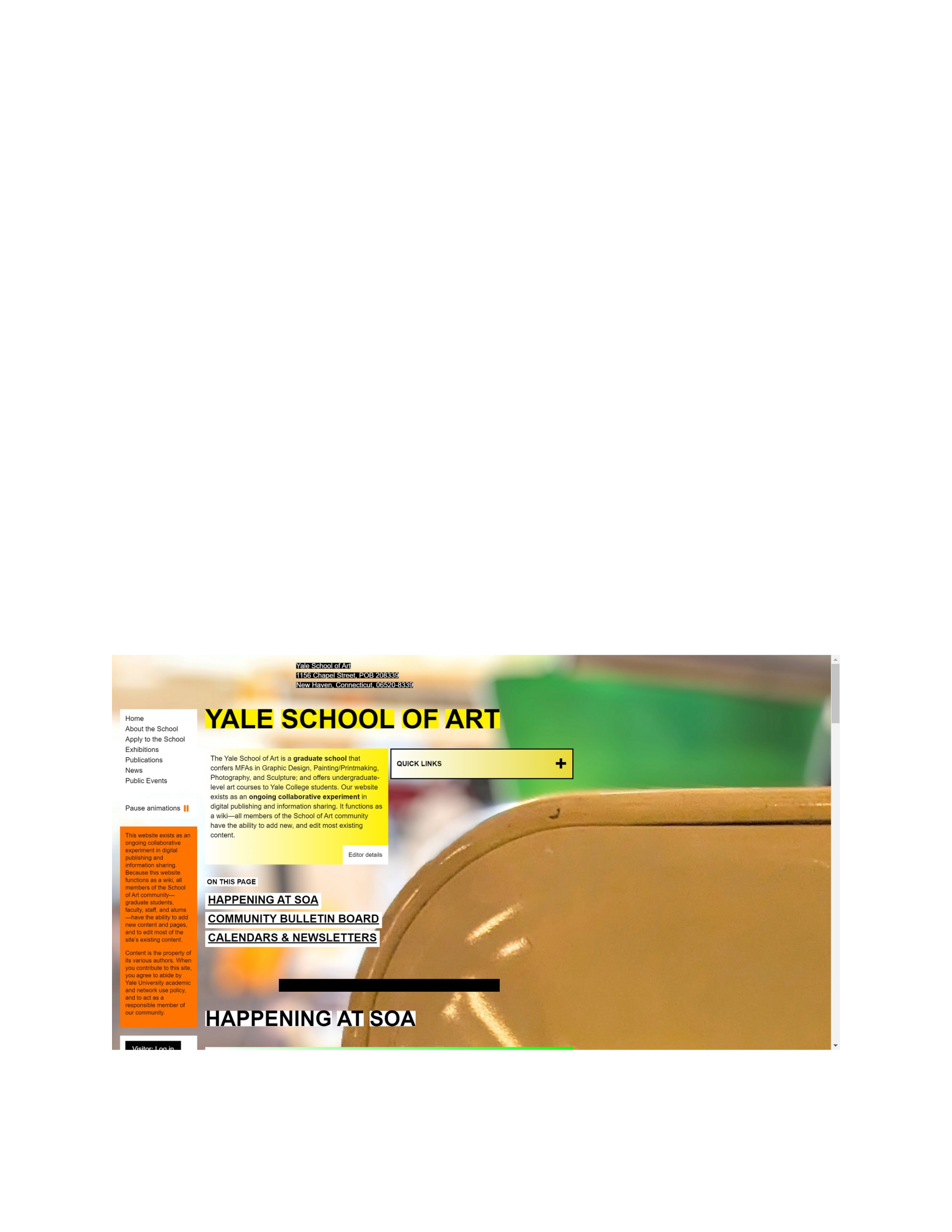
1. Internal Consistency – Violation: https://www.art.yale.edu/
Nothing about this website stays consistent. Every page the user navigates to has a different background
and different colors in the text boxes and headings. The text sizes are seemingly random as nothing is
proportionate. None of the information is placed in a consistent manner on any of the various pages of
the site. The effect on the user is just an all-around unpleasant experience. The bright and patterned
backgrounds, inconsistent text sizes and placements, and lack of proper navigation could easily drive a
user away from the page.
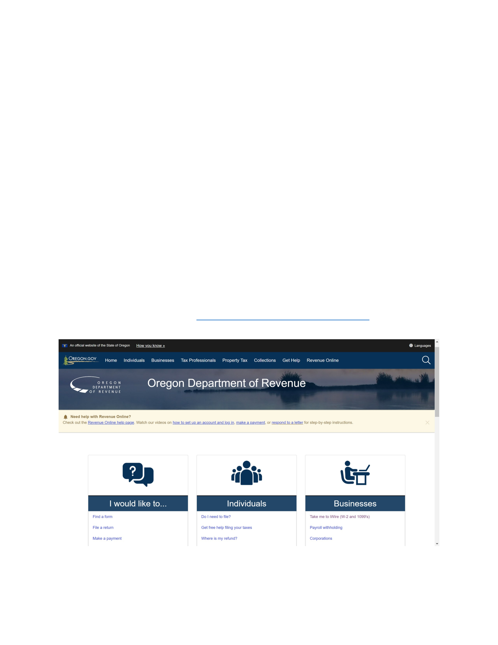
1. Internal Consistency – Adherence: https://www.oregon.gov/dor/Pages/index.aspx
The Oregon Department of revenues website keeps a nice and clean color scheme throughout the whole
website. The navigation bar stays in the same place no matter what page the user is on. Information is
placed in similar locations on the various pages of the website. The icons and fonts stay consistent as
well and the size and color of the headings. The outcome on the user is an easy to navigate experience
that is not confusing or frustrating.
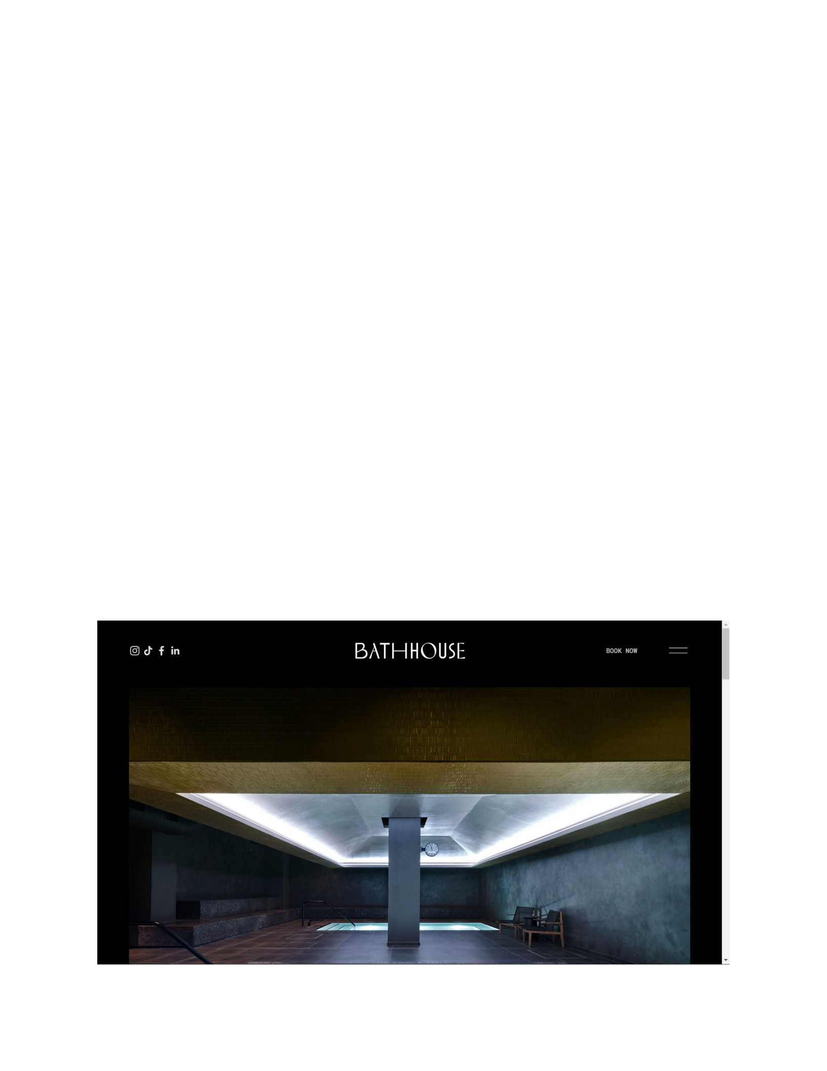
2. Obvious starting point in upper left – Violation: https://www.abathhouse.com/
Rather than starting with the menu or logo of the website in the upper left, the Bathhouse website puts
all of the links to its social media in the upper left. The user has to look across the top of the page all the
way in the upper right corner or scroll lower on the page before they get to the menu bar or any “Call-
to-Action” prompts. The effect on the user is that they could be redirected to Bathhouse’s social media
pages, from which the user could get distracted and never return to the Bathhouse website.
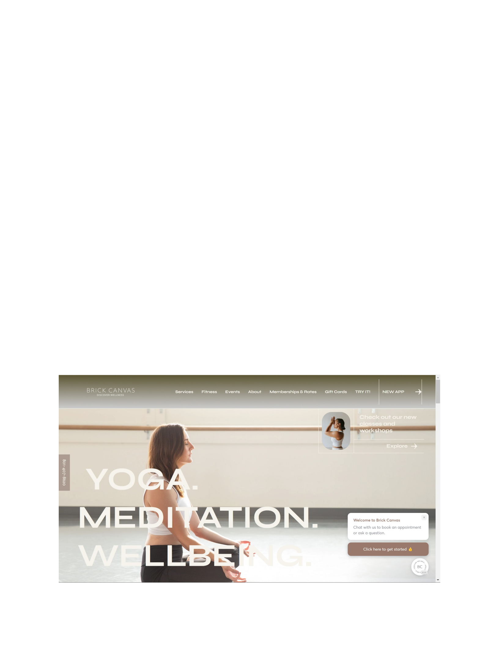
2. Obvious starting point in upper left – Adherence: https://www.brickcanvas.com/

The website for Brick Canvas adheres to the design guideline of starting in the upper left of the page.
The first thing the user is drawn to is the company’s logo in the upper left, and from there the navigation
menu of the website works its way across the top of the page from left to right. The likely outcome is the
user knows right away where to find the information they are looking for as it is displayed in a natural
reading pattern across the main area of the page.
3. Meaningful and sensible sorting of information – Violation: https://www.drudgereport.com/
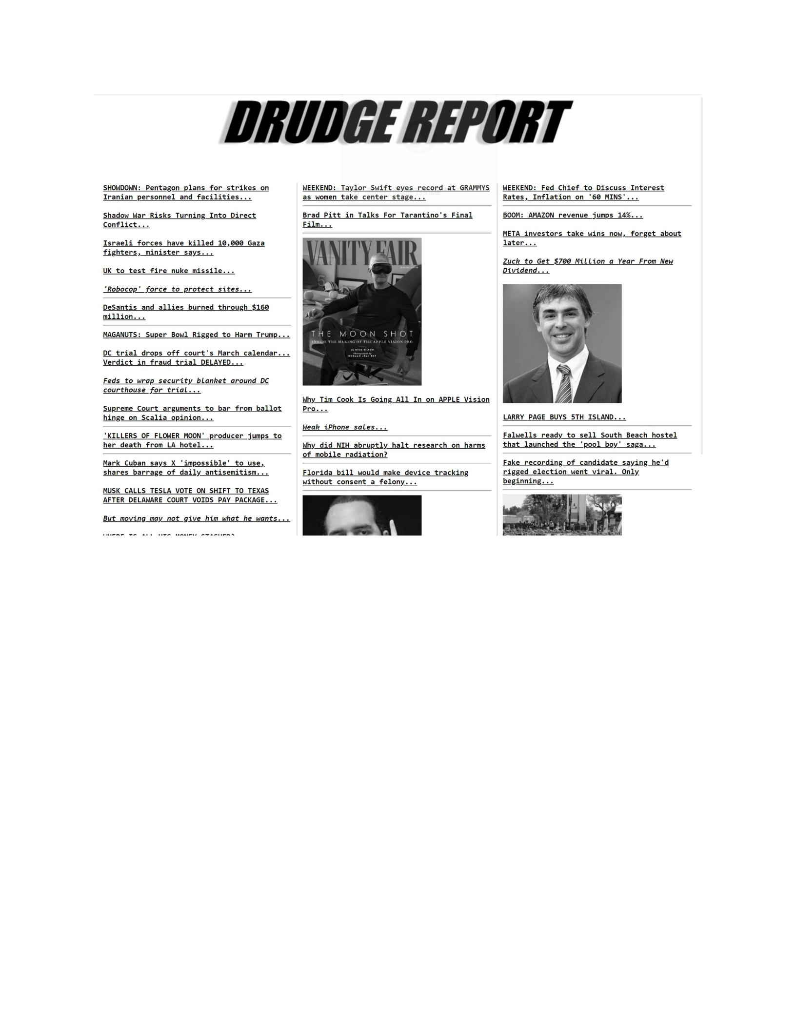
There is seemingly zero organization at all to this news site. There is no navigation menu, no sorting of
articles by date or genre. The potential effect on the user is the possibility of getting lost and frustrated
since there is so much information on the webpage, but no way to find even the genre of articles they
may be interested in reading.
3. Meaningful and sensible sorting of information – Adherence: https://portland.craigslist.org/
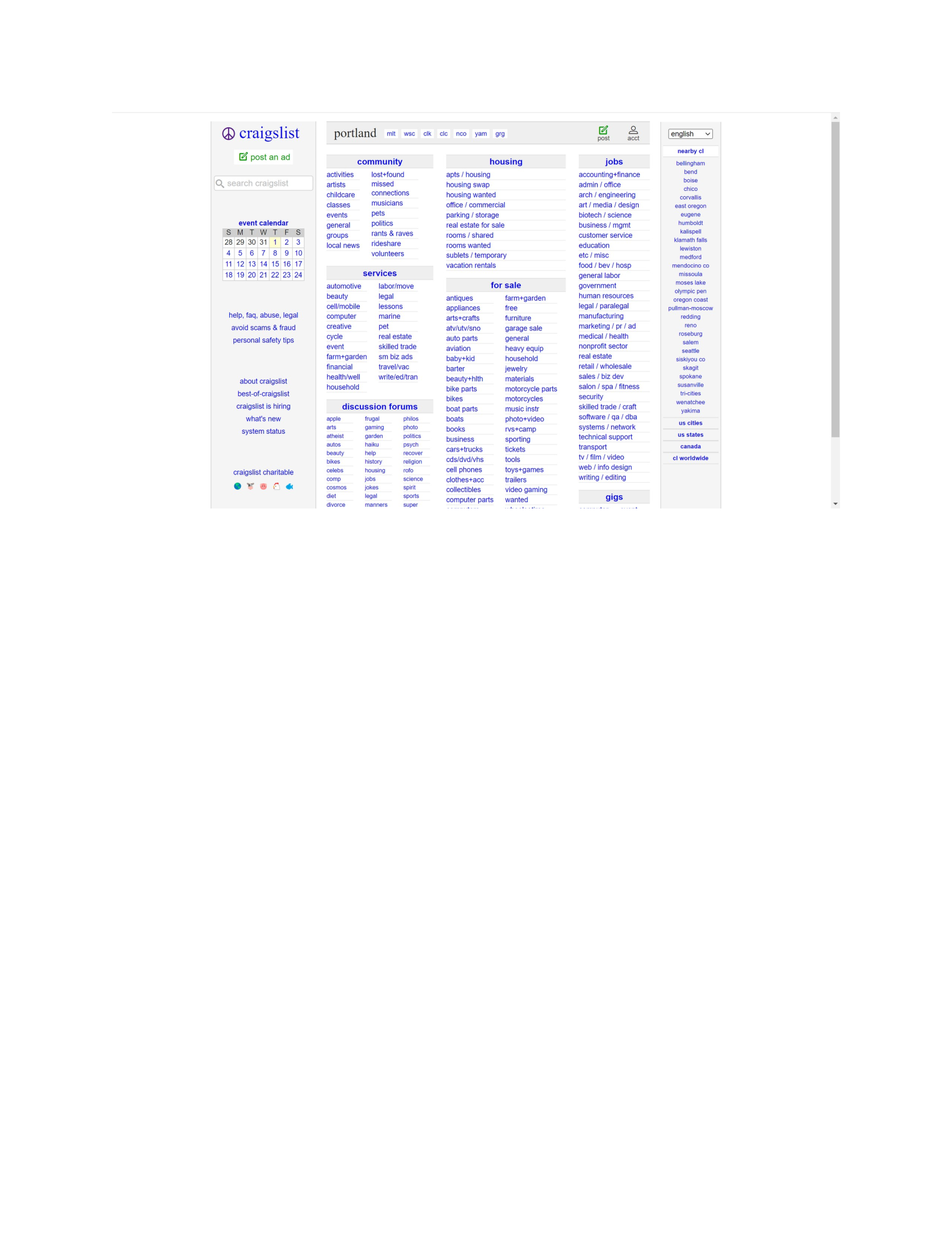
While this webpage is quite busy with information, it does a nice job of sorting the information on its
page by what the user is looking for and then breaking that information down even further into sensible
categories that the user will be able to follow. The effect on the user will be that they are able to find
exactly what they are looking for with relative ease.
4. Aesthetically pleasing (balanced, proportionate, simple) – Violation: https://lifeactionrevival.org/
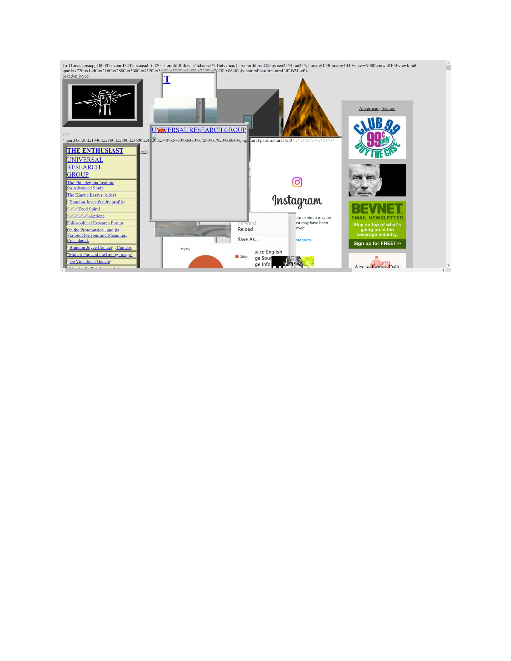
There is no balance whatsoever to this website. Not only is the content on this website placed at
random over the other content, as the user scrolls down the website there is never content laid out in a
balanced or proportionate way. If the user scrolls lower, the site only ever utilizes the left, center, or
right side of the one section at a time. The design is incredibly chaotic, and the links on the left side of
the page take the user away from the website without popping the new content into a new tab. The
effect of this website on the user is a likely outcome of confusion and frustration by the user being
unable to decipher the content on the page or how to navigate throughout the site. If the user clicks any
of the links on the website, they will be redirected to a new webpage and will likely not return to the
original website.
4. Aesthetically pleasing (balanced, proportionate, simple) – Adherence: https://atheycreek.com/
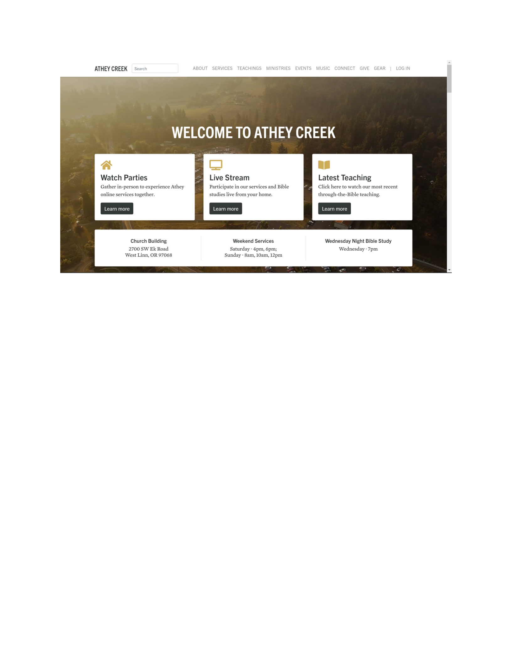
Athey Creek’s website is balanced, proportional, and simple to navigate. The background does not
distract from the content of the page, there is clear and visible navigation throughout the site, no matter
where you have navigated to, and all of the information within the site in proportional and balanced
with the rest of the content. The effect on the user is a pleasant experience, both visually and
navigationally.
5. White Space – Violation: https://www.007museum.com/

The white space to the left and right of the main content on this website is useless. It serves no purpose,
other than to make the user scroll right to see more white space, and then have to scroll left again as
they continue on. As the user scrolls down farther, it actually throws the whole site off balance. The
outcome on the user is likely frustration at having to navigate an improperly scaled website and having
to scroll right and left for no apparent reason, other than poor design.
5. White Space – Adherence: https://www.apple.com/iphone-15/
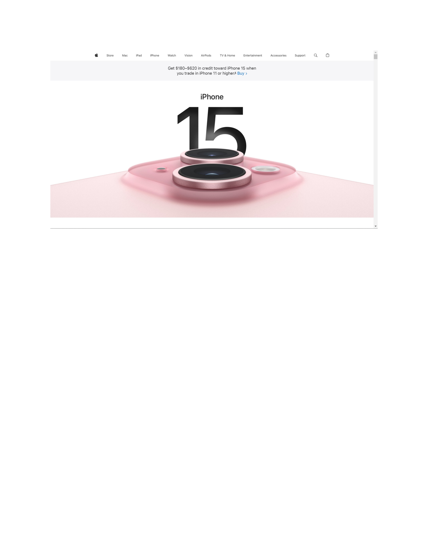
Apple does a great job of utilizing white space throughout their entire website. It gives their users a
chance to focus on the features and design of the product that Apple is marketing, rather than anything
that could distract from their product. The likely outcome for the user is an enjoyable and informative
experience.
6. Distinctiveness – Violation: https://gatesnfences.com/
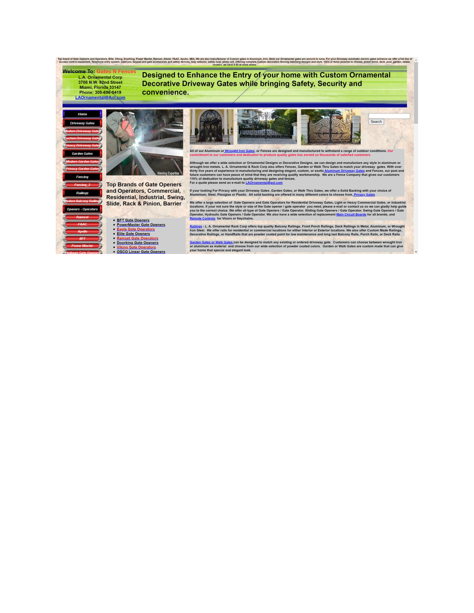
The above website is not designed to bring attention to any one area. It is cluttered with text and the
user is likely not drawn to any specific content on the page. The likely outcome for the user is that they
feel stuck wading through a lot of content that doesn’t mean anything to them, rather than being able
to direct themselves to the parts of the website they are interested in.
6. Distinctiveness – Adherence: https://knapsackcreative.com/
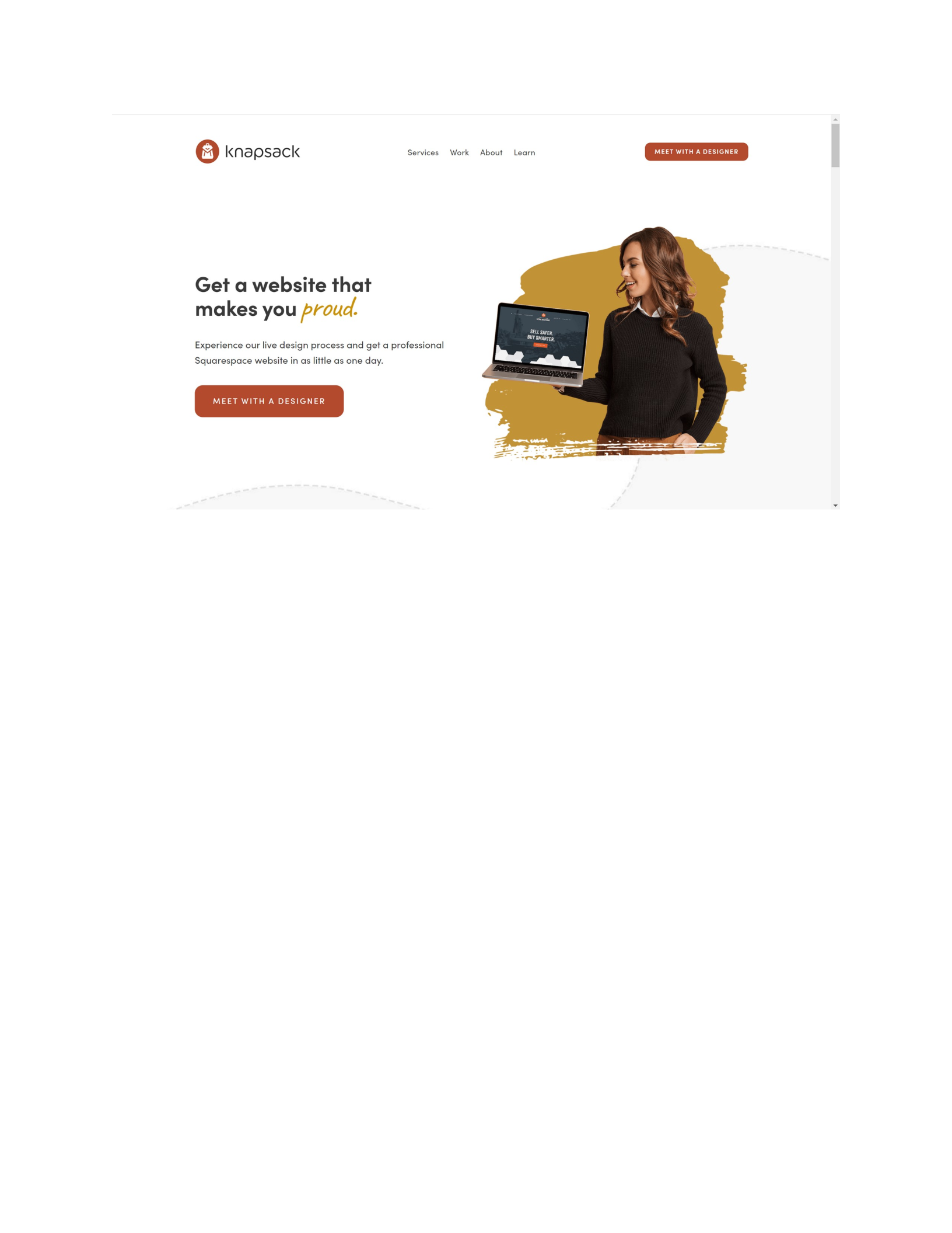
Knapsack’s website does a great job of keeping their site clean and simple. The website is not overly
crowded with meaningless distractions, and all of the important content is emphasized properly. As the
user scrolls through the website anything important attracts the user’s attention well. The lack of
content clutter makes for a seamless and enjoyable user experience.
7. Focus and Emphasis – Violation: https://www.chestertourist.com/index.htm
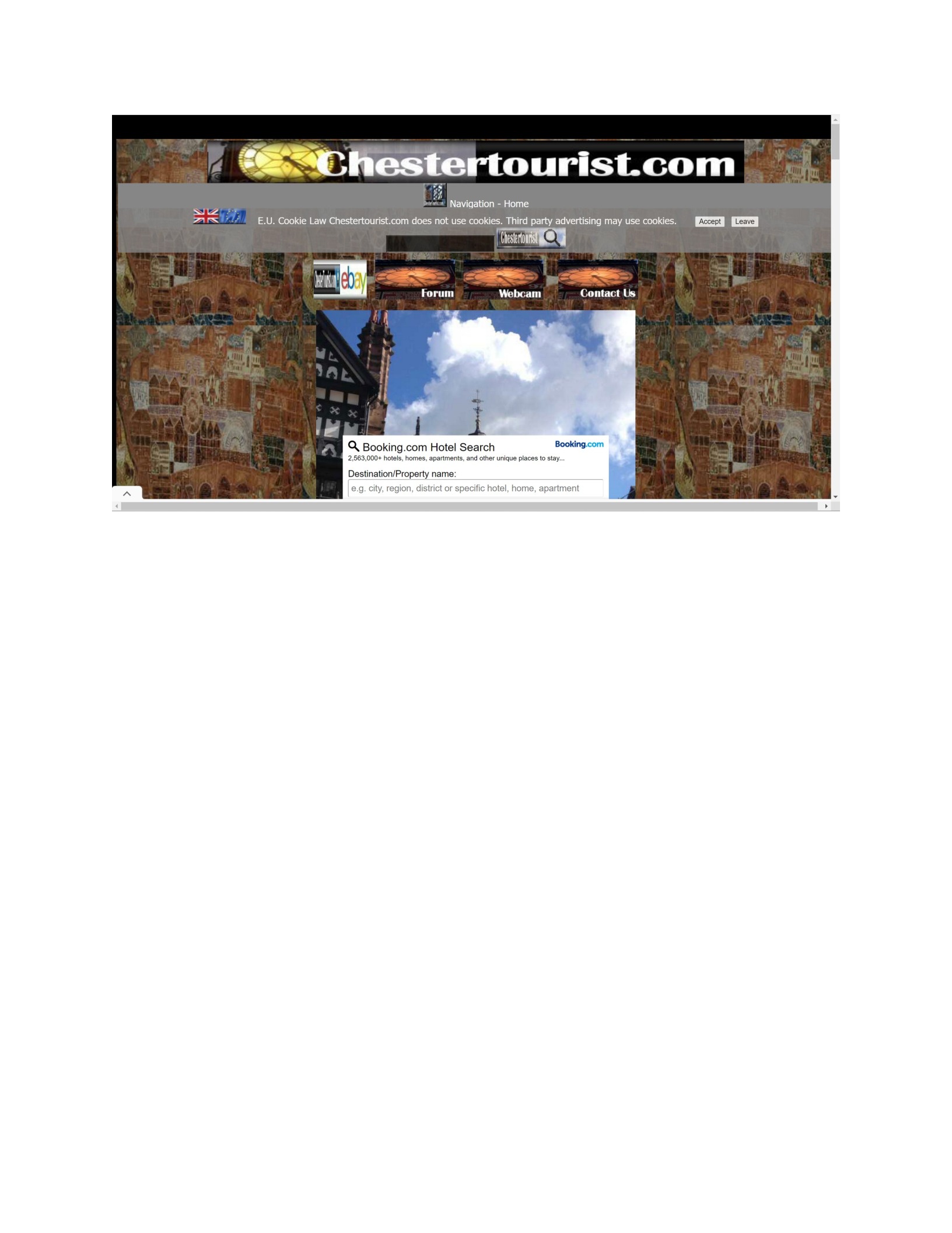
The Chester tourist website doesn’t put focus on or emphasize any of the important aspects of the site.
The contrast between the busy background image and the rest of the site are very distracting to the
user. The website does not utilize size or color to attract attention to the navigation or menu options,
which the user has to scroll to even find. The outcome is the user will have a headache-of-a-time trying
to find the more important parts of the website, like the navigation bar. All the clashing colors and
images and icons are also just a generally unpleasant experience for the user.
7. Focus and Emphasis – Adherence: https://p0wer0f1.com/index.html
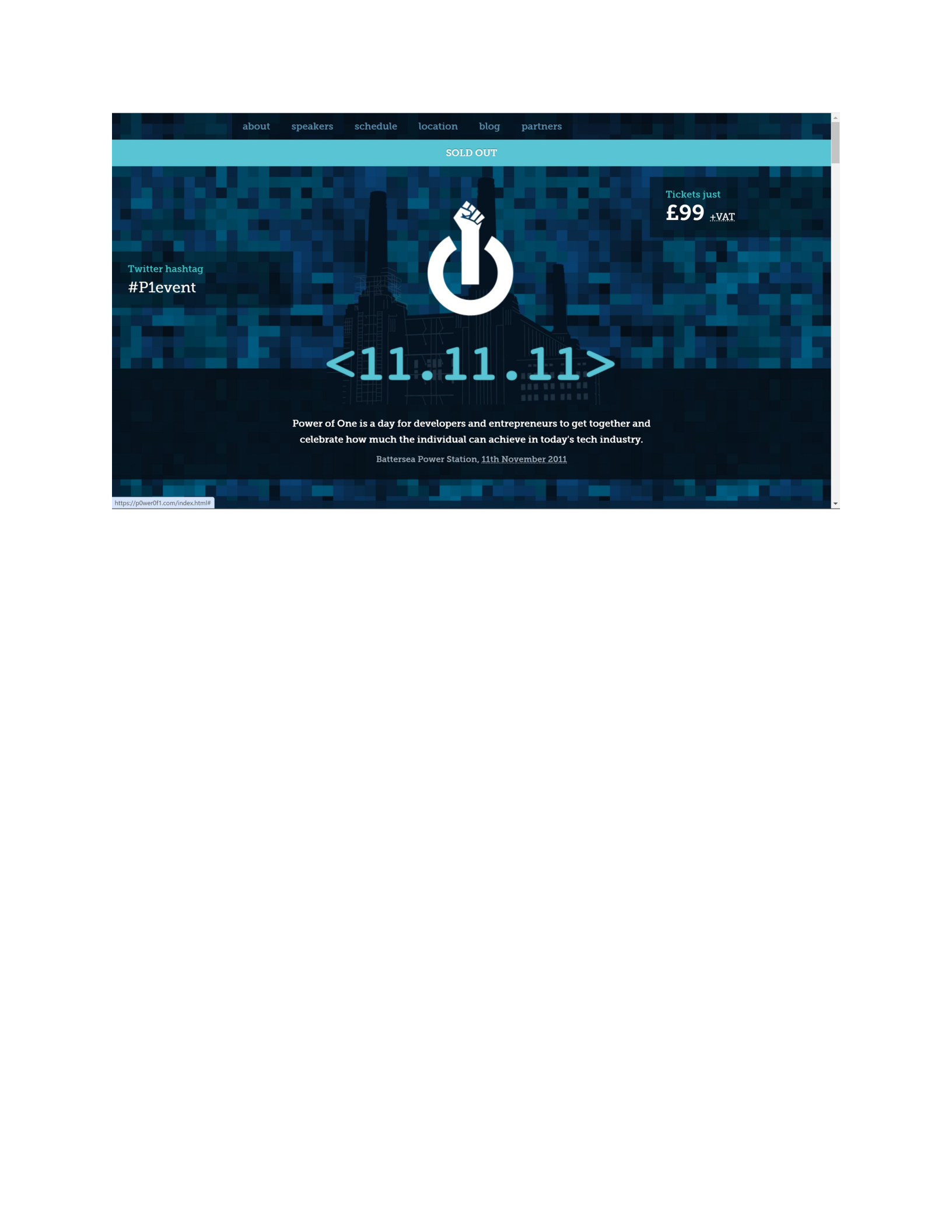
The above website uses color, contrast and size to draw focus to the logo in the center of the page.
From there the user is drawn to stay in the center of the webpage and read the date and description
underneath the logo. The outcome is that the user is drawn to the important information on the page
without really having to search in depth at all. The price and date all jump out at the user due to how
they are emphasized in the design.

