



Taylor1
CSIS 375
October 4, 2025
Color Theory Guidelines Assignment
Ericka Taylor
CSIS 375 – Introduction to Human-Computer Interaction
Alan Ours
October 4, 2025
Taylor2
CSIS 375
October 4, 2025
Part 1: Color Violation
Website: Craigslist – https://www.craigslist.org
Description:
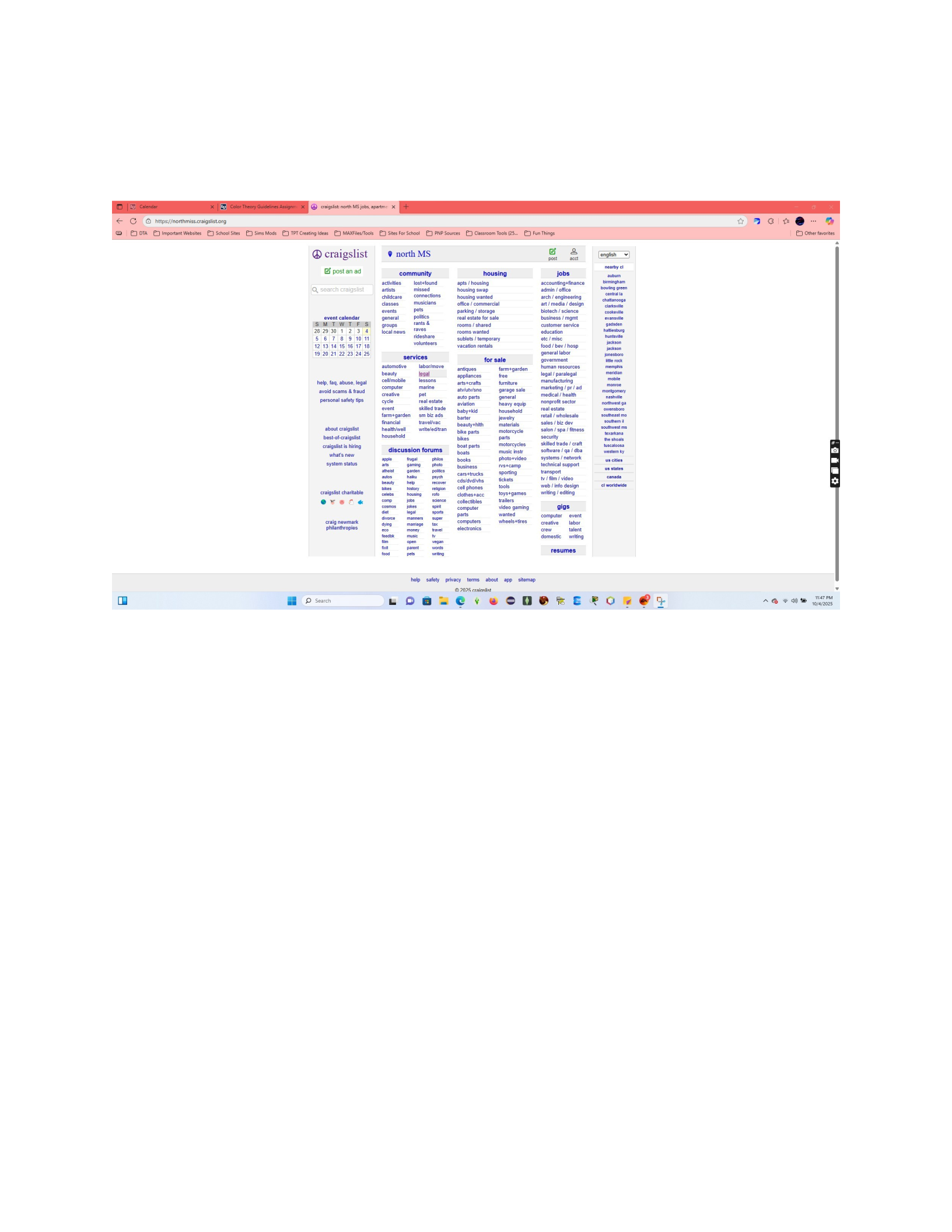
Craigslist violates color theory by displaying almost everything in the same shade of blue on a
white background, with little to no contrast or visual hierarchy. Every section, link, and category
blends together, forcing users to visually search through long lists of small, tightly packed text.
The lack of balance and harmony makes the interface appear cluttered, outdated, and
overwhelming. There are no accent colors or shaded sections to separate content or guide the
user’s focus, which makes it hard to identify what’s most important. The excessive use of blue
hyperlinks creates visual fatigue and confusion rather than helping with organization or
navigation. This poor use of color impacts usability, accessibility, and overall user satisfaction,
causing visitors to leave quickly or overlook critical information.
Part 2: Color Conformity
Website: Apple – https://www.apple.com

Taylor3
CSIS 375
October 4, 2025
Description:
Apple’s website demonstrates excellent color theory by using clean contrasts, modern gradients,
and strong visual focus. The dark black background creates a powerful contrast with the
orangegold iPhone image, immediately drawing attention to the product without distractions.
The white text and blue call-to-action buttons are easy to read and strategically placed to guide
the user’s eye from the headline to the purchase options. Apple’s use of color is purposeful and
consistent, every tone supports the message of luxury, simplicity, and innovation. The balance
of dark and light areas provides depth and clarity, making navigation intuitive and visually
pleasing. This thoughtful color application enhances readability, focus, and emotional
connection with the brand, perfectly aligning with modern design principles.
Icons
Below are the icons designed for each menu feature. Each icon represents its function clearly
using visual metaphors that support user understanding.
Manage Scenarios
🧠 Represents planning or decision-making, used to organize multiple outcomes or case
scenarios.
Manage Assumptions
💭A thought bubble represents the assumptions or ideas behind a project.

Taylor4
CSIS 375
October 4, 2025
Run Scenarios
▶️A play button symbolizes starting or running simulations.
View Reports
📊A bar graph represents reviewing and analyzing collected data.
Exit Application
🚪A door with an arrow pointing outward represents leaving or closing the app.
Enter Base Values
🔢Numbers or sliders represent inputting initial data values.
Compare Scenarios
⚖️A balance scale symbolizes comparison and evaluation between different options.
Manage Permissions
🔒A lock represents controlling access or security rights.
Manage Archives
🗄️A filing cabinet symbolizes stored or archived data.
Part 4: 3D Color Picture

Taylor5
CSIS 375
October 4, 2025
Description:
This image uses color gradients and reflections to create a realistic three-dimensional effect. The
metallic infinity shape appears raised and layered through the use of bright highlights and
smooth shading that transition from blue and green to subtle pink tones. The reflective surfaces
and curved edges give it depth, making the figure appear as if it is floating above the green
background. The illusion of depth and light is achieved entirely through color and gradient
blending rather than lines or textures, demonstrating how color alone can make an object look
three-dimensional.
Powered by TCPDF (www.tcpdf.org)

