


BUSI 820: ASSIGNMENT 2
1 | January 26, 2025
Assignment 2 Quantitative Analysis: Variables, Z Scores, Population and Output
BUSI 820 Quantitative Research Methods
January 26, 2025

BUSI 820: ASSIGNMENT 2
2 | January 26, 2025
Table of Contents
SPSS Problems 3
A.2: Chapter 3, Problem 3.1. 3
A.2: Chapter 3, Problem 3.2. 4
A.2: Chapter 3, Problem 3.3. 5
Table 3.1: Scholastic Aptitude Test.6
Table 3.2: Competence Scale Histogram.6
Table 3.3: Frequency Table of Religion.7
A.2: Chapter 3, Problem 3.4. 7
A.2: Chapter 3, Problem 3.5. 8
Conclusions 9
References 10

BUSI 820: ASSIGNMENT 2
3 | January 26, 2025
SPSS Problems
A.2: Chapter 3, Problem 3.1. Create bar charts. Discuss why you did or did not create a
bar chart for each variable.
The type of bar graph that is created depends on the nature of the data being analyzed.
Bar charts come in a variety of styles such as nominal, dichotomous, ordinal, and normal.
Dichotomous is used when there is only two possible types of outcomes and ordinal is used to
involve data that can be arranged in a specific order. In the scenario analyzing variables from the
hsbdata.sav file, a nominal bar graph was selected to present ethnicity data. Nominal bar graphs
are used for categories requiring a numerical value assigned to a category (Morgan et al., 2020).
Referencing Figure 1, page 4, it visually shows the count of ethnicities reported by selected
participants. The below bar chart shows that primary participants are of Euro-American decent,
and least amount being Asian American, with specific counts provided on Y-Axis. It would not
be appropriate to create a bar graph for each variable as other applicable representations such as
histograms and polygons have the ability to represent the data that would be more pertinent to
research then the noted above definitions of bar graphs. A bar chart would also be applicable for
the academic track variable. Noted in Figure 2, page 4, there are 41 participants are on regular
tack while 34 are on fast track for graduation. This would be most appropriate defined as a
dichotomous bar chart as the two possible outcomes are either regular track or fast track.
Figure 1
Bar Chart- Ethnicity

BUSI 820: ASSIGNMENT 2
4 | January 26, 2025
Figure 2
Bar Chart- Academic Track
A.2: Chapter 3, Problem 3.2. Create histograms. Discuss why you did or did not create a
histogram for each variable.
Histogram graphs help to represent and organize a group of data points into a range and
help to accurately visualize and distribute numerical data. Different from bar charts the show
categorical data, histograms display continuous data (Morgan et al., 2020). With topics like
continuing education and ongoing schooling, the concept of schooling and reviewing amounts of
individuals who obtain an advance degree overtime, is easily identifiable with a histogram.

BUSI 820: ASSIGNMENT 2
5 | January 26, 2025
Noted in Figure 2 below, data shows the data of research participants mothers’ education status.
This is an appropriate tool to use in this scenario as histogram help to provide visual
interpretation of a data spread in an effective manner and potentially see certain outliers or where
change occurred. The data below shows most mothers of research participants complete a high
school education, with college and advanced degrees being drastically different. From a research
perspective, the data shows me future research would be important to find correlation and
causation of research participants in terms of education on parental, specifically mother,
educational background.
Figure 2
Histogram- Mother’s Education
A.2: Chapter 3, Problem 3.3. Create frequency polygons. Discuss why you did or did not
create a frequency polygon for each variable. Compare the plots in Extra SPSS Problems
3.1, 3.2, and 3.3.
A frequency polygon helps to illustrate a graphical representation of distribution.
Frequency polygons must be used with normal data and can sometimes be sufficient graph for
ordinal data, but not used with nominal or dichotomous (Morgan et al., 2020). In the instance of
BUSI 820: ASSIGNMENT 2
6 | January 26, 2025
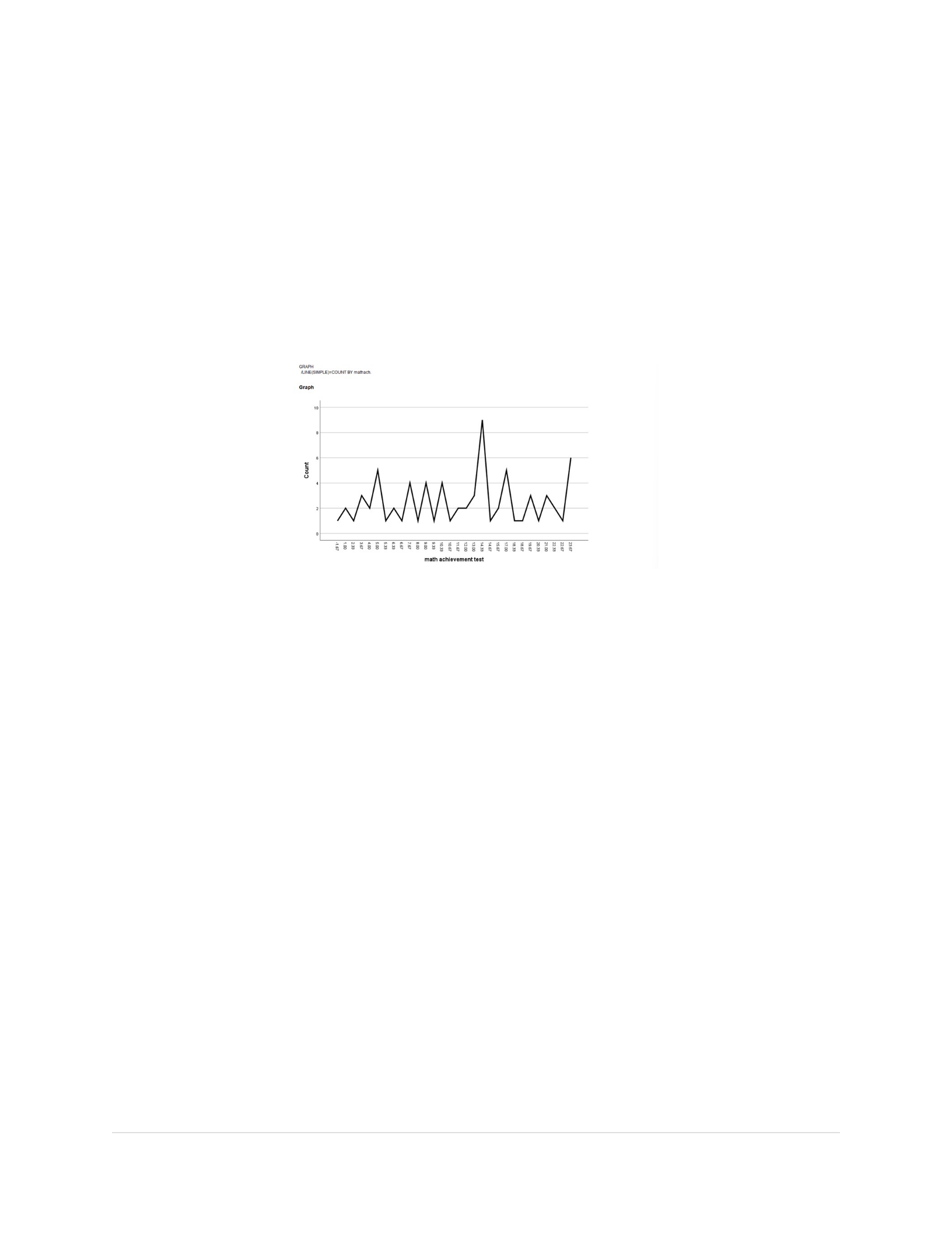
reviewing the variable of math achievement test, the frequency polygon noted below in Figure 4,
helps to show the distribution, as well as identify trends and patterns in the data, and potentially
identify whether information is symmetrical or skewed.
Figure 3
Frequency Polygon- Math Achievement Test
Table 3.1: Scholastic Aptitude Test
Table 3.1 presents the scholastic aptitude test scores of multiple students, represented as a
bar graph with a frequency distribution. The graph is skewed and not normally distributed, with
the tail of the curve or extreme scores on the lower or left side. This is referred to as an ordinal
competence scale variable in the Levels of Measurement section, as the scores are ordered from
low to high but are not approximately normally distributed (Morgan et al., 2020). The average
student aptitude score was 490.53, indicating that most students scored around 490 on this test.
Table 3.2: Competence Scale Histogram
Table 3.2 is a histogram providing statistics on students' competence scales. It represents
various students and the population, showing a mean of 3.29 on a scale of 4. The histogram
indicates that the students have a high level of competency.

BUSI 820: ASSIGNMENT 2
7 | January 26, 2025
Table 3.3: Frequency Table of Religion
Table 3.3 is a frequency table that includes categories of Protestant, Catholic, and No
Religion. The categories are not ordered, meaning Protestants could be placed after or between
Catholic and No Religion. The order of ordinal and nearly normal values cannot change, for
instance, the medium should always be between low and high (Morgan et al., 2020). The key
differences between the tables are the data used, the variables, and the fact that the graphs are not
all identical. Variables differ, such as religion in the frequency chart, aptitude test in the bar
chart, and competence in the histogram.
A.2: Chapter 3, Problem 3.4. Compute the range, standard deviation, and skewness.
Discuss which measures of variability are meaningful for each of the four variables.
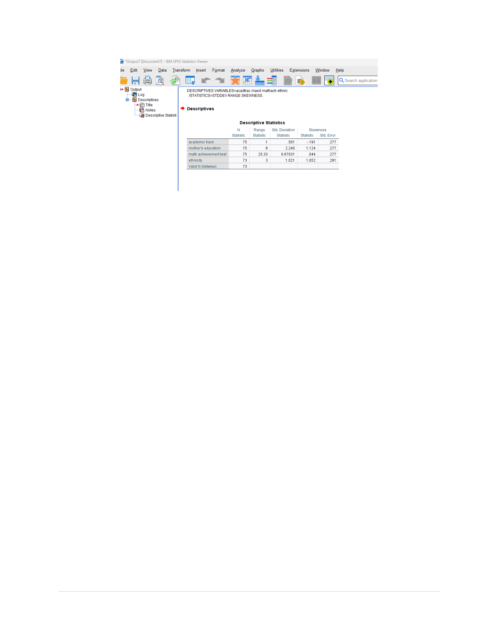
The influence of data variability varies depending on the type of variable in question.
Referencing the below Figure 4, for nominal variables, such as a mother's education or ethnicity,
the range and standard deviation of data are irrelevant. However, for dichotomous variables, the
range is always significant, while the standard deviation is not. In the case of ordinal variables,
the range and standard deviation somewhat matter, impacting factors like academic track and, to
a lesser degree, math achievement. For nominal variables, both the range and standard deviation
are always important. According to Morgan et al. (2020), the skewness or form of the data is
insignificant for nominal and dichotomous variables, including the mother's education, ethnicity,
and academic track. However, for ordinal and nominal variables, skewness is a crucial factor,
particularly in the context of math achievement exams.
Figure 4
Descriptive Statistics of Four Variables- Range, Std. Deviation, Skewness
BUSI 820: ASSIGNMENT 2
8 | January 26, 2025
A.2: Chapter 3, Problem 3.5. Compute the mean, median, and mode. Discuss which
measures of central tendency are meaningful for each of the four variables.
The relevance of central tendency measures varies depending on the type of variable. As
per Morgan et al. (2020), the applicability of these measures to four different types of variables
as referenced in Figure 5, page 9. TheFmeanFis not applicable to nominal variables, such as
mother's education or ethnicity. However, it holds moderate significance for dichotomous
variables, slight significance for ordinal variables, and is meaningful for normal variables. This
implies that the mean is somewhat relevant to the academic track and the math achievement
exam. TheFmedian, similar to the mean, is not applicable to nominal variables. It holds
occasional significance for dichotomous variables, is meaningful for ordinal variables, and is
sometimes meaningful for normal variables. This suggests that the median is relevant to the
academic track and the academic accomplishment variables. TheFmodeFis meaningful for
nominal and dichotomous variables, such as mother's education, academic track, and ethnicity. It
holds marginal significance for ordinal and normal variables, making it slightly relevant for the
math achievement variable. The relevance of central tendency measures - mean, median, and
mode - varies depending on the type of variable. Understanding this can help in the appropriate
application of these measures in statistical analysis.

BUSI 820: ASSIGNMENT 2
9 | January 26, 2025
Figure 5
Descriptive Statistics of Four Variables- Mean, Median, and Mode
Conclusion
Visualizing data through plots such as bar charts, histograms, and polygons is a powerful
tool in data analysis. These plots provide a clear and concise way to understand the distribution,
frequency, and overall pattern of a dataset. Variability measures such as range, standard
deviation, and skewness are crucial in understanding the spread and asymmetry of a dataset.
Central tendency measures such as mean, median, and mode provide a 'central' or 'typical' value
for a dataset. In conclusion, appropriate use of plots, variability measures, and central tendency
measures are fundamental in data analysis. Understanding this information and the appropriate
utilization of such provides a comprehensive understanding of the dataset, allowing for accurate
interpretations and informed decision-making.
References

BUSI 820: ASSIGNMENT 2
10 | January 26, 2025
Morgan, G. A., Barrett, K. C., Leech, N. L., & Gloeckner, G. W. (2020).FIBM SPSS for
introductory statistics: Use and interpretationF(6th ed.). Routledge.

