
1 / 7100%
WPC 300
Problem Solving and Actionable Analytics
Data Visualization
Kevin Hong
http://kevinhong.me/
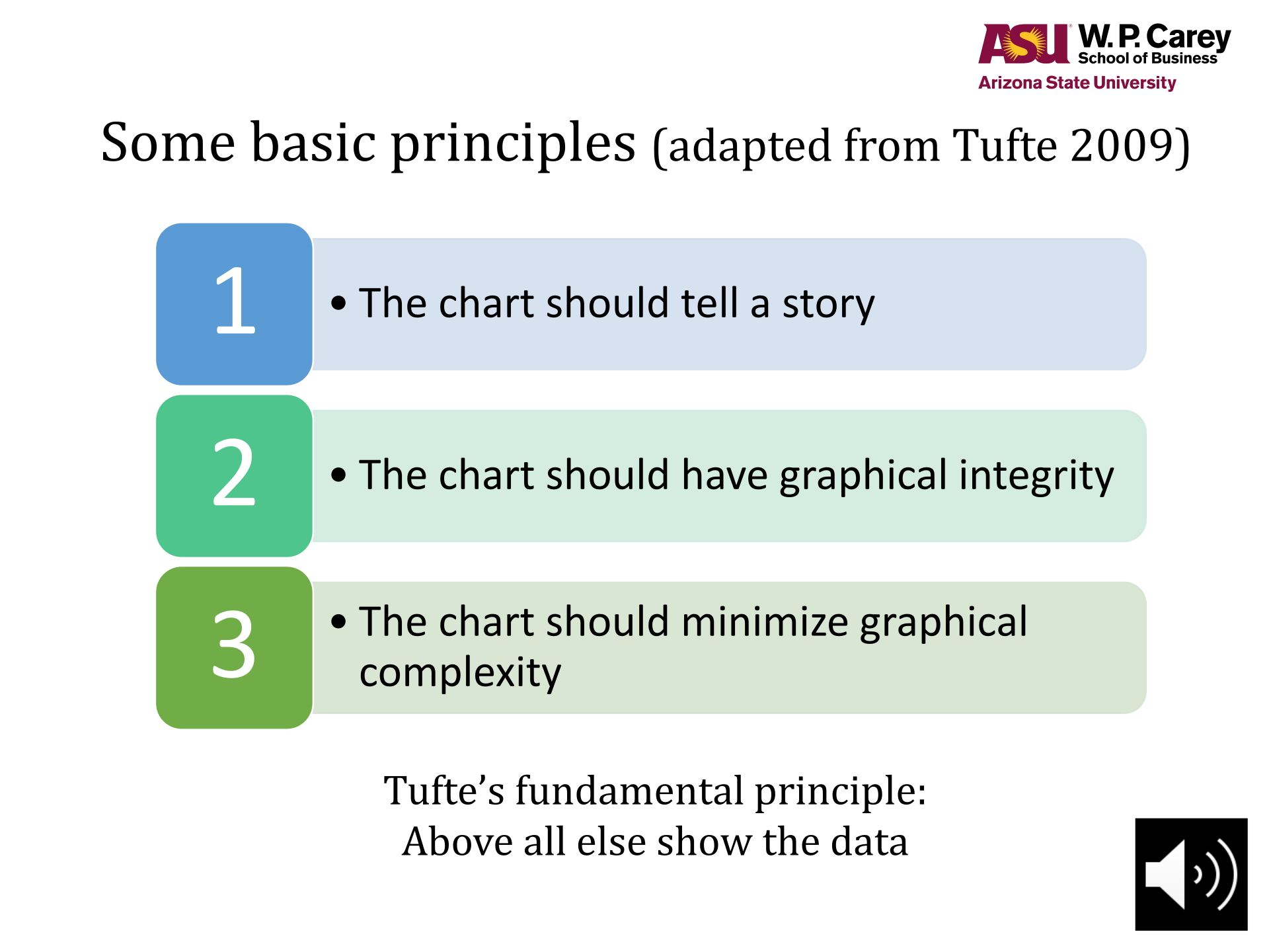
Some basic principles (adapted from Tufte 2009)
The chart should tell a story
1
The chart should have graphical integrity
2
The chart should minimize graphical
complexity
3
Tufte’s fundamental principle:
Above all else show the data
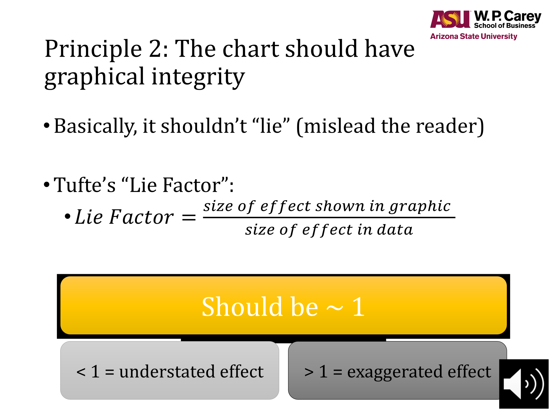
Principle 2: The chart should have
graphical integrity
Basically, it shouldn’t “lie” (mislead the reader)
Tufte’s “Lie Factor”:
𝐿𝑖𝑒 𝐹𝑎𝑐𝑡𝑜𝑟 = 𝑠𝑖𝑧𝑒 𝑜𝑓 𝑒𝑓𝑓𝑒𝑐𝑡 𝑠ℎ𝑜𝑤𝑛 𝑖𝑛 𝑔𝑟𝑎𝑝ℎ𝑖𝑐
𝑠𝑖𝑧𝑒 𝑜𝑓 𝑒𝑓𝑓𝑒𝑐𝑡 𝑖𝑛 𝑑𝑎𝑡𝑎
Should be ~ 1
< 1 = understated effect > 1 = exaggerated effect
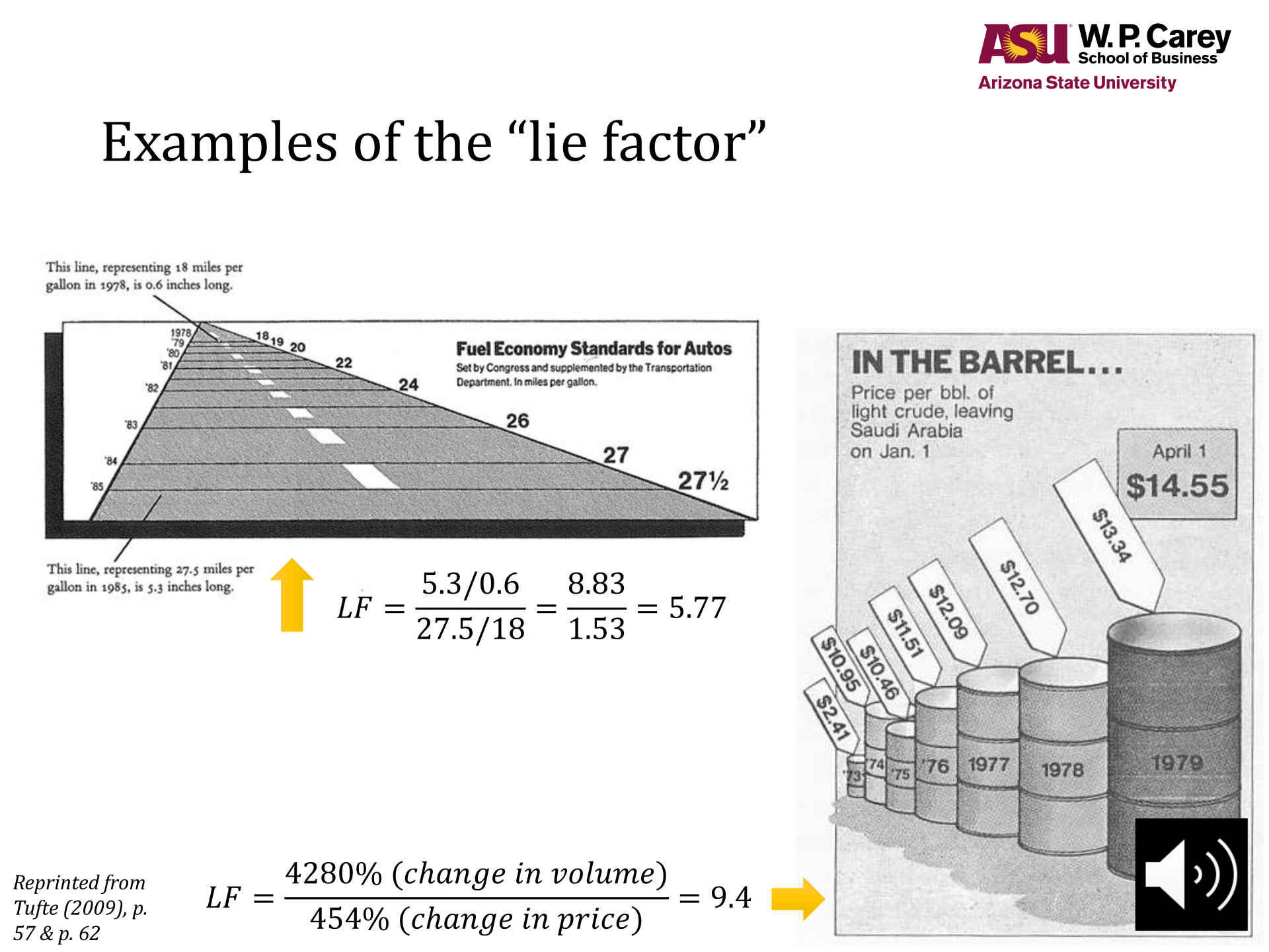
Examples of the “lie factor”
𝐿𝐹 =5.3/0.6
27.5/18 =8.83
1.53 = 5.77
𝐿𝐹 =4280% (𝑐ℎ𝑎𝑛𝑔𝑒 𝑖𝑛 𝑣𝑜𝑙𝑢𝑚𝑒)
454% (𝑐ℎ𝑎𝑛𝑔𝑒 𝑖𝑛 𝑝𝑟𝑖𝑐𝑒) = 9.4
Reprinted from
Tufte (2009), p.
57 & p. 62
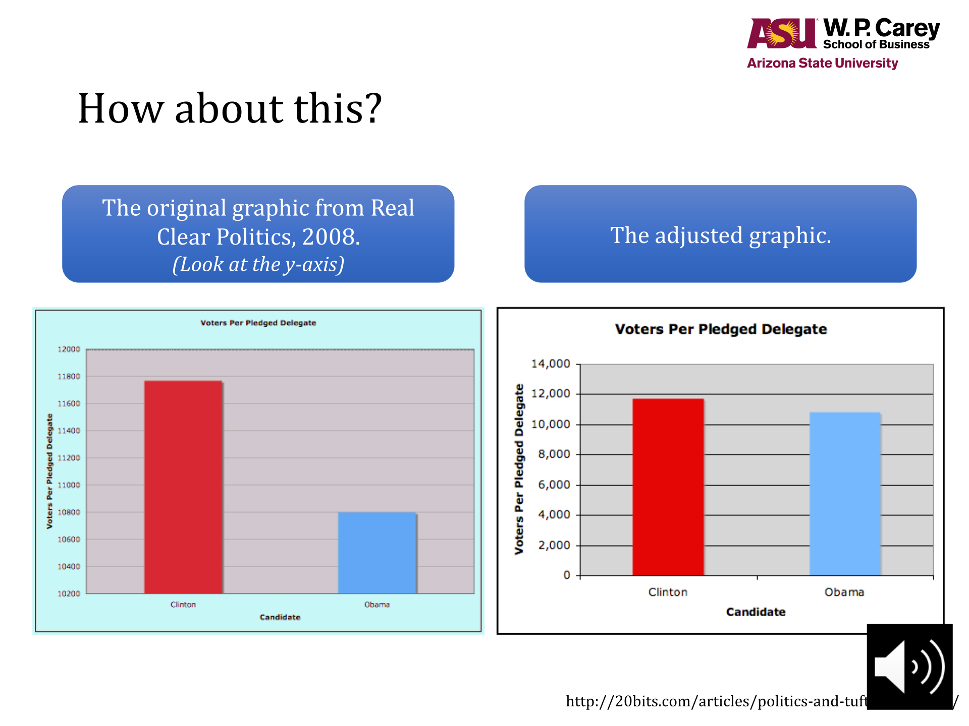
How about this?
http://20bits.com/articles/politics-and-tuftes-lie-factor/
The original graphic from Real
Clear Politics, 2008.
(Look at the y-axis)
The adjusted graphic.
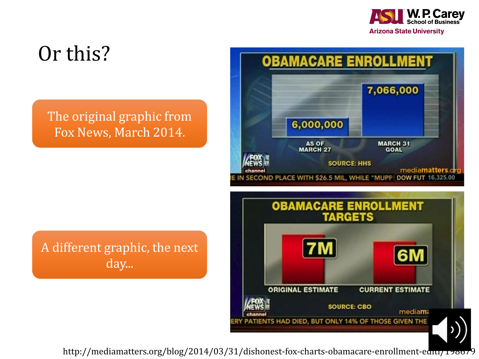
Or this?
The original graphic from
Fox News, March 2014.
A different graphic, the next
day...
http://mediamatters.org/blog/2014/03/31/dishonest-fox-charts-obamacare-enrollment-editi/198679
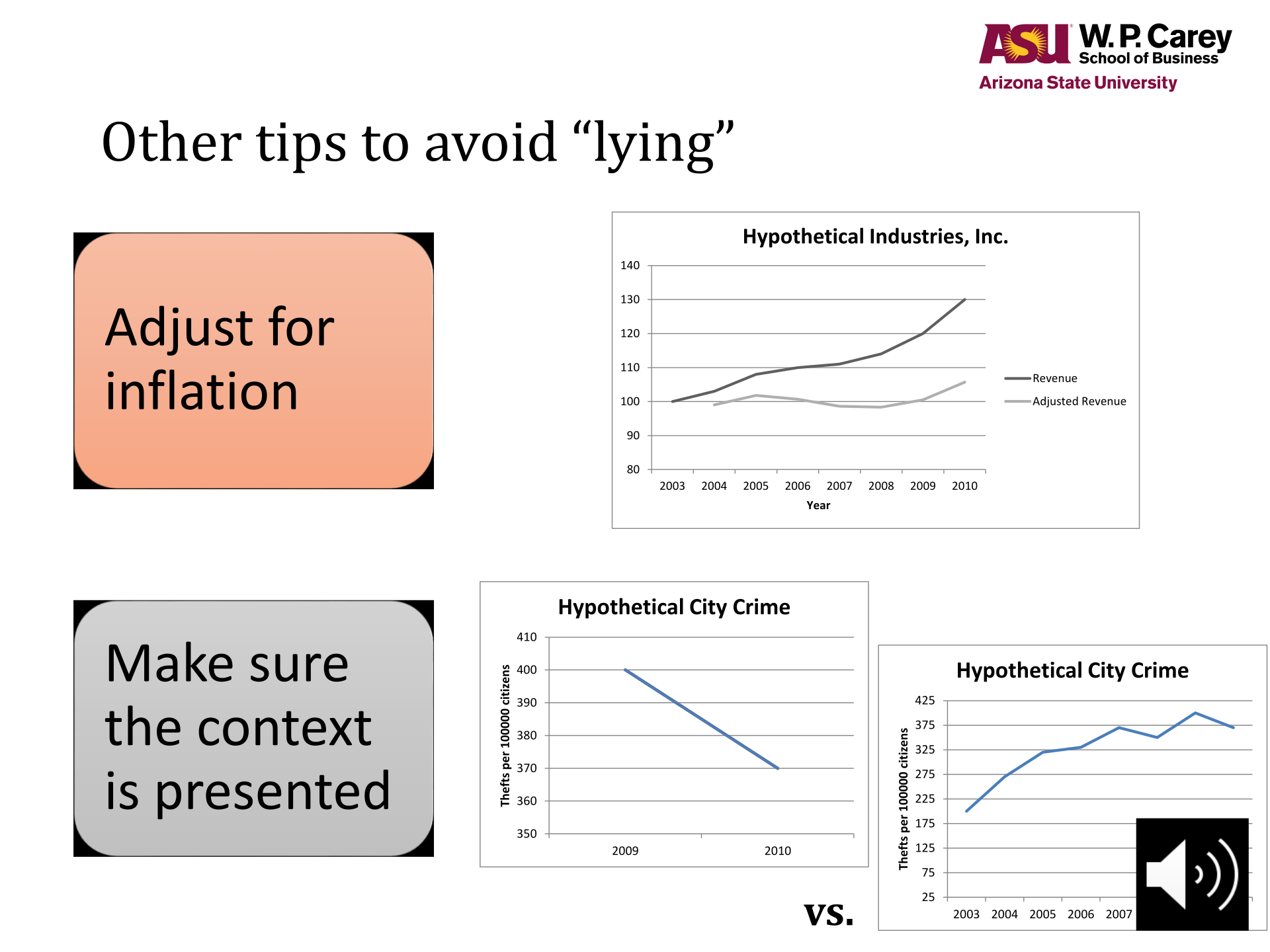
Other tips to avoid “lying”
Adjust for
inflation
Make sure
the context
is presented
80
90
100
110
120
130
140
2003 2004 2005 2006 2007 2008 2009 2010
Year
Hypothetical Industries, Inc.
Revenue
Adjusted Revenue
350
360
370
380
390
400
410
2009 2010
Thefts per 100000 citizens
Hypothetical City Crime
25
75
125
175
225
275
325
375
425
2003 2004 2005 2006 2007 2008 2009 2010
Thefts per 100000 citizens
Hypothetical City Crime
vs.
Powered by TCPDF (www.tcpdf.org)
Students also viewed