

sciology
 jackrose143
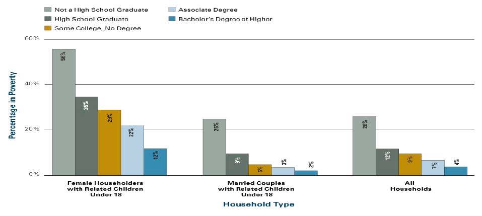
- First, in your introductory paragraph (5-7 sentences) describe the content of the chart using the displayed information. In other words, tell the reader what the chart is about.
- Second, review the data (statistics) of the chart and determine what specific “story” the chart is attempting to tell. In other words, detail for the reader what sociological theme (larger idea or concept discussed during the semester) is presented in the data of the chart and its relevance to society (5-7 sentences).
- Then, numerically (through calculations):
compare and contrast the two different types of households by education level- compare and contrast the two different types of households by poverty rates
compare and contrast poverty rates by education level
These calculations should be organized logically and using complete sentences in paragraph form.
- Next, employing applicable key terms and core concepts from the textbook provide a clear and concise explanation for several key findings (minimum of 4 of your calculations) displayed in the chart. In other words, explain how would sociologists explain the (plot line/action) the differences in education level and poverty levels between female-headed houses and marriage couple-headed households in the United States.
- Finally, provide a concise conclusion summarizing the main points of your analysis (5-7 sentences)
https://dcccd.blackboard.com/bbcswebdav/pid-12682400-dt-content-rid-95933685_1/xid-95933685_1

 8 years ago
 10
10
Answer(1)![blurred-text]()

Purchase the answer to view it

NOT RATED
 PovertyRates.docx
other Questions(10)
- Assignment 2: Mixed Methodology
- MGT 435 - Final Paper
- BUSA-202 Module 5 Test (2015)
- Space Age Furniture Company Case Study
- 2 page APA Summary of Chapter 1
- snack bar/ cafeteria style restaurants
- Harold and Mary are studying for a test. Haroldâs chances of getting a âBâ are 80%. Sharonâs chances of getting a âBâ...
- English paper
- History
- Ashford BUS 640 Week 3 DQ 2