

2 page paper
 ramzeecooper
I n
t r
o d
u c
t i
o n
t
o
D e s i g n , C o n t e x t , a n d M e a n i n g
E d i t o r - i n - C h i e f | P a m e l a J . S a c h a n t , P h . D .
P e g g y B l o o d , P h . D . | J e f f e r y L e M i e u x , M . F. A | R i t a Te k i p p e , P h . D .
ART
ARTI n t r o d u c t i o n t o D e s i g n , C o n t e x t , a n d M e a n i n g
E d i t o r - i n - C h i e f | P a m e l a J . S a c h a n t , P h . D .
P e g g y B l o o d , P h . D . | J e f f e r y L e M i e u x , M . F. A | R i t a Te k i p p e , P h . D .
Dahlonega, GA
Introduction to Art: Design, Context, and Meaning is licensed under a Creative Commons Attribution- ShareAlike 4.0 International License.
This license allows you to remix, tweak, and build upon this work, even commercially, as long as you credit this original source for the creation and license the new creation under identical terms.
If you reuse this content elsewhere, in order to comply with the attribution requirements of the license please attribute the original source to the University System of Georgia.
NOTE: The above copyright license which University System of Georgia uses for their original content does not extend to or include content which was accessed and incorporated, and which is licensed under various other CC Licenses, such as ND licenses. Nor does it extend to or include any Special Permissions which were granted to us by the rightsholders for our use of their content.
Image Disclaimer: All images and figures in this book are believed to be (after a reasonable investigation) either public domain or carry a compatible Creative Commons license. If you are the copyright owner of images in this book and you have not authorized the use of your work under these terms, please contact the University of North Georgia Press at [email protected] to have the content removed.
ISBN: 978-1-940771-29-8
Produced by: University System of Georgia
Published by: University of North Georgia Press Dahlonega, Georgia
Cover Art: The Burning of the Houses of Parliament (1834) by William Turner
Cover Design and Layout Design: Corey Parson
For more information, please visit http://ung.edu/university-press Or email [email protected]
Page | iii
TABLE OF CONTENTS
C h a p t e r O n e: Wh at i s a r t? 1 1.1 Learn ing Outcomes 1 1.2 Int r oduc t ion 1 1.3 What i s V i sua l A r t? 3 1.4 Who is Considered an Artist? What Does It Mean To Be An Artist? 8 1.5 The Ro le o f the V iewer 14 1.6 Why Do We Make A r t? 17 1.7 Concept s Exp lo r ed in L ate r Chapte r s 26 1.8 Be fo re You Move On 29 1.9 Key Te rms 30
C h a p t e r tW O: th e st r u C t u r e O f a r t 31 2.1 Learn ing Outcomes 31 2.2 Int r oduc t ion 31 2.3 A r t Spec i f i c Vocabu lar y 32 2.4 A r t Forms 32 2.5 Form and Compos i t i on 48 2.6 Be fo re You Move On 67 2.7 Key Te rms 68
C h a p t e r th r e e: si g n i f i C a n C e O f Mat e r i a l s u s e d i n a r t 77 3.1 Learn ing Outcomes 77 3.2 Int r oduc t ion 77 3.3 Ut i l i t y and Va lue o f Mate r ia l s 78 3.4 P r ec ious Mate r ia l s , Spo l ia, and Bor r owed G lo r y 82 3.5 L iqu idat ion o f Tr easures 87 3.6 Wood, In lay, and L acquer 88 3.7 Int r ins i c Va lues and Enhanced Wor th o f Meta l s 90 3.8 Rare Mate r ia l s and P roh ib i ted Uses 90 3.9 Mate r ia l Connotat ions o f C las s o r St at ion 91 3.10 Be fo re You Move On 91 3.11 Key Te rms 92
Page | iv
C h a p t e r fO u r: d e s C r i b i n g a r t 94 4.1 Learn ing Outcomes 94 4.2 Int r oduc t ion 94 4.3 Formal o r C r i t i c a l Ana lys i s 95 4.4 Types o f A r t 99 4.5 St y le s o f A r t 106 4.6 Be fo re You Move On 126 4.7 Key Te rms 127
C h a p t e r f i v e: Me a n i n g i n a r t 129 5.1 Learn ing Outcomes 129 5.2 Int r oduc t ion 129 5.3 Soc io -Cu l tura l Contex t s 129 5.4 Symbo l i sm and Iconography 141 5.5 Be fo re You Move On 155 5.6 Key Te rms 156
C h a p t e r si x: C O n n e C t i n g a r t t O O u r l i v e s 158 6.1 Learn ing Outcomes 158 6.2 Int r oduc t ion 158 6.3 Aes the t i c s 158 6.4 Express ion (Ph i l osoph ic a l , Po l i t i c a l , Re l ig ious, Pe r sona l) 161 6.5 Un i f i c a t ion/Exc lus ion 163 6.6 Communicat ion 166 6.7 P ro te s t and Shock 168 6.8 Ce lebrat ion and Commemorat ion 169 6.9 Wor sh ip 170 6.10 In fo rmat ion, Educat ion, and Insp i r a t ion 171 6.11 Be fo re You Move On 172 6.12 Key Te rms 173
C h a p t e r s e v e n: fO r M i n a r C h i t e C t u r e 175 7.1 Learn ing Outcomes 175 7.2 Int r oduc t ion 175 7.3 Res ident ia l Needs 176 7.4 Communi t y and Government 188 7.5 Commerce 192 7.6 Wor sh ip 195 7.7 Be fo re You Move On 207 7.8 Key Te rms 207
Page | v
C h a p t e r e i g h t: a r t a n d id e n t i t y 211 8.1 Learn ing Outcomes 211 8.2 Int r oduc t ion 211 8.3 Ind iv idua l vs Cu l tura l Groups 214 8.4 Be fo re You Move On 231 8.5 Key Te rms 232
C h a p t e r ni n e: a r t a n d pO W e r 233 9.1 Learn ing Outcomes 233 9.2 Int r oduc t ion 233 9.3 P ropaganda, Pe r suas ion, Po l i t i c s , and Power 235 9.4 Imager y O f War 238 9.5 Be fo re You Move On 250 9.6 Key Te rms 251
C h a p t e r 10: a r t a n d r i t u a l l i f e 253 10.1 Learn ing Outcomes 253 10.2 Int r oduc t ion 253 10.3 Ex te r io r R i tua l Spaces 253 10.4 The Sac red Inte r io r 256 10.5 Mask s and R i tua l Behav io r 269 10.6 Funerar y Spaces and Grave Goods 271 10.7 Be fo re You Move On 275 10.8 Key Te rms 277
C h a p t e r e l e v e n: a r t a n d et h i C s 279 11.1 Learn ing Outcomes 279 11.2 Int r oduc t ion 279 11.3 E th i c a l Cons ide rat ions in Mak ing and Us ing A r t 281 11.4 Censor sh ip 286 11.5 Ethical Cons iderat ions in the Col lec t ing and Disp lay of Ar t 288 11.6 Be fo re You Move On 291 11.7 Key Te rms 292
Page | 1
1What is Art?Jeffrey LeMieux and Pamela J. Sachant 1.1 LEARNING OUTCOMES
After completing this chapter, you should be able to: • Recognize various historical arguments about the definition of art and who is an artist. • Engage arguments that distinguish between art and craft. • Critically evaluate claims about whether an object is or is not art from multiple points
of view. • Engage questions about who is considered an artist and the role of the viewer. • Productively speculate about various reasons why people have made and continue to
make art. • Recognize your intuitive understanding of art, and potentially build a broader, more
comprehensive view of the nature and definition of visual art, one which incorporates historically and culturally diverse art objects and answers conceptual challenges.
1.2 INTRODUCTION We live in a rapidly changing world in which images play an important, even central, role. With
widespread use of personal electronics, we instantaneously deliver and receive sound, video, and text messages. Corporations and governments worldwide recognize the power of advertising. Art museums worldwide are putting large parts of their collections online. Today we are seeing the- ater-quality movies made with inexpensive equipment that was unavailable ten years ago. Selfies, personal video, and memes are everywhere. In 1968, artist Andy Warhol (1928-1967, USA) said, “In the future everyone will be world-famous for fifteen minutes.” (Self Portrait, Andy Warhol: http://art.newcity.com/wp-content/uploads/2011/05/Warhol_SelfPortrait.jpg) We are seeing that prediction come true with the advent of personal electronics that rival the sophistication of the most advanced professional studios of only twenty years ago. We are surrounded by images, but, for all of our clever technical abilities, the fundamental dynamics of visual art remain the same.
CHAPTER ONE: WHAT IS ART?
Page | 2
INTRODUCTION TO ART
Take a few minutes to look over the accom- panying image, Blind Homer and His Guide. (Figure 1.1) It was painted in 1875 by a leading member of the French École des Beaux Arts, or School of Fine Arts, William-Adolphe Bou- guereau (1825-1925, France), and serves as a good example of the kinds of paintings made in Europe during that time. We might wonder what a painting made more than 100 years ago in a for- eign country could have to do with us today.
The French Academic artist Bouguereau’s painting is more than a literal presentation of a forgotten moment in ancient history. The painting challenges viewers from every age to go deeper, to see the symbolism behind the histo- ry. Homer, who is thought to have lived around 1000 BCE, was the chief poet of the ancient Greeks. Ancient Greek ideas about social roles and the nature of virtue come to us in part from Homer’s epic poems the Illiad and the Odyssey. In Bouguereau’s painting, Homer symbolizes civilization and culture. Homer wanders blindly through a savage wilderness with only a youth to shelter him. In this way, Bouguereau implies that a wilderness can be not only physical but also cultural, and in that sense, all of us wander through a wilderness that threatens the human
spirit found in culture. His painting asks the question, “How are cultural values carried forward?” In Bouguereau’s work, the young man has taken responsibility for protecting Homer, who sym- bolizes the refined wisdom of the past and the foundation of western culture. This image is a call to the youth of Bouguereau’s generation (and to ours) to bring precious culture forward safely through an ever-threatening wilderness.
Wherever we find human beings, we find visual art. Works of visual art raise questions not on- ly about our ancestors, but also about the nature of visual art itself. What is art? Who is an artist? Why do artists make art? What is the role of the viewer? Does everything count as art? How have people defined art through time? How do we define art today?
In this chapter, we will examine these questions in more detail. The purpose of this exam- ination is twofold: to increase your awareness of the mechanics of those images and, thus, more effectively understand the visual art that we encounter in our daily lives. Images are powerful. Images are used in our culture in many ways, not all of them benign. When we enhance our visual literacy, we raise our awareness of the powerful images that surround us.
Figure 1.1 | Blind Homer with Guide Artist: Bouguereau Author: User “Thebrid” Source: Wikimedia Commons License: Public Domain
Page | 3
INTRODUCTION TO ART CHAPTER ONE: WHAT IS ART?
1.3 WHAT IS VISUAL ART? To explore a subject, we need first to define it. Defining art, however, proves elusive. You may
have heard it said (or even said it yourself) that “it might be art, but it’s not Art,” which means, “I might not know how to define it, but I know it when I see it.”
Everywhere we look, we see images designed to command our attention, including images of desire, images of power, religious images, images meant to recall memories, and images intended to manipulate our appetites. But are they art?
Some languages do not have a separate word for art. In those cultures, objects tend to be util- itarian in purpose but often include in their design the intent to delight, portray a special status, or commemorate an important event or ritual. Thus, while the objects are not considered art, they do have artistic functions.
1.3.1 Historic Development of the Idea of Art
The idea of art has developmentally progressed from human prehistory to the present day. Changes to the definition of art over time can be seen as attempts to resolve problems with earlier definitions. The ancient Greeks saw the goal of visual art as copying, or mimesis. Nineteenth-cen- tury art theorists promoted the idea that art is communication: it produces feelings in the viewer. In the early twentieth century, the idea of significant form, the quality shared by aesthetically pleasing objects, was proposed as a definition of art. Today, many artists and thinkers agree with the institutional theory of art, which shifts focus from the work of art itself to who has the power to decide what is and is not art. While this progression of definitions of art is not exhaustive, it is instructive.
1.3.1.1 Mimesis The ancient Greek definition of art
as mimesis, or imitation of the real world, appears in the myth of Zeux- is and Parhassios, rival painters from ancient Greece in the late fifth cen- tury BCE who competed for the title of greatest artist. (Figure 1.2) Zeuxis painted a bowl of grapes that was so lifelike that birds came down to peck at the image of fruit. Parhassios was unimpressed with this achievement. When viewing Parhassios’s work, Ze- uxis, on his part, asked that the cur- tain over the painting be drawn back so he could see his rival’s work more
Figure 1.2 | Zeuxis conceding defeat: “I have deceived the birds, but Parhassios has deceived Zeuxis.” Artist: Joachim von Sandrart; engraving by Johann Jakob von Sandrart Author: User “Fae” Source: Wikimedia Commons License: Public Domain
CHAPTER ONE: WHAT IS ART?
Page | 4
INTRODUCTION TO ART
clearly. Parhassios declared himself the victor because the curtain was the painting, and while Zeuxis fooled the birds with his work, Parhassios fooled a thinking human being—a much more difficult feat.
The ancient Greeks felt that the visual artist’s goal was to copy visual experience. This ap- proach appears in the realism of ancient Greek sculpture and pottery. We must sadly note that, due to the action of time and weather, no paintings from ancient Greek artists exist today. We can only surmise their quality based on tales such as that of Zeuxis and Parhassios, the obvious skill in ancient Greek sculpture, and in drawings that survive on ancient Greek pottery.
This definition of art as copy- ing reality has a problem, though. Jackson Pollock (1912-1956, USA), a leader in the New York School of the 1950’s, intentionally did not copy existing objects in his art. (Figure 1.3) While painting these works, Pollock and his fellow artists would consciously avoid making marks or passages that resembled recognizable objects. They succeeded at making art- work that did not copy anything, thus demonstrating that the an- cient Greek view of art as mime- sis—simple copying—does not suf- ficiently define art.
1.3.1.2 Communication A later attempt at defining art comes from the nineteenth-century Russian author Leo Tolstoy.
Tolstoy wrote on many subjects, and is the author of the great novel War and Peace (1869). He was also an art theorist. He proposed that art is the communication of feeling, stating, “Art is a human activity consisting in this, that one man consciously by means of certain external signs, hands on to others feelings he has lived through, and that others are infected by these feelings and also experience them.”1
This definition does not succeed because it is impossible to confirm that the feelings of the art- ist have been successfully conveyed to another person. Further, suppose an artist created a work of art that no one else ever saw. Since no feeling had been communicated through it, would it still be a work of art? The work did not “hand on to others” anything at all because it was never seen. Therefore, it would fail as art according to Tolstoy’s definition.
1 Leo Tolstoy, What is Art? And Essays on Art, trans. Aylmer Maude (London: Oxford University Press, 1932), 123.
Figure 1.3 | Left: The She-Wolf; Right: Gothic Artist: Jackson Pollock Author: Gorup de Besanez Source: Wikimedia Commons License: CC BY-SA 4.0
Page | 5
INTRODUCTION TO ART CHAPTER ONE: WHAT IS ART?
1.3.1.3 Significant Form To address these limitations of existing definitions of art, in 1913 English art critic Clive Bell
proposed that art is significant form, or the “quality that brings us aesthetic pleasure.” Bell stat- ed, “to appreciate a work of art we need bring with us nothing but a sense of form and colour.”2 In Bell’s view, the term “form” simply means line, shape, mass, as well as color. Significant form is the collection of those elements that rises to the level of your awareness and gives you noticeable pleasure in its beauty. Unfortunately, aesthetics, pleasure in the beauty and appreciation of art, are impossible to measure or reliably define. What brings aesthetic pleasure to one person may not affect another. Aesthetic pleasure exists only in the viewer, not in the object. Thus significant form is purely subjective. While Clive Bell did advance the debate about art by moving it away from requiring strict representation, his definition gets us no closer to understanding what does or does not qualify as an art object.
1.3.1.4 Artworld One definition of art widely held today was first promoted in the 1960s by American philoso-
phers George Dickie and Arthur Danto, and is called the institutional theory of art, or the “Art- world” theory. In the simplest version of this theory, art is an object or set of conditions that has been designated as art by a “person or persons acting on behalf of the artworld,” and the artworld is a “complex field of forces” that determine what is and is not art.3 Unfortunately, this definition gets us no further along because it is not about art at all! Instead, it is about who has the power to define art, which is a political issue, not an aesthetic one.
1.3.2 Definition of Art
We each perceive the world from our own position or per- spective and from that percep- tion we make a mental image of the world. Science is the process of turning perceptions into a coherent mental picture of the universe through testing and observation. (Figure 1.4) Sci- ence moves concepts from the world into the mind. Science is vitally important because it al- lows us to understand how the world works and to use that un- derstanding to make good pre- dictions. Art is the other side of 2 Clive Bell, “Art and Significant Form,” in Art (New York: Frederick A. Stokes Company, 1913), 2 3 George Dickie, Art and the Aesthetic: An Institutional Analysis (Ithaca, NY: Cornell University Press, 1974), 464.
Figure 1.4 | Perception: Art and Science Author: Jeffrey LeMieux Source: Original Work License: CC BY-SA 4.0
CHAPTER ONE: WHAT IS ART?
Page | 6
INTRODUCTION TO ART
our experience with the world. Art moves ideas from the mind into the world.
We need both art and science to exist in the world. From our earliest age, we both observe the world and do things to change it. We are all both scientists and artists. Every human activity has both a science (observation) and an art (expression) to it. Anyone who has participated in the disci- pline of Yoga, for example, can see that even something as simple as breathing has both an art and a science to it.
This definition of art covers the wide variety of objects that we see in museums, on social media, or even in our daily walk to work. But this definition of art is not enough. The bigger question is: what art is worthy of our attention, and how do we know when we have found it? Ultimately, each of us must answer that question for ourselves.
But we do have help if we want it. People who have made a disciplined study of art can offer ideas about what art is im- portant and why. In the course of this text, we will examine some of those ideas about art. Due to the importance of re- specting the individual, the decision about what art is best must belong to the individual. We ask only that the student understand the ideas as presented.
When challenged with a question or problem about what is best, we first ask, “What do I personally know about it?” When we realize our personal resources are limited, we might ask friends, neighbors, and relatives what they know. In addition to these important resources, the edu- cated person can refer to a larger body of possible solutions drawn from a study of the history of literature, philosophy, and art: What did the English poet Percy Bysshe Shelley say about truth in his essay Defense of Poetry (1840)? (Fig- ure 1.5) What did the French philosopher Jean-Jacques Rousseau claim about human nature in his treatise Emile or On Education (1762)? (Figure 1.6) What did Johannes Vermeer (1632-1675, Netherlands) show us about the quiet dignity of the domestic space in his painting Woman Hold- ing a Balance? (Figure 1.7) Through experiencing these works of art and literature, our ideas about such things can be tested and validated or found wanting.
We will examine works of visual art from a diverse range of cultures and periods. The challenge for you as the reader
Figure 1.5 | Portrait of Percy Bysshe Shelley Artist: Alfred Clint Author: User “Dcoetzee” Source: Wikimedia Commons License: Public Domain
Figure 1.6 | Portrait of Jean-Jacques Rousseau Artist: Maurice Quentin de La Tour Author: User “Maarten van Vliet” Source: Wikimedia Commons License: Public Domain
Page | 7
INTRODUCTION TO ART CHAPTER ONE: WHAT IS ART?
is to increase your ability to interpret works of art through the use of context, visual dynamics, and introspection, and to integrate them into a coher- ent worldview. The best outcome of an encounter with art is an awakening of the mind and spirit to a new point of view. A mind stretched beyond itself never returns to its original dimension.
1.3.3 The Distinction of Fine Art
From our definition of art proposed above, it would seem that craft and fine art are indistin- guishable as both come from the mind into the world. But the distinction between craft and art is real and important. This distinction is most com- monly understood as one based on the use or end purpose of an object, or as an effect of the ma- terial used. Clay, textiles, glass, and jewelry were long considered the province of craft, not art. If an object’s intended use was a part of daily living, then it was generally thought to be the product of craft, not fine art. But many objects originally intended to be functional, such as quilts, are now thought to qualify as fine art. (Figure 1.8)
So what could be the difference between art and craft? Anyone who has been exposed to training in a craft such as carpentry or plumbing recognizes that craft follows a formula, that is, a set of rules that govern not only how the work is to be conducted but also what the outcome of that work must be. The level of craft is judged by how closely the end product matches the pre-determined outcome. We want our houses to stand and water to flow when we turn on our faucets. Fine art, on the other hand, results from a free and open-ended exploration that does not depend on a pre-determined formula for its out- come or validity. Its outcome is surprising and original. Almost all fine art objects are a com- bination of some level both of craft and art. Art stands on craft, but goes beyond it.
Figure 1.7 | Woman Holding a Balance Artist: Johannes Vermeer Author: User “DcoetzeeBot” Source: Wikimedia Commons License: Public Domain
Figure 1.8 | Quilt Artist: Lucy Mingo Author: User “Billvolckening” Source: Wikimedia Commons License: CC BY-SA 4.0
CHAPTER ONE: WHAT IS ART?
Page | 8
INTRODUCTION TO ART
1.3.4 Why Art Matters
American physicist J. Robert Oppenheimer is considered a “father of the atomic bomb” for the role he played in de- veloping nuclear weapons as part of the Manhattan Project during World War II (1939-1945). (Figure 1.9) Upon comple- tion of the project, quoting from the Hindu epic tale Bhaga- vad Gita, he stated, “Now I am become Death, the destroyer of worlds.” Clearly, Oppenheimer had read more than physics texts in his education, which fit him well for his important role during World War II.
When we train in mathematics and the sciences, for ex- ample, we become very powerful. Power can be used well or badly. Where in our schools is the coursework on how to use power wisely? Today a liberal arts college education requires students to survey the arts and history of human cultures in order to examine a wide range of ideas about wisdom and to humanize the powerful. With that in mind, in every course taken in the university, it is hoped that you will recognize the need to couple your increasing intellectual power with a study of what is thought to be wisdom, and to view each educational experience in the humanities as part of the search for what is better in ourselves and our communities.
This text is not intended to determine what is or is not good art and why it matters. Rather, the point of this text is to equip you with intellectual tools that will enable you to analyze, decipher, and interpret works of art as bearers of meaning, to make your own decisions about the merit of those works, and then usefully to integrate those decisions into your daily lives.
1.4 WHO IS CONSIDERED AN ARTIST? WHAT DOES IT MEAN TO BE AN ARTIST?
In much of the world today, an artist is considered to be a person with the talent and the skills to conceptualize and make creative works. Such persons are singled out and prized for their ar- tistic and original ideas. Their art works can take many forms and fit into numerous categories, such as architecture, ceramics, digital art, drawings, mixed media, paintings, photographs, prints, sculpture, and textiles. Of greater importance, artists are the individuals who have the desire and ability to envision, design, and fabricate the images, objects, and structures we all encounter, use, occupy, and enjoy every day of our lives.
Today, as has been the case throughout history and across cultures, there are different titles for those who make and build. An artisan or craftsperson, for example, may produce decorative or utilitarian arts, such as quilts or baskets. Often, an artisan or craftsperson is a skilled worker, but not the inventor of the original idea or form. An artisan or craftsperson can also be someone
Figure 1.9 | J. Robert Oppenheimer Author: Los Alamos National Laboratory Source: Wikimedia Commons License: Public Domain
Page | 9
INTRODUCTION TO ART CHAPTER ONE: WHAT IS ART?
who creates their own designs, but does not work in art forms or with materials traditionally asso- ciated with the so-called Fine Arts, such as painting and sculpture. A craftsperson might instead fashion jewelry, forge iron, or blow glass into patterns and objects of their own devising. Such inventive and skilled pieces are often categorized today as Fine Craft or Craft Art.
In many cultures throughout much of history, those who produced, embellished, painted, and built were not considered to be artists as we think of them now. They were artisans and craftspeople, and their role was to make the objects and build the structures for which they were hired, according to the design (their own or another’s) agreed upon with those for whom they were working. That is not to say they were untrained. In Medieval Europe, or the Middle Ages (fifth-fifteenth centuries), for example, an artisan generally began around the age of twelve as an apprentice, that is, a student who learned all aspects of a profession from a master who had their own workshop. Apprenticeships lasted five to nine years or more, and included learning trades ranging from painting to baking, and masonry to candle making. At the end of that period, an apprentice became a journeyman and was allowed to become a member of the craft guild that su- pervised training and standards for those working in that trade. To achieve full status in the guild, a journeyman had to complete their “masterpiece,” demonstrating sufficient skill and craftsman- ship to be named a master.
We have little information about how artists trained in numerous other time peri- ods and cultures, but we can gain some un- derstanding of what it meant to be an artist by looking at examples of art work that were produced. Seated Statue of Gudea depicts the ruler of the state of Lagash in Southern Mesopotamia, today Iraq, during his reign, c. 2144-2124 BCE. (Figure 1.10)
Gudea is known for building temples, many in the kingdom’s main city of Girsu (today Telloh, Iraq), with statues portraying himself in them. In these works, he is seat- ed or standing with wide, staring eyes but otherwise a calm expression on his face and his hands folded in a gesture of prayer and greeting. Many of the statues, including the one pictured here, are carved from diorite, a very hard stone favored by rulers in ancient Egypt and the Near East for its rarity and the fine lines that can be cut into it. The ability to cut such precise lines allowed the craftsper- son who carved this work to distinguish be- tween and emphasize each finger in Gudea’s
Figure 1.10 | Gudea Source: Met Museum License: OASC
CHAPTER ONE: WHAT IS ART?
Page | 10
INTRODUCTION TO ART
clasped hands as well as the circular patterns on his stylized shepherd’s hat, both of which indi- cate the leader’s dedication to the well-being and safety of his people.
Although the sculpture of Gudea was clearly carved by a skilled artisan, we have no record of that person, or of the vast majority of the artisans and builders who worked in the ancient world. Who they worked for and what they created are the records of their lives and artistry. Artisans were not valued for taking an original approach and setting themselves apart when creating a statue of a ruler such as Gudea: their success was based on their ability to work within standards of how the human form was depicted and specifically how a leader should look within that culture at that time. The large, almond-shaped eyes and compact, block-like shape of the figure, for ex- ample, are typical of sculpture from that period. This sculpture is not intended to be an individual likeness of Gudea; rather, it is a depiction of the characteristic features, pose, and proportions found in all art of that time and place.
Objects made out of clay were far more common in the ancient world than those made of met- al or stone, such as the Seated Statue of Gudea, which were far more costly, time-consuming, and difficult to make. Human figures modeled in clay dating back as far as 29,000-25,000 BCE have been found in Europe, and the earliest known pottery, found in Jiangxi Province, China, dates to c. 18,000 BCE. Vessels made of clay and baked in ovens were first made in the Near East c. 8,000 BCE, nearly 6,000 years before the Seated Statue of Gudea was carved. Ceramic (clay hardened by heat) pots were used for storage and numerous everyday needs. They were utilitarian objects made by anonymous artisans.
Among the ancient Greeks, however, pottery rose to the level of an art form. But, the status of the individuals who cre- ated and painted the pots did not. Although their work may have been sought after, these potters and painters were still considered artisans. The origins of pottery that can be de- scribed as distinctively Greek dates to c. 1,000 BCE, in what is known as the Proto-geometric period. Over the next several hundred years, the shapes of the vessels and the types of deco- rative motifs and subjects painted on them became associated with the city where they were produced, and then specifically with the individuals who made and decorated the pots. The types of pots signed by the potter and the painter were general- ly large, elaborately decorated or otherwise specialized vessels that were used for ritual or ceremonial purposes.
That is the case with the Panathenaic Prize Amphora, 363-362 BCE, signed by Nikodemos, the potter, and attributed to the Painter of the Wedding Procession, whose name is not known but is identified through similarities to other painted pots. (Figure 1.11) The Panathenaia was a festival held every four years in honor of Athena, the patron goddess of Athens, Greece, who is depicted on the amphora, a tall, two-handled
Figure 1.11 | Panathenaic Prize Amphora with Lid Artist: Nikodemos Source: The J. Paul Getty Museum License: Open Content
Page | 11
INTRODUCTION TO ART CHAPTER ONE: WHAT IS ART?
jar with a narrow neck. On the other side of the storage jar, Nike, the goddess of victory, crowns the winner of the boxing competition for which this pot—containing precious olive oil from Athena’s sa- cred trees—was awarded by the city of Athens. Only the best potters and painters were hired to make pots that were part of such an important ceremony and holding such a significant prize. While the vast majority of artisans never identified themselves on their work, these noteworthy individuals were set apart and acknowledged by name. The makers’ signatures demonstrated the city’s desire to give an award of the highest quality; they acted as promotion for the potter and painter at that time, and they have immortalized them since. It must not be forgotten, however, that the prize inside the pot was considered far more important than the vessel or the skilled artisans who created it.
China was united and ruled by Mongols from the north, first under Kublai Kahn, in the period known as the Yuan Dynasty (1271-1368). The hand scroll painting Pear Blossoms was created with ink and colors on paper around 1280 by Qian Xuan (c. 1235-before 1307, China). (Figure 1.12) After the establishment of the Mongolian government, Qian Xuan abandoned his goal of obtaining a po- sition as a scholar-official, as the highly educated bureaucrats who governed China were known, and turned to painting. He was part of a group of artists known as scholar-painters, or literati. The work of scholar-painters was desirable to many admirers of art because it was considered more personal, expressive, and spontaneous than the uniform and realistic paintings by professional, trained art- ists. The scholar-painters’ sophisticated and deep knowledge of philosophy, culture, and the arts— including calligraphy—made them welcome among fellow scholars and at court. They were part of the elite class of leaders, who followed the long and noble traditions within Confucian teachings of expressing oneself with wisdom and grace, especially in the art of poetry.
Figure 1.12 | Pear Blossoms Artist: Qian Xuan Source: Met Museum License: OASC
CHAPTER ONE: WHAT IS ART?
Page | 12
INTRODUCTION TO ART
Qian Xuan was one of the first scholar-painters to unite painting and poetry, as he does in Pear Blossoms:
All alone by the veranda railing, teardrops drenching the branches, Although her face is unadorned, her old charms remain; Behind the locked gate, on a rainy night, how she is filled with sadness. How differently she looked bathed in golden waves of moonlight, before the darkness fell.
The poem is not meant to illustrate or describe his paint- ing of the branch with its delicate, young foliage and flow- ers; rather, the swaying, irregular lines of the leaves and the gently unfurling curves of the blossoms are meant to suggest comparisons to how quickly time passes—delicate blooms will soon fade—and evoke memories of times past.
In thirteenth-century China, as has been the case throughout much of that country’s history, the significance of a painting is closely associated with the identity of the artist, and with the scholars and collectors who owned the work over subsequent centuries. Their identities are known by the seals, or stamps in red acting as a signature, each added to the work of art. Specific subjects and how they were depicted were associated with the artist, and often referred back to in later works by other artists as a sign of respect and acknowledgment of the earlier master’s skill and expertise. In Pear Blossoms, as was often the case, the poem, and the calligraphy in which the artist wrote it, were part of the original composition of the entire painted scroll. The seals appended and notes written by later scholars and collectors continued adding to the composition, and its beauty and meaning, over the next seven hundred years.
When James Abbott McNeill Whistler (1834-1903, USA, lived England) painted Arrangement in Flesh Co- lour and Black, Portrait of Theodore Duret in 1883, he was making references back to the makers’ marks Chinese and Japanese potters used as signatures on their ceramics in the monogram he adopted for his work: a stylized design of a butterfly based on his initials. (Figure 1.13) Whistler began
Figure 1.13 | Arrangement in Flesh Colour and Black: Portrait of Theodore Duret Artist: James Abbott McNeill Whistler Source: Met Museum License: OASC
Page | 13
INTRODUCTION TO ART CHAPTER ONE: WHAT IS ART?
signing his work with the recognizable but altered figure of a butterfly, which often appeared to be dancing, in the 1860s. He had begun collecting Japanese porcelain and prints, and was tremendously influenced by their colors, patterns, and compositions, which reflected Jap- anese principles of beauty in art, including elegant sim- plicity, tranquility, subtlety, naturalness, understated beauty, and asymmetry or irregularity.
Whistler was among numerous American and Eu- ropean artists in the second half of the nineteenth cen- tury who felt compelled to break away from what they believed were the inhibiting constraints in how and what art students were taught and in the system of tra- ditional art exhibitions. For Whistler and others, such restrictions were intolerable; as artists, they must be allowed to freely follow their own creative voices and pursuits. In adopting Japanese principles of beauty in art, Whistler could pursue what he called “Art for art’s sake.” That is, he could create art that served no other purpose than to express what he, as the artist, found to be elevating, harmonious, and pleasing to the eye, the mind, and the soul:
Art should be independent of all claptrap—should stand alone, and appeal to the artistic sense of eye or ear, without confounding this with emotions entirely foreign to it, as devotion, pity, love, patriotism, and the like. All these have no kind of concern with it; and that is why I insist on calling my works “arrangements” and “harmonies.”4
Setting the artist apart in this way, as someone with special qualifications and sensibilities at odds with the prevailing cultural and intellectual standards, was far from the role played by a scholar-paint- er such as Qian Xuan in thirteenth-century China. The work Qian Xuan created was in accord with prevailing standards, while Whistler often thought of himself and his art as conflicting with the con- ventions of his day. Continuing one notion or categorization of the artist that had been present in Europe since the sixteenth century (and, later, the United States), Whistler was the singular, creative genius, whose art was often misunderstood and not necessarily accepted.
That was indeed the case. In 1878, Whistler won a lawsuit for libel against the art critic John Ruskin, who described Whistler’s 1875 painting, Nocturne in Black and Gold: The Falling Rocket, as “flinging a pot of paint in the public’s face.” (Figure 1.14) By around 1880, in the aftermath of that ran- corous proceeding, Whistler often added a long stinger to his butterfly monogram, symbolizing both the gentle beauty of his art as well as the forceful, at times stinging, nature of his personality. 4 James Abbott McNeill Whistler, The Gentle Art of Making Enemies (New York: Frederick Stokes & Brother, 1908), www. gutenberg.org/files/24650/24650-h/24650-h.htm
Figure 1.14 | Nocturne in Black and Gold: The Falling Rocket Artist: James Abbott McNeill Whistler Source: Wikimedia Commons License: Public Domain
CHAPTER ONE: WHAT IS ART?
Page | 14
INTRODUCTION TO ART
1.5 THE ROLE OF THE VIEWER An artist or craftsperson has an audience in mind when creating a work of art. Sometimes the
audience is the artist. Most of the time, however, the audience—the viewer—is someone else. It may be an individual or a group of people the artist personally knows, or people the artist knows will be viewing the work in a specific context or with a certain purpose. The artist may also consid- er what meaning or impact the work of art will have for people who view it at an unknown time or place in the future, perhaps with little information about the artist or the work itself. Or, the artist may feel the need or desire to express an emotion and have no concern for how the viewer will react to the work, or even if the viewer will understand the work and why it was created.
As the viewer of a work of art, then, we are often aware that we do not have full knowledge of what the artist intended or, at times, even what the artist depicted. Not having that information, however, is not necessarily frustrating nor does it dampen our enjoyment of the piece. Instead, we may find the colors vibrant, or the subject intriguing, or the composition relaxing; in other words, we may simply enjoy looking at the work of art without feeling the need for particulars about it or the artist. But, there are other times when it is helpful to have some information about the artist or artwork for us to better understand and appreciate what we are looking at.
Sites exist around the world where images were painted or inscribed on cave walls during the Upper Paleolithic Period, c. 40,000-12,000 BCE. The majority of the images are of animals, but outlines of hands, human figures, instruments such as bows and arrows, and designs such as spoked wheels or parallel lines can also be found. They possess a number of notable features, including the fact that these images were painted over tens of thousands of years on every conti- nent except Antarctica. Despite signif- icant differences, the types of subjects depicted during all that time and in all those places are remarkably sim- ilar. But, as they were made during the pre-historic period, that is, before humans kept written records, all we know about them is what we can in- terpret by looking at the images them- selves and by studying other objects we have found from the same places and time periods.
Scholars have put forth numerous ideas about why the images were made and what they could mean. The ani- mals depicted include horses, bulls, bison, and deer, all of which were hunted during that span of approxi- mately 30,000 years. For that reason,
Figure 1.15 | Replica of the Pech-Merle de Cabrerets Cave painting Author: User “HTO” Source: Wikimedia Commons License: Public Domain
Page | 15
INTRODUCTION TO ART CHAPTER ONE: WHAT IS ART?
some scholars hypothesize the paintings acted as a form of sympathetic magic, expressing the hope or giving thanks for a successful hunt by depicting the animals hunted. If the imag- es were associated with such activities, crucial for the survival of those who created them, then their makers, as scholars further spec- ulate, were shamans, or spiritual leaders of the group. A shaman is an individual with the power to interact with the physical world and the otherworld of spirits in order to maintain harmony between the two, predict the future, cast spells, and cure the sick.
Venturing into a cave, where all light from the outside world quickly disappears, is akin to a journey into another realm of existence. The im- ages painted, seen only by fire, would have flickered and danced on the walls as if they depicted visitors from another world. We do not know who saw the paintings other than those who created them, but in the Panel of Spotted Horses within the Chapel of Bison in the Pech-Merle de Cabrerets Cave, France, the handprints also present are evidence that there were others who viewed them. (Figure 1.15) The prints were made by placing a hand on the wall and blowing paint around it, perhaps through a hol-
low, reed-like object. Are they meant to identify or document those who were present, to indicate their hoped-for powers as hunters or their inclu- sion as part of a shamanistic experience? We do not know, but even with the little information we have as viewers today, we can nevertheless enjoy the painting’s beauty and mystery.
A labyrinth, or maze, such as the one in the floor of the nave of Chartres Cathedral (1194- 1250), France, is another example of an image or object found in a number of places, but about which we have little information. (Figure 1.16) A labyrinth is similar to a maze but generally has only one intricate and twisting path to the center. (Figure 1.17) There are labyrinths in the floors of numerous medieval Gothic cathedrals in Europe that were built in the twelfth to fif- teenth centuries. The labyrinth at Chartres Ca- thedral was built in the thirteenth century and, at 42.3 feet in diameter, it fills the width of the
Figure 1.17 | Diagram of the Labyrinth of Chartres Cathedral Author: User “Ssolbergj” Source: Wikimedia Commons License: CC BY-SA 3.0
Figure 1.16 | Labyrinth at Chartres Cathedral Author: User “Maksim” Source: Wikimedia Commons License: CC BY-SA 3.0
CHAPTER ONE: WHAT IS ART?
Page | 16
INTRODUCTION TO ART
nave, or central area of a church. While there is documentation that clergy performed dances during Easter celebrations upon labyrinths found in other cathedrals in France, no such records exist regarding Chartres. What it does seem to have in common with other labyrinths, however, is being used as a path to circumambulate, or walk, by visitors to the church who were on a pilgrimage or journey of faith. As was true of many Gothic churches, Chartres Cathedral held a relic, an object thought to have belonged to or been part of a holy person’s body, in this case, a garment believed to be the tunic worn by the Virgin Mary when she gave birth. Pilgrims traveled to Chartres to venerate this relic as a demonstration of their religious devotion. While there, pilgrims and other visitors might follow the stones of the labyrinth while in prayer or a state of meditation; the inevitable outcome of the complex and turning path leading to the center mirrors the certainty that prayer will lead the believer to God. The repetitive and focused movement of walking while ab- sorbed in prayer enhanced the devotional experience for the worshiper—who was also the viewer of the labyrinth—on both a physical and a spiritual level.
John Haberle (1856-1933, USA) was a painter who was born and spent most of his life in New Haven, Connecticut. He was well known for his trompe l’oeil works such as A Bachelor’s Drawer: paintings that were so realistic they “fooled the eye.” (Figure 1.18) Precisely rendering objects on a two-dimensional surface as if they were in three-dimensional space, he was able to create an illusion of reality that was meant to draw in his viewers, who were briefly unaware of the trick he was playing upon them. Quickly recognizing the painting was in truth an uncannily accurate semblance of actual objects, the viewer then became a participant in the artist’s game of deception.
Figure 1.18 | A Bachelor’s Drawer Artist: John Haberle Source: Met Museum License: OASC
Page | 17
INTRODUCTION TO ART CHAPTER ONE: WHAT IS ART?
The various objects in A Bachelor’s Drawer, including photographs, paper currency, theater ticket stubs, newspaper clippings, a thermometer, and a hair comb, that appear to be haphazardly fixed to a wooden drawer front are visually interesting because they are so life-like. Once the viewer shifts focus to look at these everyday and commonplace items—the sorts of things you take out of your pocket at the end of the day, often intending to throw them away—and think about what they are, we also won- der what they might mean. And, that is exactly what Haberle intended his viewers to do.
The artist even rewards his viewers for their close attention to the many details in his painting by placing some important ones in the center: several fragments of newspaper articles, including one stating, “A New Haven artist has plunged himself into trouble by making too perfect greenbacks in oil.” Viewers who knew Haberle’s work would probably have been aware the statement was true. Haberle frequently depicted paper currency in his paintings, in spite of having been warned to stop doing so by the U.S. Secret Service, which was formed in 1865 to stop the distribution of counterfeit money. Those who appreciated his work knew Haberle took pleasure in making it clear he was ignoring that demand.
A Bachelor’s Drawer, painted 1890-1894, would turn out to be the artist’s last trompe l’oeil paint- ing of currency, though, as the exacting work had strained his eyes to the point that he could no lon- ger paint such fine detail. Some of the other objects Haberle included, and the title of the work itself, seem to be referring to the end of an era. The pamphlet titled “How to Name the Baby,” prominently displayed in the upper right, partially covers the postcard showing a finely-dressed dandy with his dashing moustache that is placed directly above a discreetly covered photograph of a nude woman. They all lead down to a small photograph that appears to be stuck in the bottom (painted) frame, which is a portrait of the artist. Was he the bachelor who once had the freedom to attend the theatre, but is now taking up the life of a young father? This trail of clues is typical of the dry humor in Haber- le’s work, here turned on himself, with an open invitation for his viewers to share the joke with him.
1.6 WHY DO WE MAKE ART? Some of the earliest evidence of recog-
nizable human activity includes not only practical things like stone tools and fire pits, but also decorative objects used for personal adornment. For example, these small beads made by piercing sea snail shells, found at the Blombos Cave on the southeastern coast of South Africa, are dated to the Mid- dle Stone Age, 101,000-70,000 BCE. (Fig- ure 1.19) We can only speculate about the intentions of our distant ancestors, but it is clear that their lives included the practice of conceiving and producing art objects. One thing we appear to share with those distant relatives is the urge to make art.
Figure 1.19 | Blombos Cave Nassarius kraussianus marine shell beads and reconstruction of bead stringing Author: Marian Vanhaeren and Christopher S. Henshilwood Source: Wikimedia Commons License: CC BY-SA 3.0
CHAPTER ONE: WHAT IS ART?
Page | 18
INTRODUCTION TO ART
A culture can be defined as a group of peo- ple who agree about what is important. Today many different human cultures and sub-cul- tures co-exist; we can find in them a broad range of ideas about art and its place in daily living. One main goal of Australian Aborigi- nal artists, for example, is to “map” the world around them. (Figure 1.20) In this painting on bark, pictorial symbols tell the story of the great hunter snake in colors such as red for desert sand and yellow for the sun. (Figure 1.21) In a similar way, though with different materials, Buddhist sand paintings known as mandalas present a map of the cosmos. These circular diagrams also represent the re- lationship of the individual to the whole and levels of human awareness. (Figure 1.22)
The need to make art can be divided into two broad categories: the personal need to express ideas and feelings, and the community’s needs to assert common values. In the following sections, we’ll look at some of these motivations to more clearly understand and identify artist intent in the works of art that we encounter.
Figure 1.20 | Australian Aboriginal “Map” Symbols Author: Jeffrey LeMieux Source: Original Work License: CC BY-SA 4.0
Figure 1.21 | Sand Painting Author: Sailko Source: Wikimedia Commons License: CC BY-SA 3.0
Figure 1.22 | Wheel of Time Kalachakra Sand Mandala Artist: Losang Samten Author: Steve Osborne Source: Wikimedia Commons License: CC BY-SA 3.0
Page | 19
INTRODUCTION TO ART CHAPTER ONE: WHAT IS ART?
We should recognize that every person has lived a unique life, so every person knows some- thing about the world that no one else has seen. It is the job of artists today to tell us about what they have come to know—individually or as part their community—using the art material or medium most suited to their abilities. While copying the works of others is good training, it is merely re-working what has already been revealed. Originality, however, is more highly valued in con- temporary art. Georgia O’Keeffe (1887-1986, USA) explained her view on this matter when she wrote: (Figure 1.23)
It was in the fall of 1915 that I first had the idea that what I had been taught was of little value to me except for the use of my materials as a language—charcoal, pencil, pen and ink, wa- tercolor, pastel, and oil. I had become fluent with them when I was so young that they were simply another language that I handled easily. But what to say with them? I had been taught to work like others, and after careful thinking I decided that I wasn’t going to spend my life doing what had already been done. . . . I de- cided I was a very stupid fool for not to at last paint as I wanted to and say what I wanted to when I painted.5
1.6.1 The Personal Need to Create
Many works of art come out of a personal decision to put a feeling, idea, or concept into visual form. Since feelings vary widely, the resulting art takes a wide range of forms. This ap- proach to art comes from the individual’s delight in the experience. Doodling comes to mind as one very basic example of such delight. Pollock’s Abstract Expressionist works, also known as action paintings, are much more than doodles, though they may resemble such on the surface. (Autumn Rhythm-Number 30, Jackson Pollock: http://www.metmuseum.org/art/collection/ search/488978?=&imgno=0&tabname=online-resources; Number 10, Jackson Pollock: http:// www.wikiart.org/en/jackson-pollock/number-10-1949) They were the result of many levels of ar- tistic thought but on a basic level were a combination of delight in the act of painting and in the personal discovery that act enabled.
Some art is intended to provide personal commentary. Artworks that illustrate a personal viewpoint or experience can fulfill this purpose. Persepolis, a graphic novel by Marjane Satrapi (b. 1969, Iran) published in 2000, recounts her experiences and thoughts during the 1979 Iranian revolution, and
5 O’Keeffe 1976, unpaginated.
Figure 1.23 | Series 1, No. 8 Artist: Georgia O’Keeffe Author: User “Prosfilaes” Source: Wikimedia Commons License: Public Domain
CHAPTER ONE: WHAT IS ART?
Page | 20
INTRODUCTION TO ART
is an example of such personal commentary. (Keys to Paradise: https://imaginedlandscapes. files.wordpress.com/2014/02/ pi-102.jpg) Satrapi is a leading proponent of the graphic novel, a new approach to art making. In an ironic critique of how different parts of Iranian society were affected by war, Satrapi compares the contorted figures of Iranian youth dying in a combat zone explosion with the dance movements at her high school celebration.
Artworks can be created thus as a means of exploring one’s own experience, a way of bring- ing hidden emotions to the surface so that they may be recognized and understood more clearly. The term for this process is catharsis.
Cathartic works of art can arise from perceptions of grief, good, evil, or injustice, as in The Raft of the Medusa by Théodore Géricault (1791-1824, France), which was an indictment of the French government of his day following the sinking of a ship. (Figure 1.24) When Whistler, on the other hand, became a proponent of “Art for art’s sake,” he was rejecting outside influences such as contemporary artistic and social standards in order to “purify” art of external corruption. (see Figure 1.18) The idea of removing influence from the creation of art is a modern one. Much of the art made before the nineteenth century was produced with the support and under the direction of religious, political, and cultural authorities in the larger community.
1.6.2 Communal Needs and Purposes
Across history and geography, we see religious and political communities that remain stable despite constant pressure from both internal and external sources. One way in which communi- ties maintain stability is in the production of works of art that identify common values and expe- riences within that community and thus bring people together.
Architecture, monuments, murals, and icons are visible guides to community participation in the arts and often use image-making conventions. A convention is an agreed upon way of think- ing, speaking, or acting in a social context. There are many kinds of conventions, including visual conventions. A good example in visual art would be a conventional sense of direction. In Western cultures, text is generally read left to right. Therefore, when they look at artwork, Western viewers tend to “enter” a picture on the upper left and proceed to the right. Objects that appear on the left
Figure 1.24 | The Raft of the Medusa Artist: Jean Louis Théodore Géricault Source: Wikimedia Commons License: Public Domain
Page | 21
INTRODUCTION TO ART CHAPTER ONE: WHAT IS ART?
side of an image are thought to be “first,” while ones that ap- pear on the right are thought to be “later.” Since Asian texts follow a different convention, and tend to be read right to left, an Asian viewer would uncon- sciously assume the opposite.
Architecture, especially of public buildings, is an expres- sion of a community’s values. Courthouses, libraries, town halls, schools, banks, facto- ries, and jails are all designed for community purposes, and their shapes become strongly associated with their function: the architectural shapes be- come conventions. The use of older styles of architecture can be as references to the values of pre- vious cultures. In the United States, for example, many government buildings are designed with imposing stone facades using classical Greek and Roman columns that symbolize strength and stability. Federal government buildings such as the United States Capitol and the Supreme Court (Figure 1.25) were designed so that the community would associate ancient Greek and Roman ideals of virtue and integrity with the activities inside those more modern buildings.
Many twentieth-century archi- tects, however, have followed the guiding principle of American ar- chitect Louis Sullivan (1856-1924, USA), that “form follows function.” In his design of the Bauhaus, Wal- ter Gropius (1883-1969, Germany) rejected superfluous decoration and focused instead on the efficient and functional use of space and materi- al. (Figure 1.26) The leading school of art, craft, and architecture in Ger- many from 1919-1933, the teachings of the Bauhaus, or “construction house,” have strongly influenced do- mestic and industrial design inter- nationally since that time.
Figure 1.25 | U.S. Supreme Court Building Photographer: US Government Employee Source: Architect of the Capital License: Public Domain
Figure 1.26 | The Bauhaus Building in Dessau, Germany Author: User “Mewes” Source: Wikimedia Commons License: Public Domain
CHAPTER ONE: WHAT IS ART?
Page | 22
INTRODUCTION TO ART
Communities can remind citizens of pub- lic virtues by commemorating the individuals who displayed those qualities in monuments. Since ancient times, they have commonly been statues of such individuals placed on pedestals, columns, or inside architecture. The Equestri- an Statue of Bartolomeo Colleoni by Andrea del Verrocchio (1435-1488, Italy) is a good ex- ample of this type of monument. (Figure 1.27) Created for the city of Venice, Italy, during the Italian Renaissance, the sculpture of Colleoni on horseback shows him as the bold and victo- rious warrior he was. But The Burghers of Cal- ais by Auguste Rodin (1840-1917, France) and Vietnam War Memorial by Maya Lin (b. 1959, USA) are monuments that violate that long- standing norm. Rodin placed the burghers, or leading citizens, on ground level to humanize the six men who offered themselves as sac- rifices to save their city; he did so in order to bring their internal struggles down to the view- er’s eye level. (Figure 1.28) Lin’s memorial is below ground level, and displays the names of the approximately 58,000 Americans who died in the Vietnam War. (Figure 1.29) These choic- es reflect the belief that the Vietnam War was initially conducted “beneath the surface,” that is, unknown to most Americans, and to remind visitors that its cost was paid by real individu- als, not anonymous soldiers. These two works of art are unconventional and original in their conception and execution.
Since ancient times, murals, paintings on walls, have been created in both public and pri- vate places. Ancient Egyptians combined imag- es with writing in wall paintings to commem- orate past leaders. Some of these murals were intentionally erased when the leader fell out of favor. Roman murals were more often found inside homes and temples. The Roman mural located in a bedroom of the Villa of P. Fannius
Figure 1.28 | Burghers of Calais Artist: Auguste Rodin Author: User “Razimantv” Source: Wikimedia Commons License: CC BY 3.0
Figure 1.27 | Colleoni on Horseback Artist: Andrea del Verrocchio Author: User “Waysider1925” Source: Wikimedia Commons License: CC BY-SA 3.0
Page | 23
INTRODUCTION TO ART CHAPTER ONE: WHAT IS ART?
Synistor was unearthed in Pompeii, Italy. (Figure 1.30) It depicts landscape and ar- chitectural views between a row of (paint- ed) columns, as if viewed from inside the villa, or country house.
The Last Supper by Leonardo da Vinci (1452-1519, Italy, France) and the Sistine Chapel ceiling by Michelangelo (1475- 1564, Italy) are murals from the Italian Renaissance. They were created for a wall in a refectory, or dining hall, of a mon- astery (Figure 1.31) and for the ceiling of the Pope’s chapel. (Figure 1.32) Both de- pict crucial scenes in the teachings of the Catholic Church, the leading European religious and political organization of the time. Because many people at the time were illiterate, images played an important role in educat- ing them about their religious history and doctrines.
More modern examples of mu- rals can be found around the world today. Diego Rivera (1886-1967, Mexico) was a world-renowned artist who executed large-scale murals in Mexico and the United States. His Detroit Industry mu- rals consist of twenty-seven panels originally installed at the Detroit Institute of Arts. (Figure 1.33) The two largest panels depict workers manufacturing a V8 engine at the Ford Motor Company factory. Oth- er smaller panels show advances in science, technology, and medicine involved in modern industrial cul- ture, portraying Rivera’s belief that conceptual thinking and physical labor are interdependent. These works are now considered a Na- tional Landmark. The Great Wall of Los Angeles designed by Judith Baca (b. 1946, USA) and executed
Figure 1.29 | Vietnam Veterans Memorial Wall Artist: Maya Lin Author: User “Mariordo” Source: Wikimedia Commons License: CC BY-SA 3.0
Figure 1.30 | Cubiculum (bedroom) from the Villa of P. Fannius Synistor at Boscoreale Author: Rogers Fund Source: Met Museum License: OASC
CHAPTER ONE: WHAT IS ART?
Page | 24
INTRODUCTION TO ART
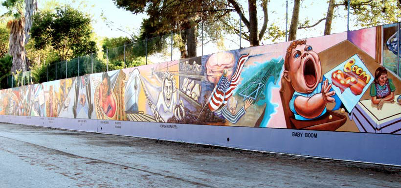
by hundreds of community mem- bers is thirteen feet high and runs for more than one half mile through the city. (The Great Wall of Los An- geles, Judith Baca: http://sparcinla. org/wp-content/uploads/2012/12/ great-wall_m.jpg) Its subject is the history of Southern California “as seen through the eyes of women and minorities.”6 The mural is part of a larger push in Los Angeles to adorn public spaces with murals that in- form and educate the populace.
The term icon comes from the Greek word eikon, or “to be like,” and refers to an image or likeness that is used as a guide to religious worship. The holy figures depicted in icons are thought by believers to have special powers of healing or other positive influence. An icon can also be a person or thing that symbolically represents a quality or virtue. A good example is the image of St. Sebastian. St. Sebastian was a captain of the Roman guard who converted to Chris- 6 Joyce Gregory Wyels, “Great Walls, Vibrant Voices,” Americas 52, no. 1 (2000): 22.
Figure 1.31 | The Last Supper Artist: Leonardo da Vinci Author: User “Thebrid” Source: Wikimedia Commons License: Public Domain
Figure 1.33 | Detroit Industry, North Wall Artist: Diego Rivera Author: User “Cactus.man” Source: Wikipedia License: Public Domain
Figure 1.32| The Ceiling of the Sistine Chapel Artist: Michelangelo Author: Patrick Landy Source: Wikipedia License: CC BY 3.0
Page | 25
INTRODUCTION TO ART CHAPTER ONE: WHAT IS ART?
tianity and was sentenced to death before a squad of archers. (Figure 1.34) He survived his wounds, and early Christians attributed this miracle to the power of their religion. (He was later stoned to death.) In the late Middle Ages during widespread plague in Europe, images of St. Sebastian were reg- ularly commissioned for hospitals because of the legend of his miraculous healing and the hope that the images would be curative.
An example of a non-religious or secu- lar icon might be the bronze bust of the fa- mous football coach Knute Rockne at Notre Dame University in Indiana. (Figure 1.35) The nose of the bronze sculpture is bright gold because many consider it good luck to rub it, so it receives constant polishing by students before exams.
We have touched only briefly on the questions of what art is, who an artist is, and why people make art. History shows us people have defined art and artists differently in various times and places, but that people everywhere make art for many differ- ent reasons. And, these art objects share a common purpose: they are all intended to express a feeling or idea that is valued either by the individual artist or by the larger community.
Figure 1.34 | The Martyrdom of St. Sebastian Artist: Giacinto Diana Source: Artstor.org License: Public Domain
Figure 1.35 | Knute Rockne Artist: Nison Tregor Author: Matthew D. Britt Source: Flickr License: CC BY-SA-NC 3.0
CHAPTER ONE: WHAT IS ART?
Page | 26
INTRODUCTION TO ART
1.7 CONCEPTS EXPLORED IN LATER CHAPTERS 1.7.1 The Structure of Art: Form and Design
In order to read this you have spent considerable time and effort learning individual letters, combinations that form a word, the structure of a sentence, and the organization of multiple sen- tences to move from one idea to the next. You use all of those skills to make sense of and understand the written word. And from there, you can introduce your own ideas, knowledge, and experiences to expand upon and bring additional meanings to what you have read.
We follow a similar process in learning how to look at and understand art. In Chapter Two: The Structure of Art–Form and Design, we will first define forms of art and the materials and processes used in creating them. We will then examine the elements of art, such as line, color, and form, as well as the principles of design, or how those elements are combined to create a compo- sition. With this new vocabulary we can better understand and talk about what we are looking at, enriching our experiences interacting with art and architecture in the world around us.
1.7.2 Significance of Materials Used in Art
One of the basic choices in creating any work of art is the material from which it will be made. The materials might make it more or less important, more or less valuable, or might bring a vari- ety of associations not inherent in the actual form of the work. In Chapter Three: Significance of Materials Used in Art, we will examine both the monetary value and the cultural value of works of art based upon the media—the materials—employed, and some of the many sources from which those values are determined.
1.7.3 Describing Art: Formal Analysis, Types, and Styles
Taking the building blocks of the vocabulary we built in reading Chapter Two: The Structure of Art–Form and Design, in Chapter Four: Describing Art: Formal Analysis, Types, and Styles we will discuss how to critically analyze, or systematically describe, a work of art. We will examine the ele- ments and principles of its design, the category in which it falls based on the relative representation of the natural world, and how we might group that work with others, or the work of other artists based on its appearance, or style.
These tools not only help us learn more about the work of art, they enhance our appreciation of art by providing us with a greater understanding of the individual work’s components and its relationship with art in the same or other cultures and time periods.
1.7.4 Meaning in Art: Socio-Cultural Contexts, Symbolism, and Iconography
Studying the historical, social, personal, political, or scientific reasons a work of art was made provides us with further, and key, information in understanding its meaning and symbolism. A work of art is part of the culture in which it was made; all artists, even those who wish to rebel against some aspect of the time in which they live, are influenced (and perhaps constrained) by
Page | 27
INTRODUCTION TO ART CHAPTER ONE: WHAT IS ART?
the world around them. In Chapter Five: Meaning in Art– Socio-Cultural Context, Symbolism, and Iconography, we will consider the many factors that influence the creation and our compre- hension of works of art. And, we will explore meanings within a work, its symbolism, as a way of providing us with deeper understanding of what the work meant within the culture it was made.
1.7.5 Connecting Art to Our Lives
For art to have meaning, it must have some connection to us and our lives. Artists and those who hire them to create works of art have myriad reasons for doing so. In Chapter Six: Connecting Art to Our Lives, we will first look at aesthetics, the study of the principles and appreciation of beauty in art, from an historical perspective to gain an understanding of another way in which the value of art has traditionally been determined. We will also explore roles that art plays: it can be a means of expression, a symbol of inclusion or exclusion, a tool of communication, or a medium of education. When we find our connection to a work of art, we are engaged with and enriched by it.
1.7.6 Form in Architecture
Human beings have created a wide variety of architecture forms from pre-historic times to the present across the entire world. The continuous presence of architecture in human history indicates the vital and numerous roles structures play for both the individual and the society in which they are made. In Chapter Seven: Form in Architecture, we will examine purpose, function, and meaning in design and construction of sites and buildings within a variety of cultures. What can the history of constructed forms tell us about the needs, beliefs, and principles of our near and distant ancestors? Answering these questions sheds light on the role of architecture throughout history, as well as how it functions in our own time.
1.7.7 Art and Identity
Often today, when we think of art and identity, we are referring to the artist’s identity, and what we mean is the artist’s personal identity and what the artist is trying to communicate on a personal level. The notion of personal identity quickly expands, however, to include aspects that link the artist to others with similar characteristics, such as gender, ethnicity, spiritual beliefs, and nationality. From there, we can begin to talk about identity within a clan, culture, nation, and other groups that share like traits and properties.
In Chapter Eight: Art and Identity, we will look at how notions of identity influence artists and the art they create. Whether artists are attempting to express individual, private feelings, or cap- ture the personality of a nation, they must first define what the characteristics are and determine how those chosen will be represented in the work of art. We will look at these visualizations of identity in a variety of forms, from small hand-held objects to large-scale works of architecture, to discuss the impact of materials, size, and audience. And, we will examine the circumstances sur- rounding the creation of these objects to investigate the role social, religious, and political forces play in defining and assigning identity in art.
CHAPTER ONE: WHAT IS ART?
Page | 28
INTRODUCTION TO ART
1.7.8 Art and Power
Throughout history, art has been used as a means of communication by those in power. When rulers commission depictions of themselves, for example, they may or may not want them to be recognizable portraits, but the sculpture or painting will certainly communicate what the ruler wants those who see the work to know about the ruler’s position, wealth, and attributes, that is, in- dications of the ruler’s power. These signs of power can be used to reassure the ruler’s own people or to warn potential adversaries of the forces at the ruler’s disposal. Rulers and others in authority have the ability to enlarge a show of power beyond a bodily display of physical strength and domi- nance to more potent and permanent monuments such as murals, sculpture, and buildings.
The power of art extends far beyond uses by those in control. Art can be used to build influ- ence, increase leverage, and give hope to those who possess little authority. It can be used as a form of protest against those in command. And, it can be used to induce change. In Chapter Nine: Art and Power, we will look at art as a tool to comment upon and garner power, and as a means of communicating power and power relations. We will identify common visual strategies, and note similarities and differences over time and in different cultures.
1.7.9 Art and Ritual Life: Symbolism of Space and Ritual Objects
Human beings possess the ability to project our thoughts forward to speculate about what will happen in our future. We can contemplate our own mortality and reflect on existence beyond our own lives. Doing so can plunge us into despair or elevate us to heights of exultation. In times of desperation, art can serve as a talisman, an object believed to have power to bring luck or offer protection, against those things or events we fear in hope the occurrence can be warded off. In the case of the inevitable, such as sickness and death, art is used to give comfort to the suffering and solace to the survivors. We also employ art to pay tribute to what we cherish and honor; with works made of the finest materials, crafted with ingenuity and the utmost skill we give expression not only to our fears, but also to our hopes.
In Chapter Ten: Art and Ritual Life–Symbolism of Space and Ritual Objects, we will look at how art helps us to understand ourselves as mortal creatures, and the role it plays in our spiritual lives as we strive to locate meaning and purpose in existence as a finite or infinite concept.
1.7.10 Art and Ethics
Art can introduce us to new ideas, and it can influence what we think about ourselves and others. Art informs us and it can change us. Does this potential for tremendous impact place an obligation upon the artist, the photojournalist, or the museum curator to act under certain guide- lines of originality or truthfulness, for example? If so, how do we define what original art is, and whose truth are we telling?
Chapter Eleven: Art and Ethics introduces us to some of the issues facing artists and others in the world of art in how they present themselves and their art.
Page | 29
INTRODUCTION TO ART CHAPTER ONE: WHAT IS ART?
1.8 BEFORE YOU MOVE ON Key Concepts
When studying a subject, it is important to have a working definition of that subject. Our sub- ject is art. The four historical attempts at defining art surveyed here each had limitations. Ancient Greek mimesis excluded art that does not re-present objects. Tolstoy’s communication theory is unverifiable and is spectator-dependent, Bell’s significant form is circular reasoning, and Dickie’s Artworld theory is about who has the power to decide what art is, not about art itself. The operating definition of art used in this text is “from the mind into the world.” The images used in this survey are considered works of art. It is the task of the student to be able to recognize, analyze, and inter- pret works of art, and to integrate this understanding into a coherent worldview. The purpose of this effort at understanding is to practice recognizing value in new and diverse forms of visual art. One end result is to then have a greater appreciation of and to simply enjoy looking at art.
Art is found wherever we find human beings. Art fulfills a basic human need for expression. This need can be sub-divided into personal needs and needs of the community. Personal needs include art created for delight, decoration, for political and religious devotion, and for personal catharsis. Communal needs can include architecture, monuments, murals, and religious and secular icons.
Test Yourself
1. List and describe the four ways stated in the text in which people have defined art in the past.
2. Briefly re-state the operating definition of art for this text.
3. What is the significance of the ancient Greek myth of Zeuxis and Parhassios?
4. What do each of the four historical definitions of art reveal of how people thought about where truth is to be found?
5. Draw parallels between the sea snail shell necklace of c. 100,000 BCE and modern practices of personal decoration, for example, a pearl necklace.
6. Speculate about why images might be important in non-literate cultures? What might be one concern about images used in religious rituals? Can you identify an example of a non-religious icon other than the one noted in the text?
7. Speculate about why most early American federal buildings were built using classical Greek and Roman columns and imposing stone facades. Why were buildings in the twentieth century built with little reference to the architecture of classical antiquity? What ideas were lost and what ideas were gained with this shift in architecture?
CHAPTER ONE: WHAT IS ART?
Page | 30
INTRODUCTION TO ART
8. Consider the change in the conventional presentation of public monuments by comparing how the monuments of Verrocchio and Rodin are presented, one on a high pedestal, the other at ground level. What does this change suggest about changing ideas about the heroic and monumental?
1.9 KEY TERMS Architecture: the design and construction of buildings or other complex structures.
Artworld theory of art: an approach to defining art as whatever the artworld says it is.
Catharsis: the process of releasing pent up emotion resulting in personal change.
Circumambulate: to “walk around”—a ritual practice of circling a sacred site, following a set path either inside or outside of a structure.
Communication theory of art: an approach to defining art as a transfer of feeling from artist to spectator.
Convention: group consensus about the way something is usually done.
Icon: a person or thing regarded as representative of something, often religious.
Institutional theory of art: another name for the Artworld theory of art.
Labyrinth: similar to a maze, but generally has only one intricate and twisting path to the center.
Mimesis: an approach to defining art as a copy of perceived reality.
Monument: a statue or other structure meant to commemorate a famous person or event.
Mural: a work of art executed directly on a wall.
Relic: an object thought to have belonged to or been part of a holy person’s body.
Secular: lacking in religious or spiritual content, not bound by religious rule.
Significant Form: an approach to defining art as what we notice.
Symbolism: the use of images to represent ideas or qualities.
Trompe l’oeil: art so realistic that it “fools the eye.”
Zeuxis and Parhassios: an ancient Greek myth about two competing painters who vie for the title of greatest artist by copying reality most faithfully
Page | 31
2The Structure of Art Form and DesignJeffrey LeMieux, Pamela J. Sachant, and Rita Tekippe 2.1 LEARNING OUTCOMES
After completing this chapter, you should be able to: • Distinguish between various materials, processes, and methods in the production of
art objects. • Identify the characteristics of different art forms and distinguish one from another. • Explain the roles of elements and principles of design in creating forms and compositions.
2.2 INTRODUCTION When we look at the art objects that people have made over the centuries and around the
world, we find they share some basic elements. They exist; they have substance; they are either flat or “in the round”; they use (or do not use) perspective, line, shape, mass, value, color, texture, and so on. Over time, both artists and art critics have developed a set of terms to describe art objects and their design. In this chapter, we will develop an art-specific vocabulary to use in iden- tifying different types of art forms, discerning the materials and processes used to create them, understanding how the elements and principles of design are used by artists, and recognizing how they convey meaning in visual art.
The possible combinations in visual art are infinite, but the visual arts have traditionally been practiced and categorized in only a few broadly termed ways. The primary distinction in the visu- al arts is dimension. Two-dimensional art consists of drawing, painting, and printmaking; three-dimensional art consists of sculpture, including installation, and kinetic art. In ad- dition to these traditional types of art, new technologies and new ideas about art have given us four-dimensional or time-based art, such as video and performance. Such art depends on the use of technology and the passage of time for its effect. Most recently, time-based art has grown to encompass a category known as new media art, which includes digital art, computer animation, interactive art, video games, virtual reality, robotics, and 3D printing.
CHAPTER TWO: THE STRUCTURE OF ART
Page | 32
INTRODUCTION TO ART
Today the separate categories of space and time are becoming blurred as artists seek ways to combine disparate approaches into a single, encompassing, and rich art experience. An important lesson from the modern approach to visual art for both artists and viewers is to recognize that each formal element and each approach to design has unique expressive power.
2.3 ART SPECIFIC VOCABULARY Every discipline has its “jargon,” and the visual arts are no different. Visual artists use a vari-
ety of materials and processes to produce their work and art critics use specialized terms to de- scribe that work. It is unavoidable that terms must be invented to serve the purposes of criticism and/or description. Many art terms are in common use and widely understood, some are less so. Some terms come from languages other than English. In the course of describing the different forms that visual art takes, this text will introduce terms by using a bold font, following them with explanations and definitions. As with any discipline, the goal in using specialized art terms here is to make things more clear and direct.
2.4 ART FORMS Because of the limits of nature, art objects are limited to the dimensions of space—and time.
For this reason, art objects fall into three cat egories: two-dimensional art, three-dimen- sional art, and four-dimensional art. Each category has divisions deriving primarily from differences between the materials and approaches used. Throughout history, art objects generally fit clearly into a discrete classification. In the nineteenth century, however, artists began explor- ing the limits of new materials as well as the boundaries of the categories into which they fell to see if they were real or arbitrary.
2.4.1 Two-Dimensional Art
Two-dimensional art occurs on flat surfaces, like paper, canvas, or even cave walls. This art can be further divided into three main categories: drawing, painting, and printmaking. All art that occurs on a flat surface is one or a combination of these three activities.
2.4.1.1 Drawing The term drawing describes both a vi-
sual object and an activity. At first glance, drawing appears to consist of making con- trasting marks on a flat surface. The term
Figure 2.1 | Replication of Chauvet Cave Lion Wall Author: User “HTO” Source: Wikimedia Commons License: Public Domain
Page | 33
INTRODUCTION TO ART CHAPTER TWO: THE STRUCTURE OF ART
implies something more, however. One can “draw” water from a well or be “drawn” to a charis- matic person. There is something in the word “draw” that is related to extracting or delineating, the “pulling out” of an essence. To draw an object is to observe its appearance and transfer that observation to a set of marks. Ancient cave painters truly “drew” the animals they saw around them based on their deep familiarity with their essential nature. (Figure 2.1) So in this context, drawing is a combination of observation and mark making.
Drawing is usually—but not always—done with monochromatic media, that is, with dry materials of a single color such as charcoal, conté crayon, metalpoint, or graphite. Color can be introduced using pastels. In addition to these dry materials, free-flowing ink can also be used to make drawings. These materials have been highly refined over centuries to serve specific artistic purposes.
Charcoal is made from wood or other organic material that has been burned in the absence of oxygen. This process leaves a relatively pure black carbon powder. Artists compress this dry powder, or pigment, with a binder, a sticky substance like pine resin or glue made from the collagen of animal hides, to make hand-held charcoal blocks of various strengths and degrees of hardness. This compressed charcoal is used to make very dark marks, usually on paper. Com-
pressed charcoal is challenging to erase. Charcoal also comes in a form called wil-
low or vine charcoal. This form of drawing charcoal leaves a very light mark as it is simply burned twigs. It is generally used for imper- manent sketches because it does not readily stick to paper or canvas and is easily erased. Both compressed and vine charcoal drawings are easily smudged and should be protected by a fixative that adheres the charcoal to the drawing surface and creates a barrier resistant to smudging.
Conté crayon is a hand-held drawing ma- terial similar to compressed charcoal. Conté crayons are sticks of graphite or charcoal com- bined with wax or clay that come in a variety of colors, from white to sanguine (deep red) to black, as well as a range of hardness. Hard- er conté is used for details and softer varieties for broad areas. This portrait by Georges-Pierre Seurat (1859-1891, France) was drawn in black conté crayon on textured paper in order to break the image into discrete marks. (Figure 2.2)
Metalpoint is the use of malleable metals like silver, pewter, and gold to make drawing
Figure 2.2 | Edmond Aman-Jean Artist: Georges-Pierre Seurat Author: User “Pimbrils” Source: Wikimedia Commons License: Public Domain
CHAPTER TWO: THE STRUCTURE OF ART
Page | 34
INTRODUCTION TO ART
marks on prepared surfaces. (Figure 2.3) The sur- face must have a “tooth” or roughness to hold the marks. Any pure silver or gold object can be used for this, though artists today favor silver and gold wire held in mechanical pencils for the process.
Graphite is a crystalline form of carbon. In the sixteenth century, a large deposit of pure graphite was discovered in England, and it be- came the primary source for this drawing mate- rial. Because of its silvery color, it was originally thought to be a form of lead, though there is no actual lead in pencils. Today powdered graphite is mixed with clay to control hardness.
Pastels are similar to compressed charcoal but, instead of finely powdered carbon, finely ground colored pigment and a binder are used to create handheld colored blocks. (Figure 2.4) The powdery pigments smudge easily, so the image cre- ated must be displayed under glass or covered with a fixative. Edgar Degas (1834-1917, France) is fa- mous for the subtle yet distinct layering of color he was able achieve in his pastel drawings. (Figure 2.5)
Figure 2.5 | Nach dem Bade sich abtrocknende Frau (After the Bath, Woman drying herself) Artist: Edgar Degas Author: User “Crisco” Source: Wikimedia Commons License: Public Domain
Figure 2.4 | Pastels Author: User “Tau1012” Source: Wikimedia Commons License: Public Domain
Figure 2.3 | Head of a Girl Artist: Leonardo da Vinci Source: Wikiart License: Public Domain
Page | 35
INTRODUCTION TO ART CHAPTER TWO: THE STRUCTURE OF ART
Oil pastels are semi-solid sticks of high pigment oil paint that are used like crayons. They were originally invented to mark livestock, but artists quickly realized their aesthetic potential. Oil pastels are a convenient way to apply and blend heavily textured oil-based pigment onto any surface without using traditional brushes. The colors are vibrant, and the marks are gestural and imme- diate so oil pastel drawings can show the “hand” of the artist in a direct way, as can be seen here in East Palatka Onions, a 1983 oil pastel drawing by Mary Ann Currier (b. 1927, USA). (East Palatka Onions, Mary Ann Currier: https://www.ket.org/content/uploads/2016/07/curri- er-ep-onions1100px.jpg)
Ink is the combination of a colored pigment, usual- ly black carbon or graphite, and a binder suspended in a liquid and applied with a pen or brush. A wide range of substances have been used over time to make ink, includ- ing lamp black or soot, burned animal bones, gallnuts, and iron oxide. The pigment must be finely ground and held
together with a binder. There is a long tradition of fine art ink drawings. Although the example given dates to the fourteenth century, the oldest ink drawings come from China in the third century BCE and are done on silk and paper. (Figure 2.6)
2.4.1.2 Painting Painting is a specialized form of drawing that refers
to using brushes to apply colored liquids to a support, usually canvas or paper, but sometimes wooden panels, metal plates, and walls. For example, Leonardo da Vinci painted Mona Lisa on a wood panel. (Figure 2.7) Paint is composed of three main ingredients: pigments, binders, and solvents. The colored pigments are suspended in a sticky binder in order to apply them and make them ad- here to the support. Solvents dissolve the binder in order to remove it but can also be used in smaller quantities to make paint more fluid.
As with drawing, different kinds of painting have most- ly to do with the material that is being used. Oil, acrylic,
Figure 2.6 | Spring Dawn Over the Elixir Terrace Artist: Lu Guang Source: Met Museum License: OASC
Figure 2.7 | Mona Lisa Artist: Leonardo da Vinci Author: User “Dcoetzee” Source: Wikimedia Commons License: Public Domain
CHAPTER TWO: THE STRUCTURE OF ART
Page | 36
INTRODUCTION TO ART
watercolor, encaustic, fresco, and tempera are some of the different kinds of painting. For the most part, the pigments or coloring agents in paints remain the same. The thing that distinguishes one kind of painting from another is the binder.
Oil painting was discovered in the fifteenth cen- tury and uses vegetable oils, primarily linseed oil and walnut oil, as the binding agent. Linseed oil was cho- sen for its clear color and its ability to dry slowly and evenly. Turpentine is generally used as the solvent in oil painting. The medium has strict rules of applica- tion to avoid cracking or delamination (dividing into layers). Additionally, oil paint can oxidize and darken or yellow over time if not properly crafted. Some pigments have been found to be fugitive, meaning they lose their color over time, especial- ly when exposed to direct sunlight. This can be seen in a detail of Leonardo’s Mona Lisa where the figure’s eyebrows and eye lashes are now “missing.” (Figure 2.8)
Acrylic painting is relatively modern and uses water-soluble acrylic polymer as the binding agent. Water is the solvent. Acrylic dries very quickly and can be used to build up thick layers of paint in a short time. One problem with acrylic is that the colors can subtly change as it dries, mak- ing this medium less suitable for portraiture or other projects where accurate color is vital. Never- theless, acrylic paint is preferred over oil paint by many artists today, in part due to its greater ease of use and clean up, and because its rapid drying time allows the artist to work at a faster pace.
Watercolor painting suspends colored pigments in water-soluble gum arabic distilled from the Acacia tree as the binder. Wa- tercolor paints are mixed with wa- ter and brushed onto an absorbent surface, usually paper. Before the industrial era, watercolor was used as an outdoor sketching medium because it was more portable than oil paint, which had to be prepared for use and could not be preserved for long periods or easily transport- ed. (Figure 2.9) Today, however, many artists use watercolor as their primary medium.
Encaustic uses melted beeswax as the binder and must be applied to rigid supports like wood with heated brushes. The advantage of encaus- tic is that it remains fresh and vi-
Figure 2.8 | Detail of the eyes of Mona Lisa Artist: Leonardo da Vinci Author: User “Cantus” Source: Wikimedia Commons License: Public Domain
Figure 2.9 | The Sponge Diver Artist: Winslow Homer Author: User “Botaurus” Source: Wikimedia Commons License: Public Domain
Page | 37
INTRODUCTION TO ART CHAPTER TWO: THE STRUCTURE OF ART
brant over centuries. Encaustic paintings from ancient Egypt dating to the period of Roman occupation (late first century BCE-third century CE) are as brilliantly colored as when they were first painted. (Figure 2.10)
Fresco is the process of painting onto plaster; it is a long-lasting tech- nique. There are two kinds of fresco: buon fresco, or “good” fresco, is paint- ing on wet plaster, and fresco secco, or dry fresco, is done after the plaster has dried. Paintings made using the buon fresco technique become part of the wall because the wet plaster absorbs the pig- ment as it is applied. (Figure 2.11) The only way to correct a buon fresco paint- ing is to chip it off the wall and start over. Buon fresco must be done in sections. Each section is called a giornate, which is Italian for “a day’s work.” Because it is done on dry plaster, fresco secco is more forgiving, but also less permanent as changes in moisture levels or damage to the wall can harm the painting. Due
to the dry air and stable weather, there are fresco secco murals created as early as 3,000 BCE in ancient Egyptian tombs that remain largely intact. (Figure 2.12)
Tempera painting has been around for centuries. The most popular version of painting during the Middle Ages was egg tempera, in which dry colored pigments were mixed with egg yolk and applied quickly to a stable surface in layers of short brushstrokes. Egg tempera is a difficult medi- um to master because the egg yolk mixture dries very quickly, and mistakes cannot be corrected
Figure 2.12 | Nebamun Tomb Fresco Dancers and Musicians Author: User “Fordmadoxfraud” Source: Wikimedia Commons License: Public Domain
Figure 2.11 | The Expulsion of Adam and Eve from Eden Artist: Masaccio Source: Wikimedia Commons License: Public Domain
Figure 2.10 | Portrait of the Boy Eutyches Source: Met Museum License: OASC
CHAPTER TWO: THE STRUCTURE OF ART
Page | 38
INTRODUCTION TO ART
without damaging the surface of the painting. The Birth of Venus by San- dro Botticelli (1445-1510, Italy) is an egg tempera painting. (Figure 2.13)
2.4.1.3 Printmaking A print is an image made by
transferring pigment from a ma- trix to a final surface, often but not always paper. Printing allows multi- ple copies of an artwork to be made. Multiple copies of an individual art- work are called an edition.
There are four main types of printmaking: relief, intaglio, plano- graphic, and stencil. Relief prints are made by removing material from the matrix, the surface the image has been carved into, which is often wood, linoleum, or metal. (Fig- ure 2.14) The remaining surface is covered with ink or pigment, and then paper is pressed onto the surface, picking up the ink. Letterpress is a relief printing process that transfers ink to paper but also indents an impression into the surface of the paper, creating a texture to the print that is often considered a sign of high quality.
Intaglio prints are made when a design is scratched into a matrix, usually a metal plate. Ink is wiped across the surface, and collects in the scratches. Excess ink is wiped off and paper is pressed onto the plate, picking up the ink from the scratches. Intaglio prints may also include texture.
Planographic prints are made by chemically altering a matrix to selectively accept or re- ject water. Originally, limestone was used for this process since it naturally repels water but can
Figure 2.15 | Stone used for lithography print Author: User “AndreasPraefcke” Source: Wikimedia Commons License: Public Domain
Figure 2.13 | The Birth of Venus Artist: Sandro Botticelli Author: User “Dcoetzee” Source: Wikimedia Commons License: Public Domain
Figure 2.14 | Relief Wood Carving Author: User “Zephyris” Source: Wikimedia Commons License: CC BY-SA 3.0
Page | 39
INTRODUCTION TO ART CHAPTER TWO: THE STRUCTURE OF ART
be chemically changed to absorb it. In stone matrix li- thography, black grease pencil drawings are made on a flat block of limestone, which is then treated with ni- tric acid. (Figure 2.15) The nitric acid does not dissolve the stone, but changes it chemically so that it absorbs water. The grease pencil is removed, and the stone wet- ted. Where the grease pencil protected the stone from the acid, the limestone repels water and remains dry. Next, oil-based ink is rolled over the stone. Where the stone is dry, the ink will stick, but where the stone is wet, the ink will not. The image is “brought up” to the desired darkness by passing an ink covered roller on it, then it is printed by pressing paper onto the surface to pick up the ink. Most commercial printing today is lithographic printing, using aluminum plates in- stead of limestone blocks, or offset printing, where the inked image is transferred from a metal plate to a rub- ber cylinder and then to paper. (Figure 2.16)
Stencil prints are made by passing inks through a porous fine mesh matrix. In silkscreen printmaking, for example, silk fabric is mounted tightly on a rigid frame. Areas of the fabric are blocked off to form an image. The fabric-lined frame is placed on top of paper, canvas, or cloth. Ink is then pulled across the frame with a rubber blade. Where the fabric is blocked off, the ink does not transfer. Where the fabric is clear, ink is pushed through onto the receiving surface.
It is important to be able to distinguish between original prints and reproductions. Orig- inal prints are handmade prints. Since each print is subtly different due to its handmade character, each print is considered an original work of art. (Figure 2.17) Editions of original prints can range from a few to dozens or hundreds of copies. Reproductions are mechanically produced. An original artwork is photographed; the photograph is then transferred to a print-
Figure 2.16 | Lithographic Press Photographer: Clemens Pfeiffer Author: User “Panoramafotors” Source: Wikimedia Commons License: Copyright - Permissions Granted
Figure 2.17 | Artist Preparing Linoleum Prints Author: Kyle Van Horn Source: Wikimedia Commons License: CC BY 2.0
CHAPTER TWO: THE STRUCTURE OF ART
Page | 40
INTRODUCTION TO ART
ing plate on a mechanical press. Each print is nearly identical, and editions can run into the thousands or tens of thousands. (Figure 2.18)
The value of an individual print de- pends on a number of factors, includ- ing whether it is an original print or a reproduction and the number of prints in an edition. Recently a new kind of print has become popular, the gicleé. This is essentially a digital inkjet print. Those who buy gicleé prints should be careful that only acid-free paper and archival inks are used in its production. The fibers that make paper can come from many different sources, some of which contain acid that will turn the paper yellow with age. Over time, ink
pigments can be fugitive, lose color intensity or even shift in hue. These effects will lower the value of the print. Acid-free paper and archival inks resist these defects and preserve the original appearance of the art object, thus maintaining its value.
2.4.2 Three-Dimensional Art
Three-dimensional art goes beyond the flat sur- face to encompass height, width, and depth. There are four main methods used in producing art in three dimen- sions. All three-dimensional art uses one or a combina- tion of these four methods: carving, modeling, casting, or assembly. A form of three-dimensional art that emerged in the twentieth century is installation, a work in which the viewer is surrounded within a space or moves through a space that has been modified by the artist.
Sculpture can be either freestanding—“in the round”—or it can be relief—sculpture that projects from a background surface. There are two categories of relief sculpture: low relief and high relief. In low relief, the amount of projection from the background surface is limited. A good example of low relief sculpture would be coins, such as these ancient Roman types dating from c. 300 BCE to c. 400 CE. (Figure 2.19) Also, much Egyptian
Figure 2.19 | Common Roman Coins Creator: Rasiel Suarez Author: User “FSII” Source: Wikimedia Commons License: GFDL
Figure 2.18 | Offset Press Author: User “Rémih” Source: Wikimedia Commons License: CC BY-SA 3.0
Page | 41
INTRODUCTION TO ART CHAPTER TWO: THE STRUCTURE OF ART
wall art is low relief. (Figure 2.20) High relief sculpture is when more than half of the sculpted form projects from the background surface. This method generally creates an effect called undercut, in which some of the projected surface is separate from the background surface. Mythological scenes depicted on the Parthenon, an ancient Greek temple, (Figure 2.21) and the Corporate Wars series (Corporate Wars, Robert Longo: http://media.mutualart.com/Images/2 009_07/24/0205/582184/49777ffa-d61f-42aa- a3f1-9c47ed564b05_g.Jpeg) by Robert Longo (b. 1953, USA) are both examples of high relief using undercut.
Modeling is an additive process in which easily shaped materials like clay or plaster are built up to create a final form. Some modeled
Figure 2.22 | Bust of Maximilien Robespierre Artist: Claude-André Deseine Author: User “Rama” Source: Wikimedia Commons License: CC BY-SA 2.0
Figure 2.21 | Lapith fighting a centaur Author: User “Jastrow” Source: Wikimedia Commons License: Public Domain
Figure 2.20 | Egyptian Relief Carving Author: User “GDK” Source: Wikimedia Commons License: Public Domain
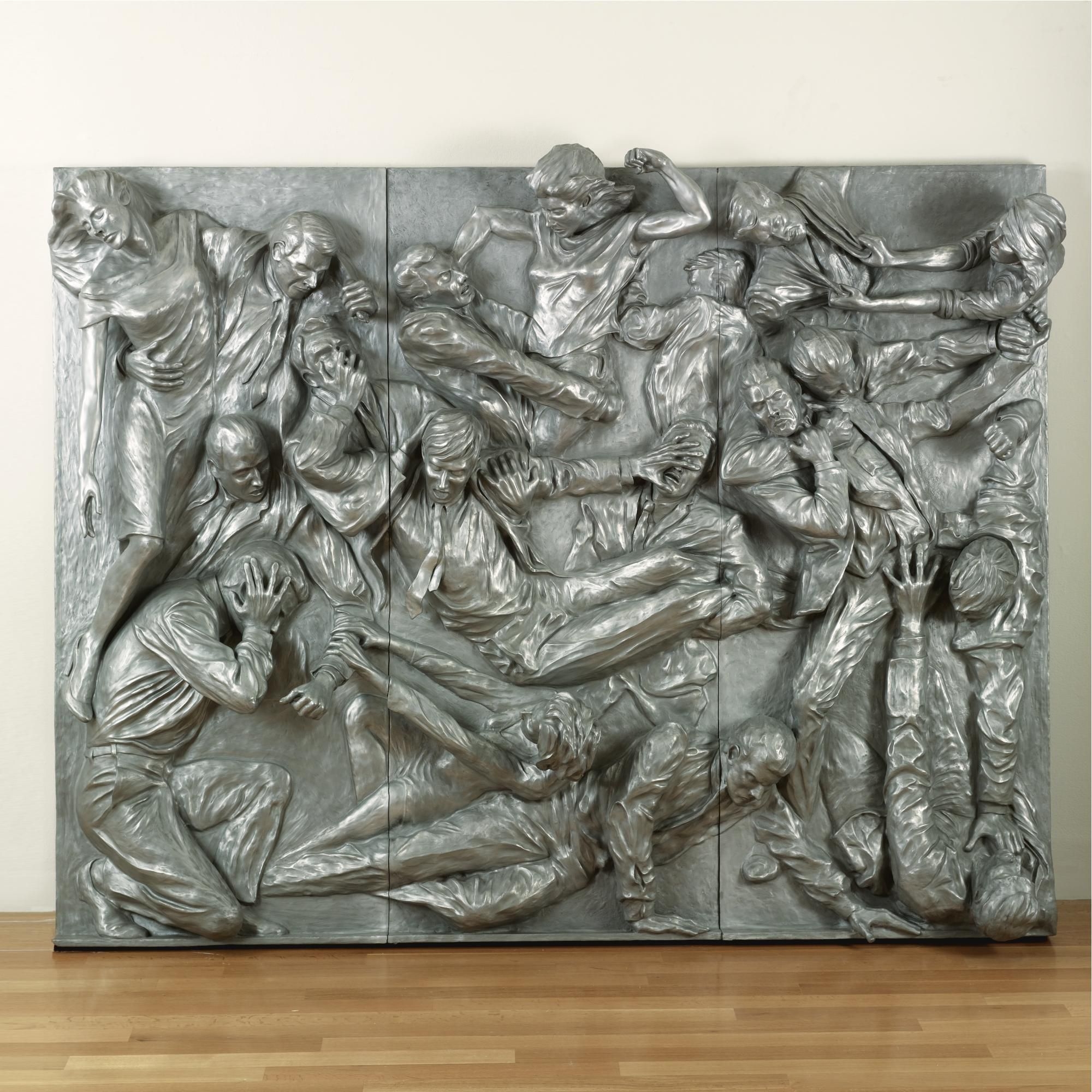
CHAPTER TWO: THE STRUCTURE OF ART
Page | 42
INTRODUCTION TO ART
forms begin with an armature, or rigid inner support often made of wire. An ar- mature allows a soft or fluid material like wet clay, which would collapse under its own weight, to be built up. This method of sculpting includes most classical portrait sculpture in terra cotta, or baked clay. (Figure 2.22) Clay lends itself to modeling and is thus a popular medium for work of this kind, although clay may also be carved and cast.
Carving is the removal of material to form an art object. Carving is a subtrac- tive process that usually begins with a block of material, most commonly stone. Tools—usually metal or metal tipped— are used to chip away the stone until the final form emerges. (Figure 2.23) The
Figure 2.23 | A selection of woodcarving gouges, chisels, and a mallet Author: User “Aerolin55” Source: Wikimedia Commons License: CC BY-SA 3.0
Figure 2.24 | Sculptor Carving Stone Author: Bain News Service Source: Wikimedia Commons License: Public Domain
Figure 2.25 | Marble statue of Eirene (the personification of peace) Artist: Kephisodotos Source: Met Museum License: OASC
Page | 43
INTRODUCTION TO ART CHAPTER TWO: THE STRUCTURE OF ART
main concern in carving, aside from achieving the correct form, is to be careful not to chip away too much material, as it cannot be replaced once it has been removed. (Figure 2.24) It is possible that the final shape of some carved stone sculptures result
from not only the artist’s intention, but also the subtle shifts caused by unpredictable variations in the stone causing the artist to “change course” when too much stone came away. This possibil- ity is not to suggest that trained sculptors do not know the limits of their medium: artists often encounter surprises and innovative ones can sometimes work solutions that incorporate them.
Different kinds of stone vary in hardness as well as color and appearance. Not all stone is suit- able for sculpting. Marble, a form of limestone, was preferred by the ancient Greeks and Romans for its softness and even color. (Figure 2.25) Diorite, schist (a form of slate), and Greywacke (a form of granite) were preferred by Egyptian and Mesopotamian cultures for their hardness and perma- nence. (Figure 2.26) The Chinese have traditionally used jade, a hard, brittle stone found in numer- ous shades, most commonly green, to indicate wisdom, power, and wealth. (Figure 2.27)
Wood is also often used as a carving material. Because of variations in grain size and texture, different species of wood have different sculptural qualities. In general, wood is prized for its flexibility and ease of forming, though it reacts to changes in humidity and lacks permanence. During the Heian era (794-1185 CE), the Japanese artist Jocho used joined wood to construct his sculpture of the Seated Buddha. (Figure 2.28)
Casting is a process that replaces, or substitutes, an initial sculptural material such as wax or clay with another, usually more permanent, material such as bronze, an alloy, or mixture of copper and tin. Casting is also a process that makes it possible to create multiple versions of the same object.
Figure 2.27 | Jade ornament of flowers with grape design Author: User “Mountain” Source: Wikimedia Commons License: CC BY-SA 3.0
Figure 2.26 | Naophorous Block Statue of a Governor of Sais, Psamtik Source: Met Museum License: OASC
CHAPTER TWO: THE STRUCTURE OF ART
Page | 44
INTRODUCTION TO ART
In the lost wax process, an original sculpture is modeled, often in clay, coated in wax, and then cov- ered in plaster to create a mold. When the plaster dries, it is heated to melt the wax, which is poured out of the mold. Molten metal is then poured into the space within the mold between the (now lost) wax coating and the original sculpted form. When the metal has cooled and solidified, the plaster is broken away to reveal the cast metal object. (Figure 2.29) In order to create multiple versions of the object, the mold must be made in such a way that it can be re- moved without being destroyed. (Figure 2.30) This operation is generally achieved by separating a mold into several sections while the original is being cast. Sectional molds are also used to cast original objects that cannot be melted or otherwise removed from the mold. To cast the form, the original is removed, and the sections are then re-fastened together. In some cases, complex sculptures are cast in several pieces and the resulting metal sections are welded together.
Assembly, or assemblage, is a fairly recent type of sculpture. Before the modern period, carv-
Figure 2.28 | Seated Buddha Artist: Jōchō Author: User “Kosigrim” Source: Wikimedia Commons License: Public Domain
Figure 2.29 | Lost Wax Casting Process Author: Jeffrey LeMieux Source: Original Work License: CC BY-SA 4.0
Page | 45
INTRODUCTION TO ART CHAPTER TWO: THE STRUCTURE OF ART
ing, casting, and modeling were the only accepted methods of making fine art sculpture. Re- cently, sculptors have enlarged their approach and turned to the process of assembly, man- ually attaching objects and materials together. Assemblies are often composed of mixed media, a process in which disparate objects and substances are used in order to achieve the desired effect.
Because she spent time near a cabinetry workshop, Louise Nevelson (1899-1988, Ukraine, lived USA) would retrieve wooden cut-offs and other discarded objects to use in her sculpture. Her art practice involved the use of found objects. Consider Nevelson’s Sky Cathedral. (Sky Cathedral, Louise Nevelson: http://www.moma.org/collection/works/81006) She filled individ- ual wooden boxes with found objects. She then arranged these boxes into large assemblies and painted them a single color, usually black or white. Each sub-unit box in the sculpture can be read as a separate point of view or separate world. The effect of the whole is to recognize that both unity and diversity are possible in a single artwork.
Installation is related to assembly, but the intent is to transform an interior or exterior space to create an experience that surrounds and involves the viewer in an unscripted interac- tion with the environment. The viewer is then immersed in the art, rather than experiencing the art from a distance. For example, Carsten Höller (b. 1961, Belgium, lives Sweden) installed Test Site in the Turbine Hall, a five-story open space, at the Tate Modern in London. (Figure 2.31) Part of a series of slides Höller created at museums worldwide, he wanted to encourage visitors
Figure 2.30 | Sectional Mold Author: Jeffrey LeMieux Source: Original Work License: CC BY-SA 4.0
CHAPTER TWO: THE STRUCTURE OF ART
Page | 46
INTRODUCTION TO ART
to use the practical, though unconventional, means of transport, and, while doing so, to experience the momentary loss of control and whatever emotional response each individual felt.
An installation that is intended for a particular location is called a site-specific installation. Good examples of site-specific installations would be Tilted Arc by Richard Serra (b. 1939, USA), (Tilted Arc, Richard Serra: https://en.wikipedia.org/wiki/ File:Tilted_arc_en.jpg); Lightning Field by Walter De Maria (1935-2013, USA), (Lightning Field, Walter de Maria: http://sculpture1.wikispaces. com/file/view/Walter_de_Maria_Lightning_ Field_1977.jpg/310921734/800x686/Walter_de_ Maria_Lightning_Field_1977.jpg); Spiral Jetty by Robert Smithson (1938-1973, USA), (Figure 2.32); and Cadillac Ranch by the art group known as Ant Farm. (Figure 2.33) In part because of the large scale of many of these works, installation is an increasingly popular form of public artwork.
Kinetic art is art that moves or appears to move. Generally this art is sculptural. Good examples of kinetic artworks are the suspended, freely moving mobiles of Alexander Calder (1898-1976, USA) that are meant to change shape as part of their
design. (Nénuphars Rouges, Alexander Calder: http://www.wikiart.org/en/alexander-calder/ red-lily-pads-n-nuphars-rouges-1956?utm_source=returned&utm_medium=referral&utm_ campaign=referral) Homage to New York was a work of kinetic art Jean Tinguely (1925-1991, Switzerland) intended to self-destruct, although it never completed its purpose because a local
Figure 2.31 | Test Site Artist: Carsten Höller Author: User “The Lud” Source: Wikimedia Commons License: Public Domain
Figure 2.32 | Spiral Jetty Artist: Robert Smithson Author: User “Yonidebest” Source: Wikimedia Commons License: CC BY-SA 2.0
Page | 47
INTRODUCTION TO ART CHAPTER TWO: THE STRUCTURE OF ART
fire department stepped in and stopped the process. (Homage to New York, Jean Tinguely: http://www.wikiart .org/en/ jean-tinguely/homage-to-new- york-1960) Reuben Margolin (USA) is a contemporary artist who uses intersecting waves to create beautifully undulating sculptures. Click the following link to view a video of Margolin’s Square Wave: https://www.youtube. com/watch?v=4UQtDbybSWc. Beginning with simple materials like paper towel tubes, fishing swivels, and fishing line, and then moving to larger, more complex sculptures using more permanent materials like wood, metal, and wire, Margolin has made a career of creating meditatively flowing sculptures.
2.4.3 Four-Dimensional Art
Four-dimensional art, or time-based art is a relatively new mode of art practice that includes video, projection mapping, performance, and new media art.
Video art uses the relatively new technology of projected moving images. These images can be displayed on electronic monitors or projected onto walls or even buildings; they use light as a medi- um. The early video constructions of Nam June Paik (1932-2006, South Korea, lived USA) are a good example. In TV Cello, video monitors are assembled in the shape of a cello. (TV Cello, Nam June Paik: http://a141.idata.over-blog.com/356x499/1/96/04/42/s-rie-F/Paik-N.-J.-TV-Cello.jpg) When a bow was drawn across this object, images of a woman playing a cello appeared on the screens.
Projection mapping is another use of video projection. One or more two- or three-dimen- sional objects (often buildings) are spatially mapped into a virtual program that then allows the image to conform to the surface of the object upon which it is projected. (Figure 2.34) Evan Roth (b. 1978, USA, lives France) creates graffiti as a video projection and then photographs the results; thus, the work is temporary. This method of spatially augmented reality has been used by numer- ous artists (and advertisers) to “tag” everything from public spaces to the human face, without leaving permanent marks.
Performance art is art in which the artist’s medium is an action. Performance artworks are generally documented by photography, but the artwork is in the act itself. Cut Piece is a per- formance work Yoko Ono (b. 1933, Japan, lives USA) originally created in 1964 in which audi- ence members were given scissors to cut off pieces of her clothing while the artist sat on a stage.
Figure 2.33 | Cadillac Ranch, Amarillo Artist: Ant Farm Author: Richie Diesterheft Source: Wikimedia Commons License: CC BY 2.0
CHAPTER TWO: THE STRUCTURE OF ART
Page | 48
INTRODUCTION TO ART
(Cut Piece, Yoko Ono: https://en.wikipedia. org/wiki/File:CutPieceOno.jpeg) As the artist passively allowed her garments to fall away, the participants and viewers were in control of her transformation from whole to segmented.
New media art usually refers to interac- tive works such as digital art, computer anima- tion, video games, robotics, and 3D printing, where artists explore the expressive potential of these new creative technologies. The inter- national connectivity of the Internet has ush- ered in a globalization of information exchange which includes the arts. One example of the use of new media in art would be 10,000 Moving Cities by Marc Lee (b. 1969, Switzerland). In this work, a viewer wears a video projection headset in which images from a chosen city are projected onto a digital urban architecture. The viewer can move within the new space through head motion. Real time social-media images and text from the chosen city are also captured and projected.
2.5 FORM AND COMPOSITION When looking at art, many people today take a holistic or gestalt approach to understanding
it. In this approach, the work of art is experienced as a single unified whole and an intuitive con- clusion is drawn. This approach to art is a good place to start, but it can also be useful to examine the individual parts of an artwork and the relationships those parts have to the whole. When we examine an artwork by taking it apart, we are looking at its design. Design is divided into two broad categories: the elements of design and the principles of design. The elements of design are the physical parts of the artwork, or the form. The principles of design are the ways in which those parts are arranged or used, or the composition.
2.5.1 Elements of Design
A design is a governing plan or approach by which various parts of an artwork are created and assembled. It is rare to find a work of art that is entirely accidental or has come wholly out of the unconscious intuition of an artist. Further, looking at the way in which various parts of a work of art are arranged—even an intuitive or accidental work—can reveal clues to the goals and beliefs of the artist, the community in which the artist has worked, and the problems the work of art was meant to address.
Figure 2.34 | Cathédrale St Jean illuminée Author: User “Gonedelyon” Source: Wikimedia Commons License: User “Gonedelyon”
Page | 49
INTRODUCTION TO ART CHAPTER TWO: THE STRUCTURE OF ART
There are six basic elements of design: line, shape, mass/volume, perspective, texture, and color. One way to think of these elements of design is to “walk up the ladder” of dimension. Our perceived world has three dimensions of space and one of time. Mathematically, a point has zero dimensions. A line has one dimension, length. A shape has two dimensions, length and height. A form with mass or volume has three dimensions, length, height, and width. In moving from points to volumes, we have “walked up the ladder” of dimension from zero to three. In addition to the three dimensions of physical space, there are two more things artists can incorporate into a given work. They can introduce texture, and they can introduce color.
Here is a brief explanation of the definition and dynamics of each element of design.
2.5.1.1 Line Line is the first order element of design. A line is an infinite series of points that are arranged
in a direction. The direction of a line may be straight (unchang- ing) or curved (changing). All kinds of objects are linear, or predominantly formed by using lines. Calligraphy, or “beauti- ful writing,” is one popular use of line. The character of line in writing has two main functions. First, the linear figure or shape of a written symbol denotes its meaning. Second, the manner in which the figure is created can be seen as expressive in itself. A tughra, or the calligraphic sig- nature of a sultan, and the re- fined text of Arabic calligraphy are renowned for their expres- sive beauty, as are many works of Asian script. In many writing cultures, the beauty of the script is as important as the message the script contains. (Figure 2.35)
One quality of line is gesture. Gesture is the line produced by the movement of the artist’s hand, arm, or body, of a kind of dance with the material, as can be seen in this photograph of Jack- son Pollock in the midst of painting. (Jackson Pollock: https://upload.wikimedia.org/wikipedia/ en/b/b7/Jackson-Pollock.jpg) For example, short, uneven staccato lines may be read as impatient, or lacking in confidence or grace. Evenly drawn horizontal lines express calm. Straight lines can represent rigidity, which is neither good nor bad, but depends on context. A rigid bridge is a good
Figure 2.35 | Tughra (Official Signature) of Sultan Süleiman the Magnificent Source: Met Museum License: OASC
CHAPTER TWO: THE STRUCTURE OF ART
Page | 50
INTRODUCTION TO ART
thing for those who depend on it not to give way. A rigid tree in a windstorm will sometimes be uprooted.
Contour is the line where differing areas meet and form edges. Human visual perception includes an enhanced ability to detect edges in nature. Contour lines follow the shapes of objects where they stand out from backgrounds. In mapmaking, contour lines indicate the shape of the landscape in regular increments of vertical height. On contour maps, lines that appear close together indicate a rapid change in height. Lines that are far apart indicate more gentle slopes. (GroundTruth Contours: http://wiki.openstreetmap.org/w/images/thumb/b/ b5/GroundTruthContours_Detail.png/300px- GroundTruthContours_Detail.png)
Crosshatching is the use of uniformly spaced intersecting lines that create the perception of value
or light and dark. These crosshatching lines generally follow the shape of an object. (Fig- ures 2.4 and 2.36)
Some lines are not drawn at all. Instead, they are implied or suggested by an inten- tional alignment of shapes. The image of the square inside the circle is an example of im- plied line. (Figure 2.37) Lines that converge beyond the edge of an artwork are another because they imply a distant intersection. A third example of a line that is not actual- ly there is psychic line. Two people looking at one another in an artwork create a psychic line between them.
Line has expressive content. By its nature, a line compels the viewer to follow
Figure 2.36 | Nude Male Figure with a Sword Artist: Alexandre Cabanel Source: Met Museum License: OASC
Figure 2.37 | Square inside a circle, demonstration of implied lines Author: Jeffrey LeMieux Source: Original Work License: CC BY-SA 4.0
Page | 51
INTRODUCTION TO ART CHAPTER TWO: THE STRUCTURE OF ART
along its path. The character of the line can control the direction, speed, and attention of the viewer. The movement of a line can be curved or angular. It can progress smoothly or with a staccato rhythm. A line can be thick or thin, pale or bold. These qualities are “read” rationally and emotionally; thus, line can have an expressive and emotional content that can often be found by viewer introspection.
Line is not just a two-dimensional design element. For example, wire is a linear medium that can be extended into three dimensions. Alexander Calder’s wire sculptures and portraits are fine examples of the expressive power of line in three dimensions. (Acrobats, Alexander Calder: http://www.calder.org/system/post_images/images/000/001/082/medium/A00504. jpg?1352222725) Another example is Pablo Picasso drawing in space with light for photographer Gjon Mili (1904-1984, Albania, lived USA) for Life magazine in 1949. (Light Drawings, Pablo Picasso: http://www.designboom.com/art/pablo- picassos-light-drawings-from-1949/)
2.5.1.2 Shape The design element of shape is the
next element in the walk up the ladder of dimension. Shape has two dimensions, length and width. Shapes can be regular or irregular, simple or complex. Shapes can have hard or soft edges. Hard-edged shapes have clearly defined boundaries, while soft-edged shapes slowly fade in- to their backgrounds. There are two broad categories of shape: geometric and organ- ic. Geometric shapes are regular and ordered shapes using straight lines and curves. Organic shapes are general- ly irregular and often chaotic. Hans Arp (1886-1966, France, lived Switzerland), in his work Untitled, used torn paper and cut shapes to create an abstract composition. While squares are geometric objects, Arp’s torn and irregular edges transform them into organic shapes. The orientation of those shapes roughly approximates a grid structure, but again, their deviation from a regular order implies a chaotic and accidental arrangement. In this work, Arp is dancing on the “edge of order.” (Figure 2.38)
Figure 2.38 | Untitled (Collage with Squares Arranged according to the Laws of Chance) Artist: Jean Hans Arp Source: MoMA License: Public Domain
CHAPTER TWO: THE STRUCTURE OF ART
Page | 52
INTRODUCTION TO ART
In two-dimensional artworks, shapes are figures placed on a two-dimensional surface that is known as a ground. This creates a relationship between foreground and background known as the figure/ground relation. The figure is the object that appears to be in front of the ground. In some artworks this relationship is intentionally unclear. In this case, an effect known as figure/ ground reversal can occur. In figure/ground reversal, what was seen as the positive shape of the figure can also be seen as the negative space of the ground. This effect disrupts the sense of space in an artwork and disorients the viewer. (Escher Woodcut II Strip 3, Maurits Cornelis Escher: http://www.tau.ac.il/~tsurxx/FigureGround/Escher2.GIF)
2.5.1.3 Mass/Volume The next and final step up the
dimensional ladder is volume or mass. Volume has three dimen- sions: length, width, and height. Volumes may have interior or exterior contours, and they may be closed or open in form. Mass is the quantity of matter, often meaning its weight. A closed form is a volume that is not pierced or perforated. One goal of ancient Egyptian sculpture was to last for eternity. There- fore, they used closed sculptural forms, which are more structur- ally robust and more resistant to wear or breakage. (Figures 2.26 and 2.39) Empty space sur- rounds a closed form but does not move through it. Conversely, empty space surrounds but also moves through an open form. Open form sculptures are closer in shape to the figures they represent and thus are more lifelike or “true” to the original reference.
Modern sculptors such as Henry Moore (1898-1986, England) have explored the abstract use of closed and open forms, as well as negative and positive space. (Reclining Figure 1969-70, Henry Moore: https://upload.wikimedia.org/wikipedia/commons/0/08/PikiWiki_Israel_12097_ reclining_figure_by_henry_moore_in_tel_aviv.jpg) In three-dimensional art, positive space is the space occupied by a given volume, while negative space is the empty space within that volume. Notice how the figure twists around an imaginary boundary. The “saddle” in the middle suggests an invisible weight pressing down on the form there. This sculpture depends as much on the empty space around it as it does on the volume occupied by the bronze. In addition, its mass is lessened by the openness of its form, especially when compared to ancient Egyptian sculpture, an entirely closed form.
Figure 2.39 | Sphinx of Hatshepsut Source: Met Museum License: OASC
Page | 53
INTRODUCTION TO ART CHAPTER TWO: THE STRUCTURE OF ART
To convey the three dimensionality, mass and volume, of forms on a flat surface, artists use chiaroscuro (Italian: “clear-dark”) or varying shades of light and dark. As a form turns toward a light source it appears brighter, and as it turns away from the light source it appears darker; the shift in light and shadow creates the illusion of volume in space. The face and hands of Leonardo’s Mona Lisa are considered masterpieces of chiaroscuro. (Figure 2.7)
2.5.1.4 Perspective Perspective in art is the illusion of space on a flat surface. Before the discovery of the geo-
metric system of linear perspective in fifteenth-century Italy, the illusion of space was created by using three main visual cues to the recession of space. These three cues are height, scale, and over- lap. Objects that are higher on the drawing surface, objects that are smaller in scale, and objects that are partially obscured by other objects all appear further away in space. (Figure 2.40)
Linear perspective is based on the regular geometric recession of space. Linear perspective uses a vanishing point and horizon line. The vanishing point is the spot where all receding lines seem to converge on the horizon line. The horizon line is the set of all possible eye-level vanishing points. (Figure 2.41) Orthogonal lines are the lines that appear to meet at the vanishing point and imply the regular recession of space. Horizon lines and vanishing points can provide clues to the artist’s intent. In Leonardo’s Last Supper, for example, the artist has located the vanishing point directly behind the head of Jesus. (see Figure 1.25) Because the vanishing point is the viewer’s vision extended infinite- ly in one direction, Leonardo’s place- ment of the vanishing point behind the head of Jesus associates Him with the infinity of the Christian God.
Before linear perspective was formulated as a coherent geometric system, painters used intuitive per- spective to portray receding space. Intuitive perspective acknowl- edges that receding lines converge, but does not recognize that they converge at a single horizon line and vanishing point. Nonetheless, even
Figure 2.41 | Height, Scale, and Overlap Author: Jeffrey LeMieux Source: Original Work License: CC BY-SA 4.0
Figure 2.40 | Height, Scale, and Overlap Author: Jeffrey LeMieux Source: Original Work License: CC BY-SA 4.0
CHAPTER TWO: THE STRUCTURE OF ART
Page | 54
INTRODUCTION TO ART
when paintings lack a rigorously coherent geometric system of linear perspective, determining where the horizon would be can inform us about how the artist views the subject. Compare two paintings of the same name, Madonna Enthroned, one by Cimabue (1240-1302, Italy) and the other by Giotto (1266/7-1337, Italy). (Figures 2.42 and 2.43) Both paintings use intuitive perspec- tive. In Cimabue’s painting of 1285, the implied horizon is low and the viewer sits at the foot of the throne, while Giotto’s image, painted in 1310, has the horizon higher, and thus the viewer is on the same level as the Madonna. This difference of viewpoint signifies changing ideas about the Madonna’s relation to the individual. Cimabue’s painting places the viewer in subservient hom- age, while Giotto’s painting may be seen as more approachable, indicative of a tiny but significant shift in European thought that eventually blossomed into the Italian Renaissance.
There are different types of linear perspective. The main types are one-, two-, and three-point perspective. The distinction is in the number of vanishing points used. One-point perspective uses a horizon line and one main vanishing point and is normally used when simple views are
Figure 2.42 | Santa Trinita Madonna Artist: Cimabue Author: User “Eugene” Source: Wikimedia Commons License: Public Domain
Figure 2.43 | The Ognissanti Madonna Artist: Giotto Author: User “Shizhao” Source: Wikimedia Commons License: Public Domain
Page | 55
INTRODUCTION TO ART CHAPTER TWO: THE STRUCTURE OF ART
depicted, such as a railway track disappearing into the distance directly in front of the spectator. Two-point perspective uses a horizon line and two separated vanishing points to present the illusion of a space that recedes in two directions. (Figure 2.44) Three-point perspective incorporates the reces- sion of space in a third, vertical direction above or below the horizon line as well as the two horizontal directions in two-point perspective. As tall buildings recede upward from street level, they also diminish in apparent size in the same way railroad tracks appear to converge in the distance toward the horizon. (Figure 2.45)
Many people make the mistake of thinking that lin- ear perspective gives a completely accurate picture of the world. It does not. Linear perspective is a limited tool for representing how the world looks. It is considered suffi- ciently “accurate” only within a limited “cone of percep- tion” of about 60 degrees. So while linear perspective is an excellent tool to represent our experience of space, it has limitations that should be recognized.
Atmospheric perspective is the way in which the illusion of distance is created on a flat surface through the use of color and focus. In a landscape that extends into the distance, the haze of the intervening air alters the colors and clarity of objects. The further away an object is from the viewer, the more it approaches the color of air, which is a light blue-gray tone. Dark objects become lighter and more blue as they recede from the viewer. Ad- ditionally, the contrast between light and dark colored objects and the perception of detail decrease with in- creasing distance. Albert Bierstadt (1830-1902, Germa- ny, lived USA) used this effect in his painting The Rocky
Figure 2.44 | Two-Point Perspective Author: Jeffrey LeMieux Source: Original Work License: CC BY-SA 4.0
Figure 2.45 | New York Daily News Building Artist: Hugh Ferriss Author: Dover Publications Source: Wikimedia Commons License: OASC
CHAPTER TWO: THE STRUCTURE OF ART
Page | 56
INTRODUCTION TO ART
Mountains, Lander’s Peak to give a sense of monumental space. (Figure 2.46)
2.5.1.5 Texture The term texture describes the sur-
face quality of an artwork. Texture is an important element of design because it engages the sense of touch as well as vi- sion. Objects can be rough or smooth, wet or dry, sticky or slick, hard or soft, brit- tle or flexible. The two main approaches to texture are actual texture and implied or simulated texture. Actual texture is primarily—though not exclusively— sculptural, while implied texture is primarily used in two-dimensional works of art.
The painters of the Northern Renaissance and the Dutch Golden Age, the fifteenth to the seven- teenth centuries, were very interested in the simulation of a wide variety of textures. One main goal of artists from those periods was to excel at telling the truth about the material world. They worked to capture the full visual range of the sense of touch. Rembrandt van Rijn (1606-1669, Netherlands) is well known for his use of impasto, or very thick application of paint, in order to heighten the sense
of reality in many of his paintings by adding actual texture. This can be seen in his handling of flesh on some of his self-portraits, as well as his rendering of metal and jew- elry in his painting of Belshazzar’s Feast. (Figure 2.47)
2.5.1.6 Color Color is the most prominent
element of design and is one of the most powerful and yet subjective el- ements in art. The nineteenth-cen- tury American transcendentalist Ralph Waldo Emerson noted this subjective quality of color when he wrote, “nature always wears the col- ors of the spirit.”1 Ideas about color 1 C. A. Bartol, Ralph Waldo Emerson: A Discourse in West Church (Boston, Mass: A. Williams & Co., 1882), 14.
Figure 2.47 | Belshazzar’s Feast Artist: Rembrandt van Rijn Source: Wikiart License: Public Domain
Figure 2.46 | The Rocky Mountains, Lander’s Peak Artist: Albert Bierstadt Source: Met Museum License: OASC
Page | 57
INTRODUCTION TO ART CHAPTER TWO: THE STRUCTURE OF ART
can be grouped into three broad categories: the histo- ry of color, physics of color, and perception of color.
The earliest use of color was limited to what kinds of pigments or coloring agents could be found in the local environment: ochres (yellow-browns) from various colors of earth, blacks and grays from ashes and burned wood or charcoal, reds and yellows from minerals, plants, and insects. Paleolithic cave paint- ers used these materials for their murals. In addition to natural pigments, ancient Egyptians formulated synthetic pigments such as powdered glass to cre- ate Egyptian blue, a distinctive hue used on statues, walls, and monuments. In the Roman Empire, a rare form of purple was extracted from a particular kind of snail and, because of its rarity, was used primarily for royal garments. During the Renaissance, a deep blue was made from a finely ground gemstone, lapis lazuli.
Egyptians associated colors with the gods; the god Amon had blue skin, and Osiris had green. The ancient Greeks took a more scientific approach to color. The ancient Greek philosopher Empedocles thought that color fell into four categories: white/light, dark/black, yellow, and red. The ancient Chinese associated color with the five elements taught in traditional physics: water (black), metal (white), wood (green), earth (yellow), and fire (red). In a number of Asian traditions, black is the col- or of heaven and white is the color of death or mourning. In western culture the opposite is the case.
Modern ideas about color were greatly refined beginning in the fifteenth century by architect and art theorist Leon Battista Alberti (1404-1472, Italy). In his treatise Della pittura (On Paint- ing), published in 1435, Alberti stated:
Through the mixing of colors infinite other hues are born, but there are only four true col- ors from which more and more other kinds of colors may be thus created. Red is the color of fire, blue of the air, green of the water, and grey of the earth . . . white and black are not true colors but are alterations of other colors.2
From this early framework, others made further discoveries. The term “color” describes the sensation caused by variations in the wavelength and intensity
of light as it interacts with the human eye. Visible light is the small portion of the electromag- netic spectrum that can be seen by humans. When the white light of the sun is passed through a prism, it is refracted into the colors of the rainbow from red through orange, yellow, green, and blue to violet. (Figure 2.48)
2 Leon Battista Alberti, On Painting, trans. John R. Spencer (New Haven, Connecticut: Yale University Press, 1956), 49-50.
Figure 2.48 | Prism Author: User “D-Kuru” Source: Wikimedia Commons License: CC BY-SA 3.0
CHAPTER TWO: THE STRUCTURE OF ART
Page | 58
INTRODUCTION TO ART
Color as perceived by humans can be bro- ken into three discrete parts: hue, saturation, and brightness. (Figure 2.49) Hue is the wave- length of a given color. Longer wavelength col- ors appear on the red end of the spectrum, while shorter wavelength colors are on the violet end. Hue is the color “name,” e.g., red, yellow, blue, green, etc. Color can be either subtractive or ad- ditive. Saturation is the purity of a color and ranges from a neutral gray to the pure color while holding brightness as a constant. Bright- ness is the lightness or darkness of a color and ranges from fully illuminated (the pure hue) to fully darkened (black). Each pure hue also has a relative brightness, for example, pure yellow has a greater brightness than pure blue.
Subtractive color, or reflective color, occurs when white light is reflected off a surface, and all the colors of the spectrum are absorbed by that surface except for the color that is reflected back to the viewer. Subtractive color mixing starts with the primary colors of red, yellow, and blue. When these colors are mixed, the secondary colors of green, orange, and purple, are created. Mixing yellow and blue makes green, mixing red and yellow makes orange, and mixing red and blue makes purple.
The English mathematician and physicist Sir Isaac Newton demonstrated in the seventeenth century that white light, when refracted through a prism, could be separated into the visible spectrum. In the nineteenth century, writer and statesmen Johann Wolfgang von Goethe and chemist Michel Eugène Chevruel separately published research that concluded that red, yellow, and blue were primary col- ors and that all other colors could be mixed from them. At the beginning of the twentieth century, industrial chemists further refined the understanding of printing inks and de- rived the CMYK (cyan, magenta, yellow, and black) subtractive color model: beginning with white, as one adds color, the mixture moves toward black. (Figure 2.50)
With the advent of television, comput- ers and digital imaging, the additive model of RGB (red, green, blue) in which colors are added together and the HSB (hue, saturation,
Figure 2.49 | HSV Color Model Author: User “SharkD” Source: Wikimedia Commons License: CC BY-SA 3.0
Figure 2.50 | Subtractive Color Mixing Author: User “Ntozis” Source: Wikimedia Commons License: CC BY-SA 3.0
Page | 59
INTRODUCTION TO ART CHAPTER TWO: THE STRUCTURE OF ART
and brightness) color system, based on human perception, have become industry standards. Additive color, or transmission color, occurs when light of different colors is projected. The primary hues of additive color are red, green, and blue. This is the RGB color model. (Figure 2.51) When red and green lights overlap, yellow is seen. When red and blue lights overlap, ma- genta is seen, and when green and blue lights overlap, cyan appears. These are the secondary hues of additive color. When red, green, and blue lights all overlap, white light is seen. Tele- vision screens are actually tiny dots, or pixels, of red, green, and blue glowing lights. The colors we see coming off those screens are additive.
Our RGB model of additive color is directly dependent on how human eyes function. The human retina is a sheet of neurons that coats the inside of the eye. Within this sheet of neu- rons, there are specialized neurons called rods and cones. Rods are neurons that are sensitive to changes in light intensity, and cones are sensitive to red, green, or blue light. The reason we have RGB computer monitors is because we have RGB eyes.
Artists sometimes intentionally exploit the physiology of human vision. Because human vision is limited by unique biology, certain effects become possible. Neurons store chemical neurotransmitters to send signals. If a neuron must continually “fire” because it is being continuously stimulated, it can deplete its supply of neurotransmitter. There is a slight delay between the depletion and restoration
of this chemical supply within the neuron. In the interim, an after- image occurs. Look at the green, orange, and black flag for 10 sec- onds, then look at a blank wall or empty white space. (Figure 2.52) For a few moments, you will see the complement, or opposite, of green (red), the complement of or- ange (blue), and the complement of black (white) in their correct place on the American flag. The fading of this image indicates that the neurotransmitters in the reti- na have been replenished.
Figure 2.52 | U.S. Flag with Inverted Color Author: User “Mike” Source: Wikimedia Commons License: Public Domain
Figure 2.51 | Additive Color Author: User “SharkD” Source: Wikimedia Commons License: CC BY-SA 3.0
CHAPTER TWO: THE STRUCTURE OF ART
Page | 60
INTRODUCTION TO ART
This effect was regularly used by art- ists during the Impressionist movement (c. 1870-1886). Consider Impression Sunrise by Claude Monet (1840-1926, France), one of the first Impression- ist paintings. (Figure 2.53) Looking for more than a moment at the expanse of blue in the painting “exhausts” the sen- sation of blue and creates a complemen- tary afterimage response, which is or- ange. Then when we look at the orange of the rising sun, we see not only the or- ange pigment on the painting itself, we also have the additional effect of “tired blue” in our retina. For this reason, the orange paint of the sun looks brighter than it would if we saw that color by it- self. Many Impressionist artists inten- tionally used this effect, and this is one reason why Impressionist paintings tend to look so vibrantly colored.
In his Homage to the Square series of paintings that he began in 1949, the Bauhaus artist Josef Albers (1888-1967, Germany, lived USA) experimented with the relative perception of color. (Homage to the Square, Josef Albers: http://www.metmuseum.org/toah/works-of-art/59.160/) His main interest was to demonstrate how a color can be affected by other colors that surround it. His book, Interaction of Color (1963), showed that perception of a single color can change depending on context. To demonstrate this, look at the accompanying image. (Figure 2.54) The band of gray in the center is one single color, but it appears to shift when placed on a contrasting background.
Contemporary artists employ specific terms for different uses of color. Natural, or local color, describes the body color of a given object. Observed color, on the other hand, is how the percep-
Figure 2.53 | Impression Sunrise Artist: Claude Monet Author: User “Paris 16” Source: Wikimedia Commons License: Public Domain
Figure 2.54 | Gradient Illusion Author: Jeffrey LeMieux Source: Wikimedia Commons License: Public Domain
Page | 61
INTRODUCTION TO ART CHAPTER TWO: THE STRUCTURE OF ART
tion of that local color changes as light shifts on an object. In Monet’s series of paintings of the Rouen Cathedral, his de- pictions of different lighting conditions are a good example of the difference between local color and observed color. The color of the stone of the Cathedral is a medium gray. But at different times of day, such as the waning light of sunset, it will reflect the oranges and blues of the lingering sun and the growing shadows. (Figure 2.55)
The Fauves were a group of artists in the early twenti- eth century who used intuitive color as the basis of their approach to making art. They were more interested in the expressive power of color than robotically reporting the lo- cal or observed color of their subjects. Consider this portrait by Henri Matisse (1869-1954, France) of his wife, Amélie Matisse. (Figure 2.56) Clearly she did not in reality have a green stripe running down the center of her face. The colors chosen by the artist were meant to express something other than simple visual observation.
Another aspect of color used by artists is color tempera- ture. Colors can be either warm or cool. The warm end of the
spectrum includes red, orange, and yellow. The cool end of the visible spectrum contains green, blue, and pur- ple. That said, even yellow can be cool, and even blue can be warm. Warm and cool colors interact in different ways and artists are trained to notice and use this difference; for example, warm colors seem to “advance” while cool colors “recede” in space and consequently shapes repre- sented in those colors appear to be at different depths.
In organizing ideas about color, artists and art theo- rists have evolved a series of color schemes, or ordered relations between different colors. A monochromat- ic color scheme uses a single color. The Old Guitarist by Picasso is a good example of a monochromatic color scheme. (Figure 2.57) The pose of the figure, the texture of the ragged clothing and hair, and the dominating use of blue work together to create a unified emotional re- sponse of weariness and loneliness to the image.
A complementary color scheme uses colors oppo- site to each other on the color wheel. As mentioned ear-
Figure 2.55 | Rouen Cathedral, Facade (Sunset) Artist: Claude Monet Author: User “Rlbberlin” Source: Wikimedia Commons License: Public Domain
Figure 2.56 | Portrait of Madame Matisse (The green line) Artist: Henri Matisse Author: User “Sparkit” Source: Wikimedia Commons License: Public Domain
CHAPTER TWO: THE STRUCTURE OF ART
Page | 62
INTRODUCTION TO ART
lier, Impressionist painters exploited the effect of comple- mentary color schemes to heighten the brilliance of their color palettes. While not an Impressionist, in his painting The Starry Night, Van Gogh (1853-1890, Netherlands, lived France) uses the blue of the night sky to charge the orange of his crescent moon. (Figure 2.58)
An analogous color scheme uses only one area of the color wheel. If the color green is chosen as the anchor color for the scheme, for example, the artist will use colors that occur between the yellow and blue points on the wheel. Still Life with a Glass and Oysters by Jan Davidsz. de Heem (1606-1684, Netherlands, lived Belgium) is a good example of an orange/yellow/green analogous scheme. (Figure 2.59) There are many other color schemes that are used for various applications, but these three suffice to illustrate the idea.
2.5.2 Principles of Design
The elements of design are the visual components that artists use to make artworks. The principles of design are
Figure 2.58 | Starry Night Artist: Vincent van Gogh Author: User “Dcoetzee” Source: Wikimedia Commons License: Public Domain
Figure 2.57 | The Old Guitarist Artist: Pablo Picasso Author: User “Chimino” Source: Wikimedia Commons License: Public Domain
Figure 2.59 | Still Life with a Glass and Oysters Artist: Jan Davidszoon de Heem Source: Met Museum License: OASC
Page | 63
INTRODUCTION TO ART CHAPTER TWO: THE STRUCTURE OF ART
the various ways in which those elements or components are arranged to produce a desired effect. There are as many ways to approach the arrangement of the elements of art as there are artists. Each work of art is unique in its conception, design, and execution. Recent developments in the visual arts have introduced accidental and irrational approaches to artmaking. In these approach- es, the outcome of the work of art is not planned. While these works of art may be said to lack conscious design, sometimes they are successful. It is often possible to attribute the success of irrationally or accidentally produced works of art to one or more operating principles of organi- zation. Becoming aware of the principles of design in a work of art allows the viewer to add depth to the analysis of those works. What follows are five principles of design. The list is not exhaustive but is a good place to start.
2.5.2.1 Unity/Variety Unity is found in similarity, while variety is found in difference. A design that shows unity is one
in which the elements of the work or relations between the elements are similar or identical. Leon- ardo’s Mona Lisa (see Figure 2.7) is considered a breakthrough in Italian Renaissance art because the soft edges of the figure are similar in approach to the soft tones of the muted background, thus unifying the image. A design that shows variety is one in which the elements of the work are varied in size, color, shape, or some other attribute. One concern with the overuse of unity in design is visu- al monotony. Visual unity may occur on a conceptual level as well as a physical one. Elements that are chosen based on a theme can display conceptual unity and yet display a variety of form. A work of art that lacks variety may be monotonous and lack interest. Many artists introduce variety into their compositions by making sure that no two intervals are the same. An inter- val is the space between elements, fig- ures, or objects in a work of art.
2.5.2.2 Scale/Proportion The design principle of scale
and proportion is the issue of size of elements both individually and in relation to other elements. A famous example of the subtle use of scale is the relative size of the figures in Michelangelo’s Pietà. (Figure 2.60) The sculpture is a depiction of Mary holding the body of her son Jesus after His crucifixion. If we measure the bodies of Jesus and Mary from heel to knee, knee to hip, and so on, and then compare them, we find that Mary is larger than Jesus. In addition,
Figure 2.60 | Pietà Artist: Michelangelo Author: User “Juan M Romero” Source: Wikimedia Commons License: CC BY-SA 4.0
CHAPTER TWO: THE STRUCTURE OF ART
Page | 64
INTRODUCTION TO ART
the figure of Mary is out of proportion, that is, the sizes of the parts of her body are not in alignment. This unusual use of scale and proportion serves to infantilize Jesus in order to subtly emphasize the mother/child relationship. Another use of scale and proportion is the use of forced perspective. (Figure 2.61) Forced perspective is the arrangement of figure and ground that distorts the scale of objects, making small objects appear large or large objects appear small by juxtaposing them with opposites. Forced perspective is most convincing when done photographically.
2.5.2.3 Balance The design principle of balance is the issue
of visual “weight.” Design elements like lines and shapes can attract our attention in a number of ways. For example, they can be brightly colored, they can be large in relation to other similar shapes, or they can be textured in unusual ways. Compositional balance is achieved when these competing visual weights are roughly equivalent. There are two kinds of compositional balance: symmetrical and asymmetrical.
The lines and shapes in a composition that uses the principle of symmetrical balance are usually equally arranged around an axis, or central line. In The Sacrament of the Last Supper by Salvador Dali (1904-1989, Spain), notice the balance of like forms to the left and right of the central figure of Jesus. (The Sacrament of the Last Supper, Salvador Dali: https://upload. wikimedia.org/wikipedia/en/f/f1/ Dali_-_The_Sacrament_of_the_Last_ Supper_-_lowres.jpg) Vertical and horizontal axes are generally reserved for very stable compositions, and this strategy is often used in a religious context to imply unchanging truth.
Figure 2.62 | The Great Wave off Kanagawa Artist: Katsushika Hokusai Author: User “Durova” Source: Wikimedia Commons License: Public Domain
Figure 2.61 | The Leaning Tower of Pisa: Forced Perspective Author: User “Vin7474” Source: Wikimedia Commons License: Public Domain
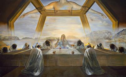
Page | 65
INTRODUCTION TO ART CHAPTER TWO: THE STRUCTURE OF ART
Asymmetrical balance is achieved when visual weights do not correspond to one an- other in shape, size, or placement; they are not distributed equally in a composition. The woodblock print The Great Wave off Kanagawa by Katsushika Hokusai (1760-1849, Japan) and Still Life with Apples and a Pot of Primroses by Paul Cézanne (1839-1906, France) are good examples of asymmetrical compositions. The large space to the right of the Hokusai’s Great Wave “offsets” the approaching wave in the left half of the composition. (Figure 2.62) In a similar way, the large gray wall to the left in Cézanne’s Still Life with Apples serves to offset the visually complex flowerpot on the right. (Figure 2.63) In each work, nearly one-third of the composition (the sky and the wall) is unoccupied, so to speak; there are no objects in those ar- eas. Within the two-dimensional space of the work, however, we “read” each blank area as having a visual weight that counterbal- ances the forms in the remainder of the compositional space.
It is not always necessary for an artwork to be balanced. An obvious imbalance can produce the effect of unsteadiness, disorientation or distress, which can become a useful part of the larger idea within the work of art. The large empty spaces in the painting by Odd Nerdrum (b. 1944, Norway) carry substantial visual weight and imply both physical and psychological isolation. (Man and Abandoned Landscape, Odd Nerdrum: https://s-media-cache-ak0.pinimg.com/736x/27/ a3/3b/27a33b6c5d3c9e087d20f7cb3c34296a.jpg)
2.5.2.4 Emphasis/Movement The design principle of emphasis or movement is the intentional use of directional forces
to move the viewer’s attention through a work of art. When we see a color shift within a shape, this implies movement. And, when we see a line in a work of art, we are compelled to follow it. For example, arrows of any shape will signify direction and are widely used in advertising to attract and direct the attention of potential customers.
There are more subtle means of moving a viewer’s attention through a work of art. Descent from the Cross by Rogier van der Weyden (1404-1464, Belgium) uses the positions of the fig- ures’ arms, legs, and heads to trace the infinity symbol, which resembles the number 8 laying
Figure 2.63 | Still Life with Apples and a Pot of Primroses Artist: Paul Cézanne Source: Met Museum License: OASC
CHAPTER TWO: THE STRUCTURE OF ART
Page | 66
INTRODUCTION TO ART
on its side. (Figure 2.64) This subtle reminder of Christ’s everlasting life is meant to reassure and give hope to the faithful gazing upon this scene of death and grieving.
2.5.2.5 Rhythm/Repetition The design principle of
rhythm is the repetition of visual elements to establish a pattern. This pattern can then be used to provide a stage for a special object, or the pattern can be interrupted to direct attention to the change. In his commentary of mass consumer culture, Andy Warhol’s use of repetition compels us to notice the small differences between the apparently identical elements of his installation of paintings, 32 Campbell’s Soup Cans. (Figure 2.65)
Figure 2.64 | Descent from the Cross (Deposition) Artist: Rogier van der Weyden Author: User “Argento” Source: Wikimedia Commons License: Public Domain
Figure 2.65 | Campbell’s Soup Cans Artist: Andy Warhol Author: User “Gorup de Besanez” Source: Wikimedia Commons License: CC BY-SA 4.0
Page | 67
INTRODUCTION TO ART CHAPTER TWO: THE STRUCTURE OF ART
2.6 BEFORE YOU MOVE ON Key Concepts
Visual art can be divided into dimensional categories: two-dimensional, three-dimension- al, and four-dimensional art. Each category has unique and specific approaches and materials. Two-dimensional art consists of drawing, painting, and printmaking. Three-dimensional art con- sists of sculpture, including installation, and kinetic art. Four-dimensional or time-based art in- cludes video and performance and depends on the use of technology and the passage of time for its effect. Time-based art has grown today to encompass digital art, computer animation, interac- tive art, video games, virtual reality, robotics, and 3D printing.
The elements and principles of design are the components and their organization within visu- al art. Line, shape, mass/volume, perspective, texture, and color are the primary elements of de- sign. Time is a recently recognized additional element of design. Principles of design include unity and variety, scale and proportion, balance, emphasis and movement, and rhythm and repetition.
In this chapter we have also outlined many of the materials and processes used in creating art. In Chapter 3 Significance of Material Used in Art, we will examine the impact and meaning of substances employed to create works of art. In Chapter 4 Describing Art: Formal Analysis, Types and Styles of Art, we will utilize our understanding of materials and processes, and elements and principles of design to describe and explore meaning in art.
Test Yourself
1. Historically, the term fine art was limited to mean painting, architecture, and sculpture. Today, other approaches to the production of art objects have been discovered and exploited. This process of evolution has had both drawbacks and advantages. Discuss.
2. “____________-dimensional art occurs on flat surfaces, like paper, canvas, or even cave walls.”
3. Art can be broken down into Form and _______________
4. “To __________________ an object is to observe its appearance and transfer that observation to a set of marks.”
5. “For the most part, the pigments or coloring agents in paints remain the same. The thing that distinguishes one kind of painting from another is the ____________.”
6. The difference between open and closed sculptural forms is that closed forms are surrounded by ____________, while open forms are penetrated by it.
7. Calligraphy is defined as “_____________ writing.”
CHAPTER TWO: THE STRUCTURE OF ART
Page | 68
INTRODUCTION TO ART
8. Perspective in art is the _________________ of space on a flat surface.
9. The three main cues to the illusion of space on a flat surface are:
10. The five elements of design mentioned in the text are: a. __________________________ b. __________________________ c. __________________________ d. __________________________ e. __________________________
11. The text mentions several principles of design. List and Describe three of them.
Principle of Design: Description: a. b. c.
12. The unique property of Kinetic sculpture is: ___________________________
13. “The Fauves were a group of artists in the early twentieth century who used ____________ color.”
14. Suggest one potential reason for the use of a monochromatic color scheme, a complementary color scheme, and an analogous color scheme.
a. Monochromatic _________________________________ b. Complementary _________________________________ c. Analagous _________________________________
2.7 KEY TERMS 2-Dimensional Art: art that is executed on a two dimensional surface that has length and width;
a flat (or nearly flat) surface. These include, but are not limited to, paintings, drawings, and prints.
3-Dimensional Art: art that is executed in the three dimensions of length, width, and height. These include, but are not limited to, sculpture, architecture, ceramics, glass, textiles, assembly, and installation.
Page | 69
INTRODUCTION TO ART CHAPTER TWO: THE STRUCTURE OF ART
4-Dimensional Art: art that is executed in, and depends upon, both space and time, which is considered the “fourth dimension.” Examples include but are not limited to performance art and video art.
Abstract Expressionism: or ABEX; this art historical term is specific to a group of painters working in New York after the Second World War. This group includes Jackson Pollock, Willem de Kooning, Lee Krasner, and Helen Frankenthaler. Their primary approach to painting was gestural, and “all over,” a condition in which no single part of the work is visually predominant.
Acrylic: a fast drying water-soluble petroleum based painting medium.
Actual Texture: the condition in which texture is created, not represented. Actual texture is the opposite of simulated texture or the illusion of texture. Examples include brushstrokes, impasto, collage, and inclusion.
Additive Color: color based on projected light.
Additive: a sculptural process in which material is added.
Afterimage: the optical sensation that occurs after a visual stimulus is removed. The afterimage is a quickly fading complement of the original stimulus.
Analogous Color: a color scheme that uses colors adjacent to an initial point on the color wheel. For example, if an artist chose red for the initial color, then an analogous color scheme would employ the color range that occurs between orange, red, and purple.
Armature: a wire or wood substructure used to support a clay sculpture while it is being worked.
Assembly: a sculptural process in which disparate materials are combined to form the final artwork.
Asymmetric: lacking symmetry.
Atmospheric Perspective: the use of color to simulate the illusion of space.
Axis: an imaginary line around which objects are arranged.
Balance: the property of equality in visual weight.
Binder: a transparent fluid used to suspend colored pigment and attach it to a support.
Brush: tools used to apply paint to a support, usually hair or fiber attached to a wooden or plastic handle.
Buon Fresco: literally, “good fresco.” A mural process in which pigment is painted on and absorbed into wet plaster.
CHAPTER TWO: THE STRUCTURE OF ART
Page | 70
INTRODUCTION TO ART
Calligraphy: beautiful writing.
Carving: a sculptural process in which material is removed to reveal the final artwork.
Casting: a sculptural process in which material is substituted to form the final artwork.
Charcoal: an art medium made from burned wood used to make dark black marks usually on paper.
Closed Form: sculptural forms that are not penetrated by exterior space.
Color Scheme: an organized or formulaic approach to the selection of color. For example, Monochromatic (one color), Complementary (opposite colors), and Analogous (adjacent colors) color schemes.
Color Temperature: in visual art, the sensation of “warm” or “cool” relative to a given color. Warm colors tend toward red/orange, while cool colors tend toward blue/white. Every color, when compared to another can be seen to be either more warm or more cool.
Color: the sensation caused by differing qualities of light.
Complementary Color: colors that when blended together create a neutral gray. On a color wheel, complementary colors appear opposite to one another. Examples of a complementary color pair would be blue and orange or red and green.
Composition: the arrangement of visual elements.
Conte Crayons: in drawing, square sticks of compressed charcoal or pigment and wax or clay.
Conte: a mixture of pigment and clay used to make colored marks, usually on paper. Traditionally manufactured in black, white, and sanguine (red) colors.
Contour: the exterior boundary of a form.
Contrast: areas with a high difference in value, color, texture, or other scale.
Cool Color: a color that tends toward blue/white in hue. A cool color can be any color that tends toward blue/white when compared to another color. For example, alizarin crimson is a cool red when compared to cadmium red medium.
Crosshatching: intersecting marks that create value on a form.
Description: the process of enumerating the various elements of an artwork.
Design: a plan for the arrangement of visual elements.
Drawing: the process of making marks on a support, often but not always representative of an idea or object.
Edge: exterior boundary of a shape.
Page | 71
INTRODUCTION TO ART CHAPTER TWO: THE STRUCTURE OF ART
Edition: a series of prints made from a single matrix.
Electromagnetic Spectrum: continuous range of radioactive energy by wavelength.
Elements of Design: the physical components of visual art.
Emphasis: the strategy of directing attention with the use of high contrast.
Encaustic: a painting process which uses wax as the binder.
Figure/Ground Relation: the figure in front of the ground. Used to specify which objects qualify as figures.
Figure/Ground Reversal: ambiguous figure ground relation in which figures can be alternately seen as grounds and vice versa.
Figure: a shape that appears in front of a background.
Forced Perspective: use of perspective to create a distorted or unnatural scale relation.
Form: the physical components of visual art.
Found Objects: material incorporated into artwork that is not normally considered an artistic medium. Found objects serve the same purpose in sculpture that magazine cutouts serve in collage.
Freestanding: sculpture that can be viewed from all angles.
Fresco Secco: the process of painting on dry plaster.
Fresco: the process of painting on wet or dry plaster.
Fugitive: pigments that change color or become transparent with time or weathering.
Geometric: a shape with mathematically regular contours.
Gestalt: intuitive perception of an artwork as a single whole experience.
Gesture: direction interpreted as movement.
Gicleé: an Ink-Jet print, usually on acid free paper with archival inks.
Graphite: a carbon-based mineral mixed with clay to make pencil leads of varying hardness.
Ground: the stage on which a figure resides.
Gum Arabic: a water-soluble resin from the Gum tree used as a binder in watercolor.
Hard-Edged: a shape with clearly defined boundaries.
Height: vertical distance or measurement.
High Relief: sculpture that remains attached to a base, but uses undercut. Opposite of low relief.
CHAPTER TWO: THE STRUCTURE OF ART
Page | 72
INTRODUCTION TO ART
Horizon Line: the visual limit of space where sky and land or water meet. In linear perspective, the vanishing point rotated 360 degrees.
Hue: the quality of wavelength in color; the color name.
Impasto: thick application of paint.
Implied Line: invisible line perceived by alignment of unrelated shapes.
Impressionism: a nineteenth century art movement, originating in Paris, in which changing variations of light become a principal subject. Examples include the work of Claude Monet, Edgar Degas, and Mary Cassatt.
Ink: a liquid pigment traditionally used with pens of various manufacture.
Installation: an art practice that surrounds the viewer in an environment.
Intaglio: a printing process in which a metal plate is scratched with a steel point to produce printed images.
Interactive: artwork in which the viewer is expected to participate.
Interval: the space between elements of an artwork.
Intuitive Color: an approach to the selection of color that relies on intuition or other internal state rather than observation of an external condition.
Kinetic Art: art that incorporates motion into its design.
Line: an infinite series of points with limited length.
Linear Perspective: geometrically constructed illusion of the recession of space.
Linear: of or pertaining to the quality of line.
Lithograph: a printing process that relies on the repulsion between oil-based ink and water. A stone (or aluminum plate) is drawn on and etched. Where the stone is etched will absorb water. Where the stone is not etched (protected by the drawing or image) the stone will remain dry. Water is applied to the stone. Ink is then rolled over the stone. Where the stone is wet, ink is repelled. Where the stone is dry, ink adheres. Paper is then pressed onto the inked stone resulting in a print.
Local Color: the color of an object under even illumination.
Lost Wax: a casting process in which a wax original is molded, then wax is melted out and replaced with metal.
Low Relief: sculpture that remains attached to a base and does not use undercut. Opposite of high relief.
Page | 73
INTRODUCTION TO ART CHAPTER TWO: THE STRUCTURE OF ART
Mass: the quality of possessing three dimensions.
Matrix: in printmaking, any material used to produce an image. For example, in relief printing, the matrix is usually a carved linoleum or wood block.
Metalpoint: drawing using ductile metal such as silver, gold, or pewter as the pigment. Usually on paper or gessoed panel.
Mixed Media: the use of unconventional or unusual combinations of materials in a single artwork.
Mobile: in sculpture, a kinetic artwork moved by wind or gravity.
Modeling: a sculptural process in which material is added to form the final artwork.
Mold: a hollow form used to shape a fluid or plastic substance.
Monochromatic: of or using a single color.
Motion: movement or change in position over time.
Negative Space: the absence of mass in space.
Non-Objective Art: art that does not have direct pictorial reference to objects seen.
Observed Color: the perception of color on an object illuminated by a directional light source. The perceived color of such an object varies as it tends toward highlight or shadow.
Oil Pastels: paper covered sticks of solid pigment and oil-based binder originally used to mark livestock.
Oil: in painting, a solvent soluble binder that dries slowly, usually linseed oil.
One-point perspective: a mathematical drawing system with the intention of making three dimensional objects and space look realistic in appearance as they converge on a single vanishing point.
Open Form: sculptural forms that are penetrated by exterior space.
Organic: shapes or forms that are loose or undefined.
Original Print: a handmade print.
Orthogonal: in perspective, lines that recede to the vanishing point.
Overlap: a shape or object which obscures or lies over something else.
Painting: the process of applying liquid pigment to a surface, or an art object resulting from this process.
Pastel: solid sticks of pigment.
CHAPTER TWO: THE STRUCTURE OF ART
Page | 74
INTRODUCTION TO ART
Performance Art: an approach to art in which the object is an action by participants.
Performance: artworks consisting of actions, usually documented photographically.
Perspective: in art a system that portrays three dimensions on a flat surface.
Pigment: in art, the substance with gives color to a medium.
Pigment: the coloring agent in paints, pastels, inks, and other art media.
Planographic: a printing process which occurs on a flat surface, originally limestone.
Point: in perspective, an object with zero dimension.
Positive Space: the area occupied by a solid or filled object.
Primary Colors: in art the three basic colors by which all other colors are mixed, i.e., red, yellow, and blue.
Principles of Design: the strategies by which the elements of art are arranged to create a desired visual effect.
Print: an artwork produced by transferring pigment from a matrix to a support, usually paper. Most often done in a series of identical impressions. See “edition.”
Printmaking: the process of producing multiple identical or nearly identical images from a single print matrix or set of matrices.
Psychic Line: in art, line that is understood without being seen by the eye.
Refracted Light: light that has been separated into distinct colors after having been passed through a prism.
Relief: the physical projection of an artwork beyond the support or base.
Reproduction: a mechanically produced print.
Rhythm: in art, a pattern formed by repeated objects.
Scale: the size of an object.
Sculpture: the production of artwork that exists in three dimensions. Examples are carving, casting, modelling, or assembly.
Secondary Colors: in art, the three colors formed by mixing two primary colors, i.e., green, orange, and purple.
Shape: an area of two dimensional space.
Simulated Texture: a visual representation of a tactile experience.
Page | 75
INTRODUCTION TO ART CHAPTER TWO: THE STRUCTURE OF ART
Site Specific: installations which use their location as part of the intended effect.
Soft-Edged: lacking a definite boundary.
Solvents: substances usually liquid, which dissolve a given paint binder.
Stencil: a printing process in which pigment passes through a mask onto a support.
Substitutes: in sculpture, replacing one substance with another. In casting, hot liquid metal is substituted for melted wax.
Subtractive Color: sensation of color created by reflection of light off of a surface.
Subtractive: a sculptural process in which material is removed.
Support: the surface on which an artwork is created.
Symmetric: shapes reflected equally about an axis.
Technological Change: notable shifts in available technology and science that play a part in the shift of culture and determine the availability of new artistic media.
Texture: the tactile quality of a surface.
Three-Point Perspective: a system of perspective that uses a third point above or below the horizon line to indicate the recession of space above the viewer.
Time Arts: the use of change as an element in art, usually performance art, kinetic art, or video.
Tughra: Islamic calligraphic device designating a high status individual.
Two-Point Perspective: a system of perspective that uses two points on the horizon to indicate the recession of space on either side of the viewer.
Undercut: in sculpture, an overhang created by removing material from underneath an object without detaching it from the base or support.
Value: in visual art, the characteristic of lightness or darkness of a color, ranging from near-white to black.
Vanishing Point: the point on the horizon where orthogonals meet, representing the viewer’s vision extended infinitely in one direction.
Vector: the characteristic of having direction.
Video: moving images recorded and projected or displayed on a monitor.
Visible Light: the portion of the electromagnetic spectrum that can be seen by the human eye.
CHAPTER TWO: THE STRUCTURE OF ART
Page | 76
INTRODUCTION TO ART
Volume: a bounded three dimensional area.
Warm Color: a color that tends toward red/orange in hue. A warm color can be any color that tends toward red/orange when compared to another color. For example, ultramarine is a warm blue when compared to cobalt blue.
Watercolor: a water soluble painting medium that uses gum arabic as binder.
Willow/Vine Charcoal: a drawing medium made from burned willow twigs, and used primarily for initial layout of paintings as it does not adhere well to drawing surfaces.
Page | 77
3Significance of Materials Used in ArtRita Tekippe and Pamela J. Sachant 3.1 LEARNING OUTCOMES
After completing this chapter, you should be able to: • Describe the differences among valuation of art materials, especially with regard to
intrinsic qualities of raw material versus produced objects • Discuss the differences between monetary and cultural values for works of art • Discuss the idea of “borrowed” significance that comes with the re-use of components
from previous artworks • Describe the significance of value added to objects by complex artistic processes or by
changing tastes in different eras
3.2 INTRODUCTION Among the aspects of an artwork that evoke
response, aid understanding, and contribute meaning will be the material(s) used in its cre- ation. These materials might make it more or less important, more or less valuable, or might bring a variety of associations that are not in- herent in the essential form. For example, you might recognize a vase not merely as a vase, but as a Louis Comfort Tiffany (1848-1933, USA) Favrile glass vase. (Figure 3.1) Knowing the cre- ator, material, and special processes involved in the artwork’s creation would add to and might change your perception and appreciation in sev- eral important respects. For example, you could
Figure 3.1 | Bowl Artist: Louis Comfort Tiffany Source: Met Museum License: Public Domain
CHAPTER THREE: SIGNIFICANCE OF MATERIALS USED IN ART
Page | 78
INTRODUCTION TO ART
link it to an important artist, an innovative artistic technique, a significant period in American dé- cor and manufacturing and marketing, a valuation based on its collectability, and numerous other interesting details about its creation and use.
The most apparent choices in this regard are for three-dimensional forms such as sculpture and architecture, where it is more likely that costly and precious materials such as gold, silver, gems, marble, or bronze are used in its creation. The distinction among material choices for draw- ing and paintings will also have certain effects for their meanings. For example, if a painter applied gold leaf, 22K gold pounded into extremely thin sheets, to a painting’s surface, the monetary and cultural value of the work increases. (Figure 3.2) The monetary value refers to the amount a buyer is willing to pay, which in this case includes the cost of the materials the artist factors into the price of the artwork. The cultural value is the perceived quality or merit of the work: what it is worth according to that culture’s standards of ar- tistic importance or excellence. If a work of art has high monetary or cultural value, the owner’s reputation and status are, in turn, elevated.
Without considering each and every possibil- ity in this regard, we should look at a few pointed examples that will help us know what to consid- er when we examine artworks with a view to the choices of materials that the artist (or patron) must have made. The techniques for many of these is discussed in greater detail in other parts of the text, so our primary focus here will be on the intrinsic materials, although the ways they are worked, used, and combined are inextricably sig- nificant in some of these cases.
3.3 UTILITY AND VALUE OF MATERIALS The earliest drawings, paintings, vessels, and sculptures were made with whatever the artists
could find and turn to their use for creating images and objects; such readily-available material includes mud, clay, twigs, straw, minerals, and plants that they could use directly or with slight alteration, such as grinding and mixing minerals with water to apply to cave walls. (Figure 3.3) Experimentation was surely part of the process and, just as surely, much of it is lost to us now, although we have some examples of works, materials, and tools to give us insight into the artistic processes and material choices.
Figure 3.2 | Annunciation to the Shepherds, illumination from the Book of Pericopes (Lectionary) of Henry II, fol. 8v, 1002-1012 CE. Source: Artstor.org License: Public Domain
Page | 79
INTRODUCTION TO ART CHAPTER THREE: SIGNIFICANCE OF MATERIALS USED IN ART
For example, in works such as this earthenware, or baked clay, vessel, the artist had ex- plored sufficiently to discover that mixing a certain type of earth in certain proportions with water would yield a flexible substance. The resulting clay could be handbuilt, generally by wrapping and smoothing coils, into a vessel shaped with a conical bottom that would sit nicely in a coal fire for heating its contents. (Figure 3.4) A twig or string might be used to incise marks in the surface, not only to decorate it, but also to make it easier to hold onto than if it were completely smooth. Dating to c. 3,500 BCE, pots such as this from the late Neolithic era in Korea are known as Jeul- mun pottery, meaning “comb-patterned.” The clay could be found in different colors, textures, density, potential for adherence, etc. It could be manipulated by hand to make containers to store, transport, cook, or serve all sorts of goods.
The invention of the potter’s wheel allowed artists to “throw” the clay on a rotating platform the artist operated by hand or powered with a kicking motion. When and where the potter’s wheel first appeared is much debated, but it was widely used in Mesopotamia, Egypt, and Southeast Asia before 3,000 BCE. Using a potter’s wheel allowed the artist to turn vessels with thinner walls, a greater variety of and more uniform shapes and sizes, and a larger array of painted and incised decorative elements for additional aesthetic appeal. They could, as well, make molds for serial production of commonly used types of pots.
By the time of the Ming Dynasty in China (1368-1644), vases such as this from the Xuande period (1426-1435) painted in imperial (cobalt) blue and white display both the technical inno- vations and the remarkable degree of refinement achieved. (Figure 3.5) The development of such
Figure 3.3 | Reproduction of a bison of the cave of Altamira Author: User “Rameessos” Source: Wikimedia Commons License: Public Domain
Figure 3.4 | Korean neolithic pot, found in Busan Author: User “Good friend100” Source: Wikimedia Commons License: Public Domain
CHAPTER THREE: SIGNIFICANCE OF MATERIALS USED IN ART
Page | 80
INTRODUCTION TO ART
mineral resources as kaolin and petuntse allowed ceramicists to create porcelain, one of the most refined and hardest types of pottery, which became known as “china” because of the origins of the materials and processes; chinaware was soon emulated the world over for its beauty and utility as tableware and décor.
Traders from Portugal returned from China with chinaware (porcelain vessels) in the sixteenth century. The semi-translu- cent material, elegant shapes, and glass-like, intricately dec- orated surfaces of the pots were unlike anything produced in Europe at that time. The demand for such wares quickly spread throughout Europe, and ceramicists on that continent spent the next two centuries trying to unlock the secret of how to create such smooth, white, and hard pottery. Ehrenfried Walther von Tschirnhaus and Johann Friedrich Böttger, both employed for that purpose by Augustus II the Strong, Elector of Saxony (to- day Germany) and King of Poland (r. 1694-1733), are credited with producing the first European porcelain in 1708. It would become known as Meissen ware because it was produced at the factory set up in the town by Augustus II for that purpose to safeguard the formula and maintain his exclusive control over the creation and sale of European porcelain. (Figure 3.6)
The monopoly held by Augustus II was short-lived, howev- er, as the secret was sold and a competing factory opened in
Figure 3.5 | A Ming dynasty Xuande mark and period (1426-1435) imperial blue and white vase Author: User “Meliere” Source: Wikimedia Commons License: CC BY-SA 4.0
Figure 3.6 | Teapot Artist: Königliche Porzellan Manufaktur Author: Walters Art Museum Source: Wikimedia Commons License: CC BY-SA 3.0
Figure 3.7 | Pitcher Artist: American Porcelain Manufacturing Company Source: Met Museum License: OASC
Page | 81
INTRODUCTION TO ART CHAPTER THREE: SIGNIFICANCE OF MATERIALS USED IN ART
Vienna, Austria, by 1717. From there, variations of the formula and the production of porcelain spread throughout Europe as demand increased from the privilege of royalty, to the rich and titled, and eventually to all who could afford the status-giving ware. For example, this nineteenth-cen- tury commemorative pitcher made by the American Porcelain Manufacturing Company would have been presented to specially mark an occasion. (Figure 3.7) Although it is a distant relative of Chinese imperial porcelain ware and the royal courts of Europe, the techniques and materi- als used in its creation were still associated with tradition, wealth, and high social standing, elevating the cultural val- ue of this mass-produced vessel to the level of a keepsake or even a family heirloom. Objects such as this are valued beyond their monetary worth or utilitarian purposes, both due to the tactile and aesthetic qualities that come from the physical substance and techniques used and to histori- cal and social associations they hold.
Similarly, drawing and painting, apparently first confined to the rock walls of nature, were areas of exploration for artists who later applied color to the built walls of architecture, and then to portable objects of various types. Ceramic ware was decorated with images from nature, pictorial and narrative motifs, and messages of myth, power, and even everyday life. The same is true of tomb walls of Egypt (Figure 3.8), palace walls in ancient Iraq, (Ashurnasirpal II with Attendants and Soldier: http://www.museumsyndicate. com/item.php?item=36470) and Greek vessels used for practical or ritual purposes (Figure 3.9).
Figure 3.8 | Egyptian tomb wall painting Author: British Library Source: Wikimedia Commons License: CC0 1.0
Figure 3.9 | Terracotta krater Source: Met Museum License: OASC
CHAPTER THREE: SIGNIFICANCE OF MATERIALS USED IN ART
Page | 82
INTRODUCTION TO ART
Eventually such vessels, as well as books and other ob- jects, bore written information and pictorial explications of textual content: illustrations. Early textual works were often inscribed on stone tablets to ensure their durability or on relatively fragile materials like papyrus that required laborious preparation to make it suitable for conveying in- formation. In either case, the materials used added to the work’s significance. By the time of the development of the codex (probably in the Roman era), or manuscript with bound pages, the most common form of modern physical books, the choice material was animal skin, as seen in man- uscripts throughout Late Antiquity and the Middle Ages, roughly the beginning of the fourth to the fifteenth centu- ries, in the Western and the Middle Eastern regions of the world. (Figures 3.10 and 3.11) Sheepskin, or parchment, the most commonly used support for written works, was obtained by laborious preparation of the pelts, through scraping and buffing the surface to make it suitable for use
by scribes and il- lustrators who add- ed the words and pictures. The most refined book arts were often presented on vellum, or calfskin, prized for its smoother and finer surface. When used for especially im- portant works or those made for royal purposes, it was often dyed purple or dark blue, with script applied in gold or sil- ver ink and illustrations that included areas of gold or silver. (see Figure 3.2) These lustrous images were known as illu- minations, that is, given light. The viewer would at once recognize the special and distinctive treatment implied by the use of such precious materials and know that the patron had paid well for an elegant and important book.
3.4 PRECIOUS MATERIALS, SPOLIA, AND BORROWED GLORY
Objects made for sacred or royal use were often wrought of such lavish and treasured components as vellum, silk, lin- en, wool, ivory, gold, silver, gems, and rare stones and min- erals. Frequently crafted for further refinement, such works
Figure 3.10 | Historiated Letter L, with illustration of the Tree of Jesse, Capuchin’s Bible, f. 7v, c. 1180. BNF Author: User “Soefrm” Source: Wikimedia Commons License: Public Domain
Figure 3.11 | Kitab al-Bulhan: Middle Eastern House and Lifting Machine, Arab scientific manuscript leaf. 1. 14th century Author: User “Peacay” Source: Wikimedia Commons License: Public Domain
Page | 83
INTRODUCTION TO ART CHAPTER THREE: SIGNIFICANCE OF MATERIALS USED IN ART
show their precious properties to advantage. In ancient Rome/Byzantium, there were quarries for porphyry, a rich purple marble stone (the basis for the association of the color purple with royalty). Because it was restricted to royal purposes, its very appearance carried connotations of the imperial significance of any work made from it. It was often used for columns and other architectural components that thereby accentuated important structures or parts of them. Once the imperially controlled mines were abandoned in the fifth century CE, new items could not be made of porphyry, so older monuments were sometimes pillaged and re-used, with the royal sig- nificance transferred to the plunderers, implying not only the replacement of the old order by the new, but also the superiority of the conquerors.
Porphyry burial containers were especially prized in antiquity and the Middle Ages. Constan- tina was the eldest daughter of Emperor Constantine the Great (r. 306-337 CE), the Roman ruler who in 313 CE decreed early Christians could practice their faith without persecution and confis- cated land should be returned to the Church. Although Constantine considered himself a Chris- tian, he did not abandon the Roman gods and religious rituals. For example, in 321 CE he stated that Christians and pagans alike should observe the day of the sun (later named Sunday); the cult of the sun god had been popularly observed in Roman culture for centuries, and associations of the sun as the source of light, warmth, and life had been adopted by those of the Christian faith. Constantine, according to legend, was baptized a Christian on his deathbed in 337 CE.
When his daughter Constantina died in 354 CE, she was entombed in a porphyry sarcoph- agus, or stone coffin, that was richly carved with motifs from both the pagan Roman and Chris- tian faiths. (Figure 3.12) There are small, winged cupids gathering grapes among garlands of grape vines with peacocks and a ram below on the front and back of the coffin, and cupids treading on grapes on both ends. In Roman mythology, such scenes were associated with Bac-
chus (known to the Greeks as Di- onysus), the god of the wine har- vest and wine making who as a baby was reborn after having been slaughtered by the Titans. Interpreted as Christian motifs, the cupids, who became known as putti or small, winged angels, are seen as preparing the grapes for the Eucharist, the sacrament commemorating the Last Supper by consecration of the bread and wine as the Body and Blood of Je- sus Christ. Such re-imaging and re-purposing of motifs and their meanings were frequently seen at this time of transition from pa- ganism to Christianity; further,
Figure 3.12 | Sarcophagus of Constantina Author: User “Jean-Pol GRANDMONT” Source: Wikimedia Commons License: CC BY-SA 3.0
CHAPTER THREE: SIGNIFICANCE OF MATERIALS USED IN ART
Page | 84
INTRODUCTION TO ART
having been adopted by Constantine and his family, they were associated with imperial pow- er and carried connotations of the Christian con- quest of paganism.
Later, in the eighth and ninth centuries CE, Charlemagne (r. 768-814 CE) used pillaged por- phyry columns inside arches on the upper level of his imperial chapel, a building intended for his own entombment. (Figure 3.13) The Palatine Chapel (c. 796-798 CE, consecrated 805 CE) was part of the palace complex Charlemagne had built at Aachen, in what is now Germany. The interior of the chapel is an octagon topped by a dome supported by heavy piers with arches on the second level, where the imperial throne is located, with a view to the high altar (the ta-
ble or other surface where religious rituals are carried out) located across the church on the first floor below. (Figure 3.14) The design of the building is modeled on mausolea, or buildings containing tombs, and church- es from the late Roman, early Christian, and early Byzantine periods (fourth-seventh cen- turies), such as San Vitale (526-647 CE) in Ravenna, Italy. (Figure 3.15) Charlemagne, who was not only King of the Franks and King of the Lombards but was also crowned as the first Holy Roman Emperor in 800 CE, used that design and the plundered columns to signify the revival and replacement of the old Roman Empire with his own reign as a Christian world ruler.
Figure 3.13 | Aachen, Palace Chapel of Charlemagne. c. 800 Author: User “Velvet” Source: Wikimedia Commons License: CC BY-SA 3.0
Figure 3.14 | Cross-sections of the Palace Chapel of Aachen Author: User “Sir Gawain” Source: Wikimedia Commons License: Public Domain
Page | 85
INTRODUCTION TO ART CHAPTER THREE: SIGNIFICANCE OF MATERIALS USED IN ART
Among others, Holy Roman Emperor Henry (or Heinrich) II (r. 973-1024) similarly borrowed and supplanted Charlemagne’s glory by adopting his pal- ace complex at Aachen and adding to its structure and furnishings with his own statements of imperi- al power. Henry II commissioned a lavish pulpit for the chapel that was completed in 1014. (Figure 3.16) The semi-circular pulpit has a smaller semi-circle to either side, a shape known as a trefoil. The center is made up of nine rectangular panels covered with chased gilt copper that has been formed by ham- mering into low relief images of the Four Evange- lists. The panels are adorned with gemstones and embellished with enamel, powdered glass fused to the surface by heat, and filigree, beads or threads of gold or silver arranged in designs on a metal sur- face. The three ivory panels on each of the smaller semi-circles depict pagan mythological figures; the panels were made in Egypt in the sixth century CE. Re-used parts such as the porphyry columns, gem-
stones, and ivory panels are known as spolia, remnants that had been taken from older art and architecture and incorporated into new art objects and places with the implications of conquest, supe- riority, and heritage for the new patrons.
Figure 3.15 | San Vitale, Ravenna Author: User “Väsk” Source: Wikimedia Commons License: Public Domain
Figure 3.16 | Ambon (11th- century) of Henry II, Holy Roman Emperor. Aachen Cathedral, Germany. Author: User “HOWI” Source: Wikimedia Commons License: CC BY-SA 3.0
Figure 3.17 | The Barbarossa chandelier Author: User “Lokilech” Source: Wikimedia Commons License: CC BY-SA 3.0
CHAPTER THREE: SIGNIFICANCE OF MATERIALS USED IN ART
Page | 86
INTRODUCTION TO ART
Another, later Holy Roman Emperor, Frederick I (r. 1155- 1190), and his wife, Beatrice, commissioned a chandelier to hang below the octagonal dome in the chapel. (Figure 3.17) This was called the Barbarossa chandelier, reflecting the emperor’s nickname after his red beard; it was installed between 1165 and 1170 in honor of the Virgin Mary and as a tribute to Charlemagne. The chandelier’s forty-eight candles cast a tremendous spread of light in an age when artificial illumination was costly, emphasizing its association with earthly wealth and heavenly light.
As a continuation of the work undertaken by his grandfa- ther Frederick I, which also included exhuming Charlemagne’s bones, Frederick II (r. 1220-1250), following the plans Bar- barossa had made, completed the creation of a lavish, new jew- eled and gilded shrine for the remains of Charlemagne, seeking to elevate him to the rank of sainthood. These statements in rich material forms, imply the surpassing glory of their impe- rial predecessor, shared by those who followed in his lineage. Moreover, the associations of royalty and honor for earthly rul- ers was often intertwined in very pointed ways to artwork asso- ciated with the Christian God and saints. Notable in this regard
Figure 3.18 | Shrine of Charlemagne, Interior of palatine chapel in Aachen Cathedral, Germany. Author: User “ACBahn” Source: Wikimedia Commons License: CC BY-SA 3.0
Figure 3.19 | Shrine of Charlemagne Author: User “HOWI” Source: Wikimedia Commons License: CC BY-SA 3.0
Figure 3.20 | Cross of Lothair Author: CEphoto, Uwe Aranas Source: Wikimedia Commons License: CC BY-SA 3.0
Page | 87
INTRODUCTION TO ART CHAPTER THREE: SIGNIFICANCE OF MATERIALS USED IN ART
is the shrine for Charlemagne—clearly a statement of imperial power—made of rich materials that reflect popular Christian no- tions of the Heavenly Jerusalem, where these saintly rulers were thought to act as intercessors for the believer. (Figures 3.18 and 3.19) Often such imperial works actually featured objects or sig- nificant decorative details from imperial Roman works, such as the antique cameo of the Roman Emperor Augustus that was applied to the Cross of the Emperor Lothair II. (Figures 3.20 and 3.21) The gilded cross, dated to c. 1000, is covered with 102 gemstones and thirty-two pearls and has a rock crystal seal near its base bearing a portrait of Lo- thair II (r. 835-869). Including the portraits of earlier emperors further emphasized the wealth
and power of the ruler who had it made, believed to be Otto III (r. 983-1002). In addition, gemstones on such devotional works were selected for their qualities associated with healing, good fortune, the ability to ward off evil, and their mystical translu- cence, that fostered spiritual illumination.
3.5 LIQUIDATION OF TREASURES Works such as these
often implied the stor- ing of riches as heav- enly treasure and also represented a means of storing material wealth that could be used for mundane purposes in time of need. We have records of a number of extrav- agant shrines and liturgical (relating to worship) fur- nishings that have not survived because they were tak- en apart and sold to feed a famine-stricken community or to provide for a new building project or an updated expression of devotion. Such works as the sumptuous Screen of Charlemagne (Figure 3.22) and the enormous Stavelot Altarpiece (Figure 3.23) are known to us only from drawings and small fragments that remain from the original objects. The disappearances of such works
Figure 3.21 | Augustus cameo Author: User “Absalypson2” Source: Wikimedia Commons License: CC BY-SA 3.0
Figure 3.22 | Screen of Charlemagne Artist: Piersac Source: www.medart.pitt.edu License: Public Domain
Figure 3.23 | The mid-12th-century silver altar piece surrounding the shrine of Saint Remaclus Author: User “Kleon3” Source: Wikimedia Commons License: Public Domain
CHAPTER THREE: SIGNIFICANCE OF MATERIALS USED IN ART
Page | 88
INTRODUCTION TO ART
indicate that their rich material components, while once intrinsic to their great spiritual impli- cations, at some point came to be seen as an important source of wealth that could be put to other use.
3.6 WOOD, INLAY, AND LACQUER Sculptures, objects, and architectural components of wood were also fashioned with a view
to their monetary and cultural value. Some varieties of wood are more rare, others have qualities that make them easier to work in certain types of process, and there have been waves of “fashion” in wood choices at many eras. For example, lindenwood and limewood are associated with the Middle Ages, mahogany with eighteenth-century England and Scotland, oak with the Arts and Crafts work of the mid-nineteenth to early twentieth centuries, and delicately lacquered wooden goods with Yuan Dynasty China.
Wooden sculpture was a far more predominant art form than painting in northern Europe during the Romanesque (c. 1000-1200) and Gothic periods (c. 1200-1500) in that region. The material favored was lindenwood or limewood due to the fineness of the wood’s grain, which allowed the sculptor to carve intricate detail. Generally, the sculpture was then poly- chromed, or painted, to increase the lifelike quality of the figure. Suggesting that spark of life was important in works such as The Throne of Wisdom because Mary, the compassionate and merciful Mother of God and Queen of Heaven, was believed to have the power to inter-
cede with her Son, the infant Christ, on behalf of the faithful. (Figure 3.24)
Mahogany was discovered as a marketable wood by European explorers and traders in the Caribbean islands, Central America, and South America by the seventeenth century. The naturally reddish-brown wood was prized for its beauty and strength and, throughout the 1700s, was fre- quently used in England and Scotland to create fine furni- ture for the market there and in the American colonies. A table such as this was a status symbol indicating the own- er’s wealth and taste, which was further enhanced by its use: this was not a utilitarian piece but a display table for chinaware. (Figure 3.25)
The Arts and Crafts movement began in England in the middle of the nineteenth century, but quickly spread throughout Europe and to the United States. In a time of growing industrialization, with an ever greater num- ber of people moving to urban areas, working in facto- ries, and consuming machine-made goods, some felt the need to reclaim the handmade. With romantic associa- tions of simpler times, greater authenticity, and individ-
Figure 3.24 | Throne of Wisdom Author: User “Okapi07” Source: Wikimedia Commons License: CC BY-SA 3.0
Page | 89
INTRODUCTION TO ART CHAPTER THREE: SIGNIFICANCE OF MATERIALS USED IN ART
ual labor, furniture and decorative objects made as part of the Arts and Crafts movement were prized for their workmanship, design based on forms from nature, and respect for the natural materials used. For example, this cabinet is thought to have been made by Daniel Pabst (1826-1910, Germany, lived United States), one of the leading furniture makers of his day. It features elab- orately carved surfaces and inlay, where one material is cut and fit into another in complex patterns. (Fig- ures 3.26 and 3.27) Although the types of wood used—walnut, maple, and white pine—are not exotic or ra- re, the mastery with which they have been painstakingly cut and applied conveys a sense of preciousness. Inlay techniques were of- ten used to provide visual contrast and to emphasize both the distinctive and diverse qualities among the materials brought together and the refined craftsmanship involved. A piece of furni- ture made with such skill was prized for its singularity and for the intricacy of the craft involved in its creation.
Lacquer has been used in art through- out Asia since Neolithic times, but carved lacquer is created in China only. Lacquer is resin from trees found in continen- tal Asia that hardens to a natural plastic when exposed to the air; it is resistant to water and du- rable. The base of a lac- quered object is wood, to which the liquid resin is applied in up to 200 lay- ers. This tray was made in the fourteenth century, during the Yuan Dynasty,
Figure 3.25 | China table Source: Met Museum License: OASC
Figure 3.26 | Cabinet Artist: Daniel Pabst Source: Met Museum License: OASC
Figure 3.27 | Detail of Cabinet Artist: Daniel Pabst Source: Met Museum License: OASC
CHAPTER THREE: SIGNIFICANCE OF MATERIALS USED IN ART
Page | 90
INTRODUCTION TO ART
when lacquer was most often tinted red by add- ing cinnabar, powdered mercury sulfide. (Figure 3.28) Once hardened, the lacquer was carved away to create detailed scenes of court life, such as we see here, floral motifs, nature scenes, drag- ons or abstracted patterns. While the resin itself is of little monetary value, the laborious process and high level of skill required for such delicate carving meant the completed objects had, and still have, significant cultural value.
3.7 INTRINSIC VALUES AND ENHANCED WORTH OF METALS
Some of the materials prized by artists and patrons become more valuable because of these artistic uses; others are valuable for their intrin- sic worth as raw substance. From the earliest times, metals such as gold, silver, iron, and copper were used and traded in their natural states, as they came from the earth. They were mixed
with other materials to create alloys, used for minting coins and forming sculptural objects. Among the most prominent metal materials first used for art were iron and bronze; forging and casting them were among the earliest complex artistic processes devised. Brass (copper alloyed with tin, lead, and/or other metals) and the harder, more durable bronze have been wide- ly used for grand public monuments that have fine detail, weather well, and can be hollow cast to reduce the amount of metal used. (Figures 3.29 and 3.30). Because forging and casting are complex and highly skilled processes, a viewer should know that an object made of this material was a significant statement for the artist or patron to make, one involving consider- able planning and staging to accomplish the work.
3.8 RARE MATERIALS AND PROHIBITED USES
The economic and ecological factors involved in some materials have sometimes moved consideration of their use far beyond the discussion of artistic
Figure 3.28 | Tray with women and boys on a garden terrace Source: Met Museum License: OASC
Figure 3.29 | Bronze statue of Buddha Author: User “Dirk Beyer” Source: Wikimedia Commons License: CC BY-SA 3.0
Page | 91
INTRODUCTION TO ART CHAPTER THREE: SIGNIFICANCE OF MATERIALS USED IN ART
production. An example is work in ivory, especially that obtained from elephants, although it was also taken to use for sculpture from their kin, the extinct mammoth, as well as from walruses and other mammals. Its rarity and workability led to its valuation for finely carved works, often for aristocratic patrons and very special purposes, such as the devotional objects (The Virgin and Child, Unknown: http://collections.vam.ac.uk/ item/O166591/the-virgin-and-child-polyptych- unknown/) and personal toilet articles (Attack on the Castle of Love, Unknown: http://collections. vam.ac.uk/item/O88416/attack-on-the-castle- of-mirror-back-unknown/) that were popular among the court ladies of the late Middle Ages. Its exploitation has led to scarcity and, ultimately, now threatens the very existence of elephants, since they have been savagely hunted and their herds decimated in the interest of profit. Consequently, both the sale and purchase of ivory objects, even those considered antiques and historical treasures, are now widely boycotted in the interest of preservation of the species.
3.9 MATERIAL CONNOTATIONS OF CLASS OR STATION Other more mundane materials and appropriated components might also have strong
political connotations that intensify the meaning of the artwork. Korean artist Do Ho Su chose and assembled military dog tags to create a larger-than-life figural impression of an imperialistic robe with a hollow core. It carries connotations of the political strength of his native land being built upon such things as the dehumanizing mandatory military service he had performed, and the relationships between individuals and the collectives they form. (Some/One, Do Ho Suh: http:// www.art21.org/images/do-ho-suh/some-one-2001; Some/One detail, Do Ho Suh: http://www. art21.org/images/do-ho-suh/some-one-detail-2001)
3.10 BEFORE YOU MOVE ON Key Concepts
One of the basic artistic choices for any creation is the material from which it will be made and so should be an area for careful attention in our analysis of any artwork. Deliberate choices can also involve the pointed spurning of rich resources in favor of humbler stuff, as in the robe created by Do Ho Su, and less refined surfaces, such as cardboard or burlap for paintings; things that are
Figure 3.30 | The Minute Man Artist: Daniel Chester French Author: User “Flying Jazz” Source: Wikimedia Commons License: Public Domain
CHAPTER THREE: SIGNIFICANCE OF MATERIALS USED IN ART
Page | 92
INTRODUCTION TO ART
only more recently available than those traditionally used, like plastics for sculpture, titanium for architecture; and the technologically evolved media that move into the realms of the physically immaterial. Choices and implications have expanded exponentially, and our examination of them should be broad, deep, and careful.
Test Yourself
1. Discuss the differences between materials that are intrinsically precious, and those that are made more valuable by the processes or creative ideas in works of art, by considering specific examples.
2. Consider the use of spolia in at least three specific examples and discuss how they changed the significance of the art work to which they were applied.
3. Review and describe a specific process for creating artwork that involved procedures for combining diverse materials into the product.
4. Considering such common materials as clay or wood, discuss the ways in which an artist might use it for making an object of much greater value than the inherent worth, and what factors, other than the creation process, might lead people to value it highly.
3.11 KEY TERMS Codex: the book form in which pages (or leaves) of material such as parchment, vellum, or paper,
are gathered into bundles and bound together—initially by sewing, now usually by glueing— and then provided with a cover to protect the sheets. Its ancestor was the scroll, in which the sheets were joined into a long continuous roll that was opened out from one side, rolled up at the other, for viewing the contents.
Cultural value: the perceived quality or merit of the work: what it is worth according to that culture’s standards of artistic importance or excellence.
Earthenware, or objects made from clay: such as vessels that are formed for specific uses and hardened either by drying in the air or by baking in high heat. Often, earthenware goods are distinguished from more refined clay-based objects that are creating with additional processing of the material or different/more complex firing methods. See porcelain
Gold leaf: 22K gold pounded into extremely thin sheets, to be applied selectively to areas of 2-d or 3-d objects.
Handbuilt: clay objects that are shaped by hand, often by wrapping and smoothing coils of clay into the desired form. These are distinguished from wheel-thrown or mold-made goods.
Illumination: literally, given light, specifically through the use of gold or silver for letting of
Page | 93
INTRODUCTION TO ART CHAPTER THREE: SIGNIFICANCE OF MATERIALS USED IN ART
illustrative touches in a manuscript. The term is also sometime used to describe manuscripts that have images added to them, as opposed to simply including lettered text
Manuscript: literally, hand-written presentation of script and/or images. The form was supplanted by books produced with a printing press, although the term is still used for a singular copy of a written work.
Mausolea, plural of mausoleum: a building designed to house one or more tombs, usually for an important person. These were most often centrally-planned, with a design that pivoted around the burial site. In Christian usage, these were sometimes attached to a larger, congregational structure, but sometimes stood alone. They might house more than one tomb.
Monetary value: the worth of materials or objects, in terms of “market value.” This might be determined by the value of the materials use or of the finished art object, considered differently from the cost of the materials.
Parchment: sheepskin, prepared for use in manuscripts—less refined than vellum, used for finer and more expensive works.
Polychrome: painted in several colors.
Porcelain: highly refined ceramic ware, initially produced in China, with select materials like petuntse and kaolin, to create semi-translucent material, with elegant shapes, and glass-like, intricately decorated surfaces, and high-temp fired for hardened finishes.
Potter’s wheel, wheel-thrown: pottery made with the use of a potter’s wheel, a device for turning the clay body on a rotating platform for a more uniform shape. These were first turned by hand, knee, or pedal motion, later electrified.
Putti plural of putto: a small winged baby angel, a cherub.
Spolia: bounty taken from and original context, as in the “spoils of war.” Often, items of spolia were re-used in later works to imply the conquest (and superiority) of the new owner over the original.
Vellum: calfskin, prepared for use in luxury manuscripts, more highly prized than the rougher, less expensive parchment.
- Cover
- Title Page
- Copyright Page
- Table of Contents
- Chapter 1: What is Art?
- 1.1 Learning Outcomes
- 1.2 Introduction
- 1.3 What is Visual Art?
- 1.4 Who is Considered an Artist? What Does It Mean To Be An Artist?
- 1.5 The Role of the Viewer
- 1.6 Why Do We Make Art?
- 1.7 Concepts Explored in Later Chapters
- 1.8 Before You Move On
- 1.9 Key Terms
- Chapter 2: The Structure of Art
- 2.1 Learning Outcomes
- 2.2 Introduction
- 2.3 Art Specific Vocabulary
- 2.4 Art Forms
- 2.5 Form and Composition
- 2.6 Before You Move On
- 2.7 Key Terms
- Chapter 3: Significance of Materials Used in Art
- 3.1 Learning Outcomes
- 3.2 Introduction
- 3.3 Utility and Value of Materials
- 3.4 Precious Materials, Spolia, and Borrowed Glory
- 3.5 Liquidation of Treasures
- 3.6 Wood, Inlay, and Lacquer
- 3.7 Intrinsic Values and Enhanced Worth of Metals
- 3.8 Rare Materials and Prohibited Uses
- 3.9 Material Connotations of Class or Station
- 3.10 Before You Move On
- 3.11 Key Terms
- Chapter 4: Describing Art
- 4.1 Learning Outcomes
- 4.2 Introduction
- 4.3 Formal or Critical Analysis
- 4.4 Types of Art
- 4.5 Styles of Art
- 4.6 Before You Move On
- 4.7 Key Terms
- Chapter 5: Meaning in Art
- 5.1 Learning Outcomes
- 5.2 Introduction
- 5.3 Socio-Cultural Contexts
- 5.4 Symbolism and Iconography
- 5.5 Before You Move On
- 5.6 Key Terms
- Chapter 6: Connecting Art to Our Lives
- 6.1 Learning Outcomes
- 6.2 Introduction
- 6.3 Aesthetics
- 6.4 Expression (philosophical, political, religious, personal)
- 6.5 Unification/Exclusion
- 6.6 Communication
- 6.7 Protest and Shock
- 6.8 Celebration and Commemoration
- 6.9 Worship
- 6.10 Information, Education, and Inspiration
- 6.11 Before You Move On
- 6.12 Key Terms
- Chapter 7: Form in Architecture
- 7.1 Learning Outcomes
- 7.2 Introduction
- 7.3 Residential Needs
- 7.4 Community and Government
- 7.5 Commerce
- 7.6 Worship
- 7.7 Before You Move On
- 7.8 Key Terms
- Chapter 8: Art and Identity
- 8.1 Learning Outcomes
- 8.2 Introduction
- 8.3 Individual vs Cultural Groups
- 8.4 Before You Move On
- 8.5 Key Terms
- Chapter 9: Art and Power
- 9.1 Learning Outcomes
- 9.2 Introduction
- 9.3 Propaganda, Persuasion, Politics, and Power
- 9.4 Imagery Of War
- 9.5 Before You Move On
- 9.6 Key Terms
- Chapter 10: Art and Ritual Life
- 10.1 Learning Outcomes
- 10.2 Introduction
- 10.3 Exterior Ritual Spaces
- 10.4 The Sacred Interior
- 10.5 Masks and Ritual Behavior
- 10.6 Funerary Spaces and Grave Goods
- 10.7 Before You Move On
- 10.8 Key Terms
- Chapter 11: Art and Ethics
- 11.1 Learning Outcomes
- 11.2 Introduction
- 11.3 Ethical Considerations in Making and Using Art
- 11.4 Censorship
- 11.5 Ethical Considerations in the Collecting and Display of Art
- 11.6 Before You Move On
- 11.7 Key Terms