

Data Visualization for Business With Tableau
 Daraja
Visualisation for Business
ANL 201
Advanced Data Visualisation Techniques
Study Unit 5
January 2020
Visualisation of
Spatial Data
3
Visualisation of Spatial Data Best practices for visualising spatial data (1/2)
‣ The most common way to visualise spatial data is with maps that place values within a geographic coordinate. We can visualise the geographic coordinate of a
location by mapping the latitude and longitude coordinates to two-dimensional
space, and draw a point on the space
‣ When the density of individual locations across a region is more informative than the overlapping points on a map, we may want to colour code the region based
on the density scale, or use lines to show data continuously over geography
4
Visualisation of Spatial Data Best practices for visualising spatial data (2/2)
‣ We can also size the regions by the data and ignore the physical area, so that the regions with high density data will appear bigger than the regions with low
density data
‣ If we want to explore relationships between entities, we can plot each entity on a map, and draw lines to connect each with the others they are associated with
5
Visualisation of Spatial Data Visualising spatial data
‣ Map
‣ Mapping Point-to-Point Details on Map
6
Visualisation of Spatial Data Visualising spatial data — map
https://help.tableau.com/current/pro/desktop/en-us/maps_howto_simple.htm
7
Visualisation of Spatial Data Visualising spatial data — point-to-point details on map
https://help.tableau.com/current/pro/desktop/en-us/maps_howto_origin_destination.htm
Visualisation of
Multi Variable Data
9
Visualisation of Multi Variable Data Best practices for visualising multi variable data
‣ To visualise multi-variable data, we can fit all data onto a screen and display the relationships amongst variables or trends in each variables
‣ We can use scatterplots to visualise the relationships amongst variables
‣ However, if the relationships amongst variables are not so straightforward, we should consider using multiple views through more straightforward charts
10
Visualisation of Multi Variable Data Visualising multi variable data
‣ Scatterplot
‣ Circle View
‣ Side-by-Side Circle Plots
11
Visualisation of Multi Variable Data Visualising multi variable data — scatterplot
https://help.tableau.com/current/pro/desktop/en-us/buildexamples_scatter.htm
12
Visualisation of Multi Variable Data Visualising multi variable data — circle view
https://www.interworks.com/sites/default/files/blog/TECTCircle2.jpg
13
Visualisation of Multi Variable Data Visualising multi variable data — side-by-side circle plot
http://www.theinformationlab.co.uk/wp-
content/uploads/2015/03/Side-by-side-Circle-
view2.png
What type of chart will you recommend for the scenarios listed?
(a) The Customer Service Director of a network service
provider is interested to know where majority of their customers
are residing so that he is able to plan the location of the new
service centre.
(b) The Sales Director of a mobile phone manufacturer is
interested to compare the sales performance of a new mobile
model that had just been launched in the various regions.
(c) The Product Director of a mobile phone manufacturer is
interested to compare the sales performance of a new mobile
model that had just been launched with other mobile models of
the company in the various regions.
Discussion
Visualisation of
Data Distributions
16
Visualisation of Data Distributions Best practices for visualising data distributions
‣ We can visualise the distribution of data at different granularities with bullet charts, bubble charts, and histograms
‣ For single-variable distributions, using a histogram will enable us to see where the data is clustered and any outliers, by keeping track of where the outliers sit
on the vertical axis
‣ For multi-variable distributions, sometimes values come as pairs, so it makes more sense to visualise both values at the same time
17
Visualisation of Data Distributions Visualising data distributions
‣ Bullet Chart
‣ Bubble Chart
‣ Histogram
‣ Box Plot
‣ Pareto Chart
18
Visualisation of Data Distributions Visualising data distributions — bullet chart
https://help.tableau.com/current/pro/desktop/en-us/qs_bullet_graphs.htm
19
Visualisation of Data Distributions Visualising data distributions — bubble chart
https://help.tableau.com/current/pro/desktop/en-us/buildexamples_bubbles.htm
20
Visualisation of Data Distributions Visualising data distributions — histogram
https://help.tableau.com/current/pro/desktop/en-us/buildexamples_histogram.htm
21
Visualisation of Data Distributions Visualising data distributions — box plot
https://help.tableau.com/current/pro/desktop/en-us/buildexamples_boxplot.htm
22
Visualisation of Data Distributions Visualising data distributions — pareto chart
https://help.tableau.com/current/pro/desktop/en-us/pareto.htm
Forecasting
24
Forecasting The general approach
‣ Forecasting is the act of predicting future values based on historical values
‣ Parameters are variables that allow data visualisation users to alter the content of a formula or change a dimension or measure contained in the view
‣ Using parameters, data visualisation users can change normally static values into dynamic entities that facilitate ad-hoc analysis without the need to change
the design of the data visualisation
25
Forecasting Creating forecasts
‣ Trend and season
‣ Trend only
‣ Season only
‣ No trend or season
‣ Parameters: Reference Line, Bin Size (Histogram), Ranking (in-value comparison)
Please read these two webpages to understand how
to perform forecasting in Tableau…
https://help.tableau.com/current/pro/desktop/en-us/forecast_options.htm
https://help.tableau.com/current/pro/desktop/en-us/forecast_how_it_works.htm
Tableau (Class Activity)
Tableau (Class Activity)
1. Follow your instructor to create the following visuals:
• Map View
• Scatterplot with filter
• Histogram
• Boxplot
• Create Parameter
• Forecast chart
Map View
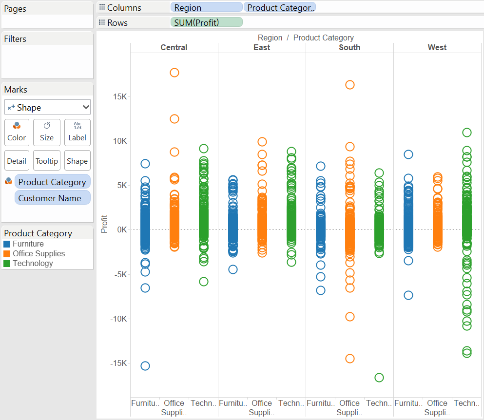
Tableau (Class Activity)
Scatterplot Histogram
Tableau (Class Activity)
Boxplot Create Parameter
Tableau (Class Activity)
Forecast Chart
Tableau (Class Activity)
suss.edu.sg
Course Homepage https://canvas.suss.edu.sg/courses/21575
Study Guide https://ibookstore.suss.edu.sg/
Tableau Desktop https://www.tableau.com/products/trial
Tableau Tutorials https://www.tableau.com/learn/get-started/creator
Academic Calendar https://www.suss.edu.sg/docs/default-
source/contentdoc/cel/ft-2020acadcalendar.pdf