

Data Visualization for Business With Tableau
 Daraja
Visualisation for Business
ANL 201
The Art of Data Visualisation
Study Unit 3
January 2020
Visual Cues
3
Visual Cues The eight components of visual cues
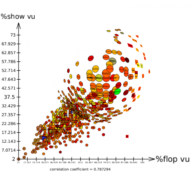
1. Position (e.g., scatterplot)
2. Length (e.g., bar chart)
3. Angle (e.g., pie chart)
4. Direction (e.g., line graph)
5. Shape (e.g., scatterplot)
6. Area (e.g., square area graph)
7. Volume
8. Colour
4
Visual Cues
5
Visual Cues
6
Visual Cues Colour — the Red-Green-Blue (RGB) colour system
‣ The basic idea of the RGB colour system is that any coloured light can be matched by a weighted sum of any three distinct primary colours
C ≡ rR + gG + bB,
where
C is the colour to be matched
R, G, and B are primary sources to be used to create a match
r, g, and b are the amounts of each primary source
≡ denotes a perceptual match
7
Visual Cues Colour — the CIE colour system
‣ The CIE colour system uses a set of abstract primaries called tristimulus values that are labelled XYZ. These values are chosen for their mathematical
properties, and not because they match any set of actual lights
‣ The CIE colour system is by far the most widely adopted colour system to measure coloured lights. We should always use the CIE colour system when
precise colour specification is required
8
Visual Cues Colour — the HSV colour system
‣ The HSV colour system uses colour hue, colour saturation, and black-white brightness (i.e., value) to specify the surface colours
‣ In the HSV colour system, hue refers to which part of the rainbow colour map a colour belongs to, such as red or green. Saturation refers to how rich a colour
hue is, for example, neon colours are very saturated, while pastel colours are
less saturated. Value denotes how bright a colour is, or in other words, how close
a colour is to pure white or pure black
Coordinate Systems
10
Coordinate Systems The cartesian coordinate system
‣ The cartesian coordinate system specifies each data point on a plane by a pair of numerical coordinates. The numerical coordinates are the signed distances
from the data point to the two fixed perpendicular reference lines, called the x-
axis and y-axis
‣ Both axes meet at a point, called the origin, which is usually represented by the ordered pair (0, 0)
‣ The numerical coordinates can also be expressed as a signed distance from the origin
Coordinate Systems
The cartesian coordinate system
12
Coordinate Systems The polar coordinate system
‣ In the polar coordinate system, each data point is determined by the distance between a fixed point and an angle from a fixed direction
‣ The fixed point, which is analogous to the origin in the cartesian coordinate system, is called the pole. The ray or half-line from the pole in the fixed direction
is called the polar axis. The distance from the pole is called the radial coordinate
or radius, and the angle is called the angular coordinate, polar angle or azimuth
Coordinate Systems The polar coordinate system
14
Coordinate Systems The geographic coordinate system
‣ The geographic coordinate system enables every location on the earth to be specified by a set of numbers or letters. To represent the location, the coordinate
system commonly uses latitude and longitude. Sometimes the coordinate system
may also use elevation
‣ Latitude lines run east and west, which indicates north and south positions on the globe. Longitude lines run north and south, which indicates east and west
positions. Elevation can be thought of as a third dimension
Coordinate System
Source: http://image.slidesharecdn.com/projectionsandarcgis-131008191137- phpapp01/95/understanding-coordinate-systems-and-projections-for-arcgis-4-638.jpg?cb=1381259844
The geographic coordinate system
16
Coordinate Systems The geographic coordinate system — projections (1/4)
‣ The surface of the earth is wrapped around a spherical mass, but we usually want to display a location on earth on a two-dimensional surface, like a piece of
paper or a computer screen
‣ Therefore, there is a variety of ways to map the surface of the Earth on a two- dimensional surface, which are called projections
17
Coordinate Systems
1. Equirectangular — typically used for thematic mapping and it does not
preserve any area or angle
2. Albers — does not preserve scale and shape, and angle is minimally distorted
3. Mercator — preserves angles and shapes in small area, so it is good for
direction
The geographic coordinate system — projections (2/4)
18
Coordinate Systems
4. Lambert Conformal Conic — better used for showing smaller areas and it is
often used for aeronautical maps
5. Sinusoidal — preserves area and it is useful for showing areas near the prime
meridian
6. Polyconic — used to show the map of the U.S. in the mid-1900s. There are
little distortions in small areas near the meridian
The geographic coordinate system — projections (3/4)
19
Coordinate Systems
7. Winkel Tripel — a good choice for showing the world map, because it
minimises area, angle and distance distortions
8. Robinson — a good choice for showing the world map because it compromises
preserving areas and angles
9. Orthographic — represents a three-dimensional object in a two-dimensional
space. Using this method, the user needs to rotate to the area/location of
interest
The geographic coordinate system — projections (4/4)
Scales
21
Scales Comparing the different scales (1/2)
‣ With a linear scale, the visual spacing between each of the data points is the same regardless where the data points are on the axis
‣ The logarithmic scale condenses the distance between each of the data points when the value of the data points increase
‣ A percent scale is usually linear, but when it is used to represent part of the whole data, its maximum is 100 percent
22
Scales Comparing the different scales (2/2)
‣ We use a categorical scale when we want to provide visual separation of categorical data, such as country of residence or gender
‣ We use the time scale when we want to plot temporal data on a linear scale, or to divide the temporal data on a categorical scale, such as by year, month or day
Context
24
Context The big idea
‣ Context is a data visualisation component that lends to better understanding of who, what, when, where and why of the data. Context can make the data clearer
for interpretation
‣ When we would like to enable viewers to see the data visualisation object of primary interest in full detail, and at the same time get an overview within the
context (i.e., surrounding information) available, this is known as a focus-context
problem in data visualisation
25
Context The three premises of the focus-context problem
1. The viewer needs both context (i.e., overview of the information), and focus
(i.e., details of the information) simultaneously
2. The information needed in the overview may be different from that needed in
the detail
3. These two types of information need to be combined within a single interactive
data visualisation
26
Context
‣ Spatial related problems are common to all Data Visualisation that use maps
‣ Structural related problem arises when we try to visualise data that have structural components at many levels
‣ Temporal related problem involves understanding the timing of data at very different scales
Sub-types of the focus-context problem
27
Context
‣ The distortion technique spatially distorts a data presentation to give more room to the designated points of interest, and to decrease the space given to regions
away from those points
Solving the focus-context problem — distortion
Context Distortion – Hyperbolic Tree Browser
29
Context
‣ The rapid zooming technique allows viewers to zoom rapidly in and out of points of interest
Solving the focus-context problem — rapid zooming
30
Context
‣ The elision technique hides parts of a structure from viewers until they are needed
Solving the focus-context problem — elision
Context Elision – Fish Eye Technique
32
Context
‣ The multiple windows technique allows viewers to have one window that shows an overview of the data, and several other windows that show the expanded
details
Solving the focus-context problem — multiple windows
Discussion
Source: https://zylab.files.wordpress.com/2010/09/hyperbolic_tree.png ; http://www.ceh.ac.uk/sites/default/files/hyrad-static-and-rapid.jpg ; http://tulip.labri.fr/TulipDrupal/sites/default/files/uploadedFiles/images/scatterplot_view_detail_fisheye.preview.png; https://www.devexpress.com/products/net/dashboard/i/demos/winforms-hr-dashboard.png
Can you identify the four focus-context data visualisation techniques
(a) (b)
(c) (d)
Tableau (Class Activity)
Tableau (Class Activity)
1. Sit with your GBA’s team mates
2. Follow your instructor for the following exercises:
- Data:
- global_superstore_2016.xlsx (orders)
- Coffee Chain.xlsx and Office City.xlsx
Calculation: Aggregate VS Record-Level
Aggregate Functions
1. Aggregation of a measure
2. Aggregation of a dimension
More information:
• https://help.tableau.com/current/pro/desktop/en-us/calculations_aggregation.htm
• https://help.tableau.com/current/pro/desktop/en-us/calculations_calculatedfields_aggregate_create.htm
Exercise 1. Create a calculated field: for each state, calculate combined sales from office city.xlsx
and coffee chain.xlsx
Quick Table Calculation
percent of total
Quick Table Calculation
running total
Quick Table Calculation
running total for each year: Is this chart correct?
Quick Table Calculation running total for each year:
Quick Table Calculation
More Information:
https://help.tableau.com/current/pro/desktop/en-us/calculations_tablecalculations.htm
suss.edu.sg
Course Homepage https://canvas.suss.edu.sg/courses/21575
Study Guide https://ibookstore.suss.edu.sg/
Tableau Desktop https://www.tableau.com/products/trial
Tableau Tutorials https://www.tableau.com/learn/get-started/creator
Academic Calendar https://www.suss.edu.sg/docs/default-
source/contentdoc/cel/ft-2020acadcalendar.pdf